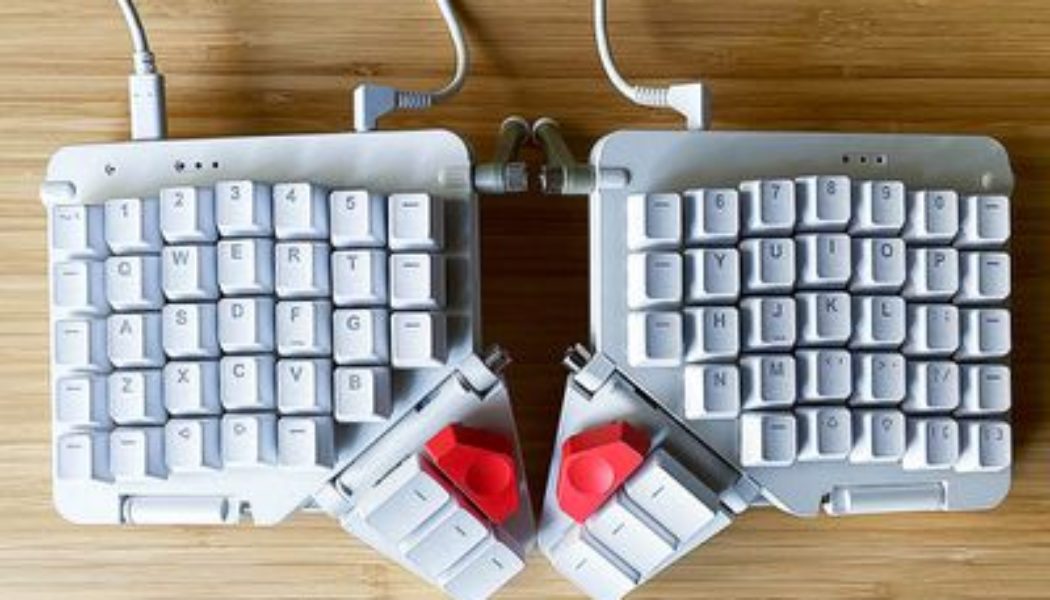
I’ve spent a lot of time with many ergonomic keyboards, but ZSA’s Moonlander Mark I may be my favorite one I’ve ever used. It’s a customizable mechanical keyboard that’s split into two halves for better shoulder ergonomics. You can adjust its tilt to make it most comfortable to your hands. You can swap out the switches for any key without much effort. You can program multiple functions for every single key.
I’ve been typing full-time on the Moonlander for about three months, and I may very well switch over permanently from my previous daily driver, the Kinesis Freestyle Pro. But getting the Moonlander to that point has taken a lot of work.
The keyboard is endlessly customizable, and the sheer amount of options at your disposal can be overwhelming. Even if you’re used to typing on an ergonomic split keyboard, like I am, it could still take weeks until you’ve dialed in all of its adjustments. And then there’s the Moonlander’s price: an eye-watering $365 to start.
If you want one of the best ergonomic keyboards available, and you’re willing to pay for the amount of customization it offers, I’d say the Moonlander is worth that steep price. But for someone who is thinking about making the Moonlander their first ergonomic keyboard, you might want to consider a more affordable option to see if you even like using this kind of keyboard.
Let’s get this out of the way first: yes, the Moonlander, with its split layout, tented angles, and the clusters of keys designed to be used by your thumbs, just doesn’t look much like a traditional keyboard. If you’re coming from a more standard keyboard layout to the Moonlander, it’s probably going to feel strange to type on at first.
You’re almost certainly going to go through a potentially weeks-long adjustment period until you’re typing at full speed. I’ve used two keyboards with layouts similar to the Moonlander as my daily drivers before — ZSA’s ErgoDox EZ and Kinesis’ Advantage 2 — and it still took me a couple weeks to feel fully comfortable on the Moonlander.
But now that I’m used to it, I am a huge fan of everything nontraditional about the Moonlander’s design. The split layout lets me type with my shoulders in a more open position. Typing at an angle feels better for my hands, and you can easily change that angle by adjusting the keyboard’s feet. That fine level of control isn’t something I’ve had with most other ergonomic keyboards I’ve used — with the Kinesis Freestyle Pro, for example, you need to attach a separate accessory to tent the keyboard and it only offers three different angles.
:no_upscale()/cdn.vox-cdn.com/uploads/chorus_asset/file/22706307/jpeters_210707_4662_0009.jpg)
Ergonomically, the Moonlander feels great. I can type on it for a full eight-plus hour workday and my hands usually won’t get sore. (By comparison, if I spend more than a couple hours on my MacBook Air’s flat keyboard, I have to stretch my hands or take short breaks because my wrists start to flare up.) My one wish is that I could angle up the inside edges of the Moonlander even higher so it would better match the height I’m used to on my Kinesis Freestyle Pro. But I should say that even though the keyboard feels good ergonomically for me, everybody’s hands and needs are different, so I can’t guarantee that it will be a perfect fit for you, even with how adjustable it is.
The keyboard comes with integrated wrist rests, but you can fold them out of the way, where they cleverly attach magnetically to the underside of the keyboard. (Folding up the wrist rests also makes the keyboard fit nicely in the included carrying case.) And if you want, you can take the wrist rests off entirely.
:no_upscale()/cdn.vox-cdn.com/uploads/chorus_asset/file/22706302/jpeters_210610_4662_0004.jpg)
I love the thumb clusters, which I’ve programmed for common keys like space, backspace, and enter. (More on that programmability later.) The angle of the thumb cluster can also be adjusted, though you’ll have to loosen it with an included hex key. I thought I’d use the big red keys at the top of the thumb cluster, but for me, they’re just out of reach to be comfortable to use in regular typing. I eventually turned the left one into a layer switcher for my media keys. The right one has a slightly more fun purpose that I’ll explain later.
:no_upscale()/cdn.vox-cdn.com/uploads/chorus_asset/file/22706301/jpeters_210610_4662_0003.jpg)
:no_upscale()/cdn.vox-cdn.com/uploads/chorus_asset/file/22706304/jpeters_210706_4662_0006.jpg)
Swapping out key switches is a breeze, thanks in large part to the included tool that lets you pull up keys and their underlying key switches without the need to desolder anything. (Keyboard enthusiasts will know this is referred to as “hot swappable” switches.)
That tool also makes it easy to pull everything off so you can clean the keyboard and every key, which I can do over the course of about two hours. If you go with the white model, you’ll be glad cleaning the keyboard is so simple, since the included keycaps can get grimy within a matter of days.
:no_upscale()/cdn.vox-cdn.com/uploads/chorus_asset/file/22706299/jpeters_210609_4662_0001.jpg)
:no_upscale()/cdn.vox-cdn.com/uploads/chorus_asset/file/22706300/jpeters_210609_4662_0002.jpg)
When you order a Moonlander from ZSA, you can pick from 10 different key switches: two types of Cherry-manufactured switches (brown and blue) and eight types of Kailh-manufactured switches (bronze, gold, silver, copper, box brown, box red, box white, and box black). You can also order switches from ZSA separately, if you’d like. The board supports both 3-pin or 5-pin switches, so if you want to swap in another option, you can do that.
I ordered my review unit with Cherry MX brown key switches since I was familiar with them from my Kinesis, and they sound nice and clicky, with a tactile tick for each press. ZSA also sent me samples of Kailh silver and bronze switches to try. The silvers were a linear switch that felt too mushy for me. I loved the clicky bronzes (which are also known as thick golds), I just wished they were a little quieter.
If you want to outfit the keyboard in your own keycaps, you can use 1u keycaps for the 64 main keys on the board. (You can also buy keys with just the line on ZSA’s website in batches of 10.) Using your own keycaps with the thumb cluster requires less common sizing — the six rectangular keys use 1.5u keycaps and the two big red buttons use 2u keycaps — which might make it harder to find custom caps if you want to customize the keyboard.
The keys on the Moonlander are in line with each other instead of being slightly offset. The idea with this staggered columnar layout is that it’s easier for your fingers to reach keys above and below the home row, but I didn’t feel a major difference in reachability between the Moonlander’s layout and the offset layout of my MacBook Air’s keyboard.
You might have also seen that the keys are laid out in a nontraditional way out of the box, and that many keys you might expect to see just aren’t there. Notice how there’s no marked Windows key? No Command key? Or how about things like shift, return, or even a spacebar? None of those are officially labeled on the Moonlander.
:no_upscale()/cdn.vox-cdn.com/uploads/chorus_asset/file/22706303/jpeters_210706_4662_0005.jpg)
This is where the Moonlander’s software steps in — you can pick where all those keys go yourself. Using ZSA’s online configurator tool, you can program an impressive number of options for each key.
If you just want a key to do a single function, you can set that. But you can also set macros, and not just one per key: if you want, you can set up to four different macros per key, depending on combinations of tapping and holding the key. You can also set different layers of entirely different layouts, which you can swap to by, yes, customizing keys on your keyboard.
All this doesn’t mean that out of the box, you won’t be able to hit the spacebar. You just have to know where to look for it. Check out the default layout, from ZSA’s online configurator tool. It places the space bar in the left thumb cluster on the left-most key. Backspace is one key over from that one. Return? On the right-hand thumb cluster on the right-most key.
:no_upscale()/cdn.vox-cdn.com/uploads/chorus_asset/file/22702856/Screen_Shot_2021_07_06_at_9.03.31_PM.png)
My layout is much different. I’m a Colemak typist, so I had to remap many letter keys just so that I could type words. But over time, I kept tweaking my layout to add a few more advanced shortcuts thanks to macros. For example, I can press and hold X, C, and V to perform cut, copy, and paste, respectively. (This doesn’t work perfectly — I’m sure my colleagues have wondered why I sometimes just type the letter “v” in Slack.) I made a separate layer that’s designed almost exclusively to make it easier to watch YouTube videos, with arrow keys under the WASD keys, one-key shortcuts to speed up and slow down videos, and easy access to the volume controls. My editor suggested I set macros to mute and end Zoom meetings, which I added promptly.
:no_upscale()/cdn.vox-cdn.com/uploads/chorus_asset/file/22702855/Screen_Shot_2021_07_06_at_9.02.38_PM.png)
At this point I would find it hard to live without my current layout on the Moonlander, especially for my day-to-day work. And I’ve noticed that I’m just not as efficient when I’m typing on the “normal” keyboard on my MacBook Air, especially when I can’t do my handy press-and-hold shortcuts. The MacBook Air has an advantage with its function row, which lets me raise or lower volume with just one keystroke — on my Moonlander setup, it takes two because I have to switch to my dedicated layer — but it’s only a minor disadvantage that I’ve gotten used to. And if I really wanted to, I could find a way to put media controls on my main layer.
Getting my Moonlander to work exactly the way I wanted took about two weeks of near-daily tweaks, though. Sometimes, my imagined improvements were hilariously off-base. The first time I flashed a custom layout onto the keyboard, I immediately realized that I forgot to add an apostrophe key, which is kind of an important one in my work.
Depending on how much you want to customize your layout, you might spend a long time fiddling with ideas in the configurator tool. There were a couple times early on where I’d spend upward of half an hour after work putting together new ideas. Fortunately, once you’ve decided on a layout, actually implementing it is speedy, as it only takes a minute or two to download and flash it to the keyboard.
And to be fair, you don’t need to customize the Moonlander within an inch of its life like I have. It’s a perfectly functional keyboard right out of the box, and I’m sure you could get used to it in time. But to be honest, I didn’t use the default layout at all; since I already had an idea of some customizations I wanted to make based on my experience with the ErgoDox, and I flashed those onto the keyboard right away and used them as a starting point.
The freedom to decide which keys go where can also create a paralysis of choice. I was stumped for days trying to figure out the “best” way to replicate an inverted T arrow key layout, and eventually, I gave up, keeping two arrow keys on each side of the keyboard but in a slightly different position from the default. Trying to nail where the Mac’s Command key should go was a puzzle as well, and my solution to put it on the keys closest to the thumb clusters still feels imperfect.
There are also programmable RGB LEDs under each key, meaning that in addition to trying to figure out what each key does, you might also delve into how each key looks, too. For my main layer, I’ve landed on keeping all the lights off most of the time, but I can flip on some prebuilt animations if I’m feeling colorful. You can switch between these prebuilt animations with the press of a key, too, which is what I use that big red key on the right side of the keyboard for.

On my media controls layer, I have a more practical use for the RGB LEDs: lighting up just the keys I’ve programmed for different functions. (I admit that I’ve changed the colors assigned to those keys a few times, though.)
One other thing I should mention is that the left side of the Moonlander can function on its own, which opens up a lot of interesting possibilities for gamers. I’m not much of a PC gamer, but I could easily imagine a scenario where you create a gaming-focused macro layer on the left side of the keyboard and unplug the right side entirely to open up some desk space for your mouse.
While doing some research for this review, I came upon my colleague Alex Cranz’s great 2017 article about the world of mechanical keyboard fans. It ends with a quote that I haven’t been able to get out of my head: “There’s no best keyboard… There’s the best keyboard for you.”
I honestly can’t tell you if ZSA’s Moonlander is the best ergonomic keyboard out there. It works very well for me, well enough that I might not go back to my trusty Kinesis Freestyle Pro. But it took weeks of tweaking, adjustments, and time on the keys to get it to a point where I felt that way. And if you drop the $365 to get a Moonlander for yourself, it might be a rough adjustment period to start.
Once you’ve wrapped your head around all of the possibilities offered by the Moonlander, though, your imagination might run wild. It offers a whole lot that can make it the best keyboard for you.
Photography by Jay Peters / The Verge


