After delivering Martí Guerrero’s Tim Comix Figure, eclectic Hong Kong select shop and vintage purveyor ASTERISK has reconnected with Yu Nagaba for a playful release. The collaboration is built on a friendship with the Japanese modern and contemporary artist which began in 2016 when Nagaba illustrated ASTERISK’s logo that is still used today.
Back in 2019, ASTERISK and Yu Nagaba came together to discuss the idea of materializing the 2D logo into a 3D object. Resulting in the birth of 星仔/Sing Jai, through rigorous collaboration and countless sketches the figure was brought to life by lauded art name HOW2WORK.
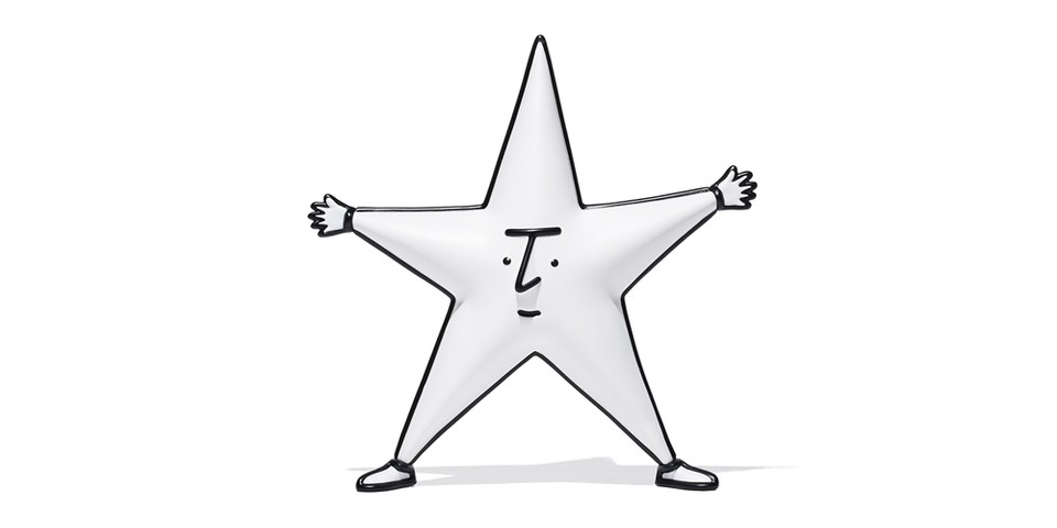
The ASTERISK x Yu Nagaba 星仔/Sing Jai Figure 1st Edition crafted by HOW2WORK is constructed of vinyl and faithfully represents Nagaba’s minimal yet emotive drawing style. 星仔/Sing Jai, Cantonese for “Star Boy,” features a clean rotund white base star shape complete with a bulbous backside. Contrasting black is used for the facial details and serves to frame the form of the vinyl figure.
Limited to just 100 figures, each 星仔/Sing Jai comes in special packaging marked with co-branding and accompanied by a coaster signed by Yu Nagaba.
The ASTERISK x Yu Nagaba 星仔/Sing Jai Figure 1st Edition crafted by HOW2WORK will be available exclusively in-store at Asterisk February 14. Catch an interview with Yu Nagaba regarding the release below.
Asterisk
Landmark, BELOWGROUND
Shop 7, Basement, 15 Queen’s Road,
Central, Hong Kong
Tracing back to 2016, what was the intention of choosing the star as the main design element for the logo of ASTERISK?
I remember the initial meeting with Wai, the manager of ASTERISK, who said he wished to have a shop logo that is cute but at the same time retains a sense of stylishness. The asterisk typographical symbol (*) looks like a star so it was an easy connection to make and a good jumping point.
Any unforgettable moments to share during the design process of the ASTERISK logo?
What made me most satisfied was how 星仔/Sing Jai came to be. As we already chose the star for the logo, I made good use of the star shape to form the four limbs, along with my signature facial features. The design of 星仔/Sing Jai is simple yet stands out.
What was your first impression of ASTERISK?
ASTERISK is a shop full of surprises. Aligned with Japanese select shops, I could tell the manager’s interests and hobbies through the presented products. When I first visited ASTERISK, I saw tons of ’80s and ’90s Apple Computer clothing and accessories, which really surprised me, and because of my interest in American vintage, I immediately got along with the manager of the shop.
You usually illustrate portrait work with existing characters, however, 星仔/Sing Jai is an original character. Were there any difficulties in getting inspiration?
Yes! At the very beginning, I did worry about it as the star shape was not that easy to design with both cuteness and the vibe of ASTERISK. Luckily we were all satisfied with the final design and I think it suits the shop very well.
Through this project, ASTERISK and HOW2WORK turned the 2D logo into a 3D collectible figure. What are your thoughts about the process?
It’s amazing to see my 2D illustration turned into a 3D figure. I think the 3D figure helps fill in the imaginative part of the 2D version and the finalized form of the figure is completed with a sense of pureness.
If you were asked to make changes to the ASTERISK logo, would you leave the design unchanged or make some changes?
I think I would make some refinements. To go back and take a look, I think there is room for improvement and if there is a chance to make a new version of the star design I will happily share it with you all.
The first edition of the 星仔/Sing Jai figure is in a simple white color tone. Are there any special colorways that you would like to suggest for the next version?
The white color tone for the first version is familiar since the original illustration uses a white color tone. I believe a black color with a glowing effect would be an interesting combination and I would also like to see 星仔/Sing Jai fabricated from metal or marble.
In case you missed it, Ghibli Park and Toyota are developing a ridable Catbus.