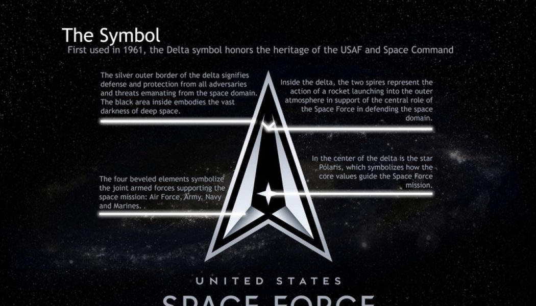
An official logo and motto for the United States Space Force have been revealed, following the announcement of its official seal back in January, and flag in May. The organization’s motto is “Semper Supra,” which is Latin for “Always Above,” while the logo itself is based around a delta shape that’s been the focus of some mockery thanks to its similarity to Starfleet’s logo from Star Trek.
Defenders of Space Force’s seal were quick to point out that its actual inspiration appears to be the shield for Air Force Space Command. The official US Space Force Twitter account points out that the shape has been been in use by space organizations as far back as 1961. Star Trek, meanwhile, debuted in 1966.
So what about the other elements of the logo? The star in the middle is meant to symbolize Polaris, otherwise known as the North Star, the core values and guiding light for the organization. The two spires are meant to look like a rocket launch, while the four beveled elements at the bottom represent the four armed forces supporting the space mission. Around the edge there’s a silver border, signifying “defense and protection,” and the black background is the blackness of space, obviously.
“The black area embodies the vast darkness of deep space,” Space Force’s official Twitter account cheerfully notes, “Some feel fear and dread but we prefer to be inspired and stand up to the challenge.”
:no_upscale()/cdn.vox-cdn.com/uploads/chorus_asset/file/20108148/200722_F_GO452_0002.png)
Space Force is the sixth branch of the US military alongside the Army, Marine Corps, Navy, Air Force, and Coast Guard.


