In which we investigate the ‘digital crown’ and discuss why scrolling is so intrinsic to its nature.
Share this story
See our ethics statement.
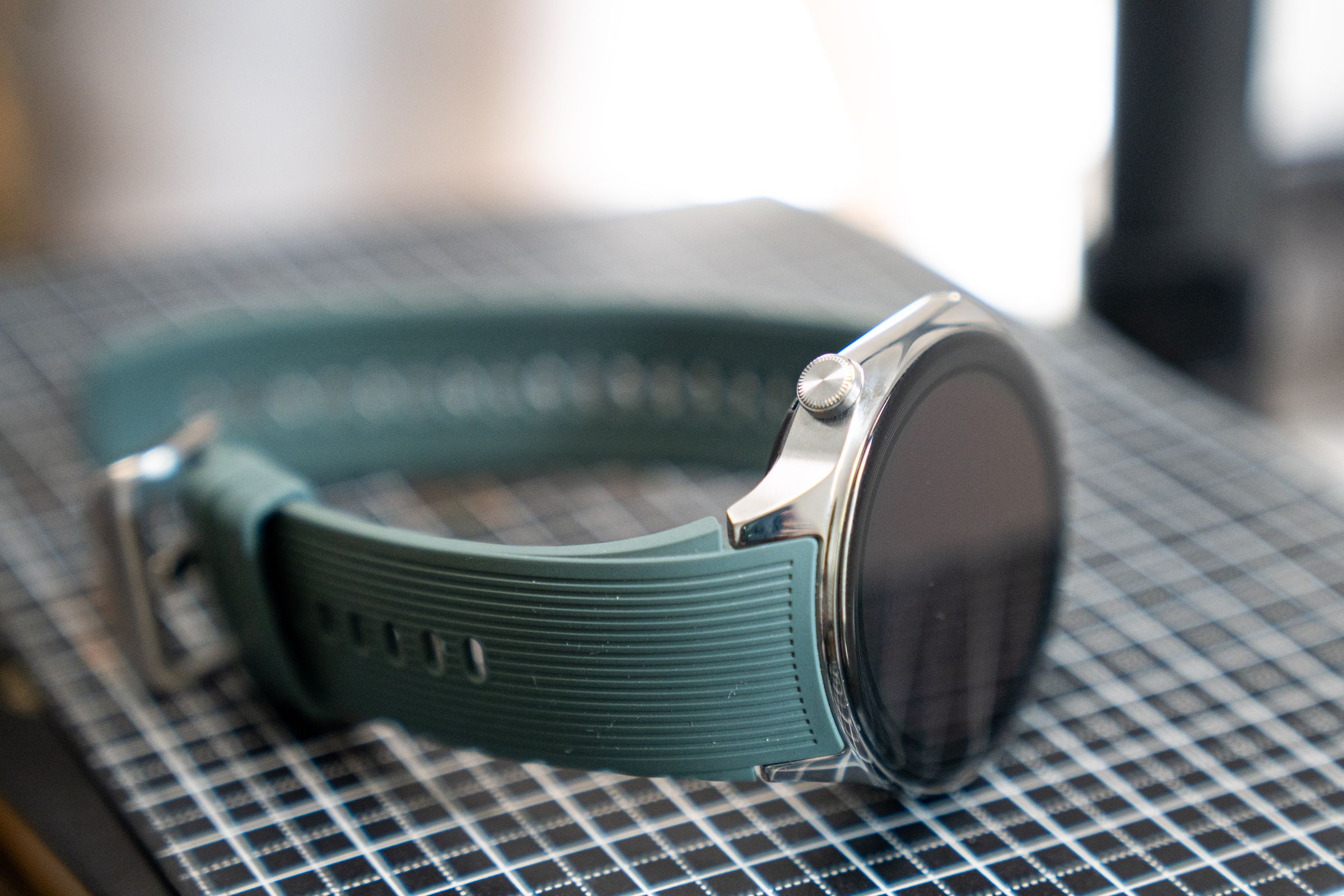
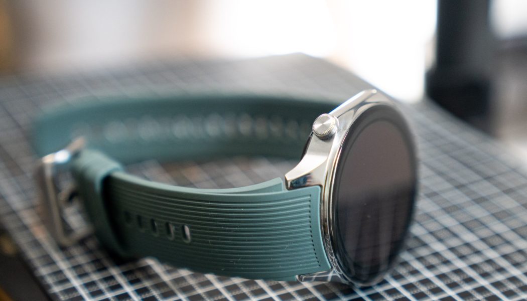
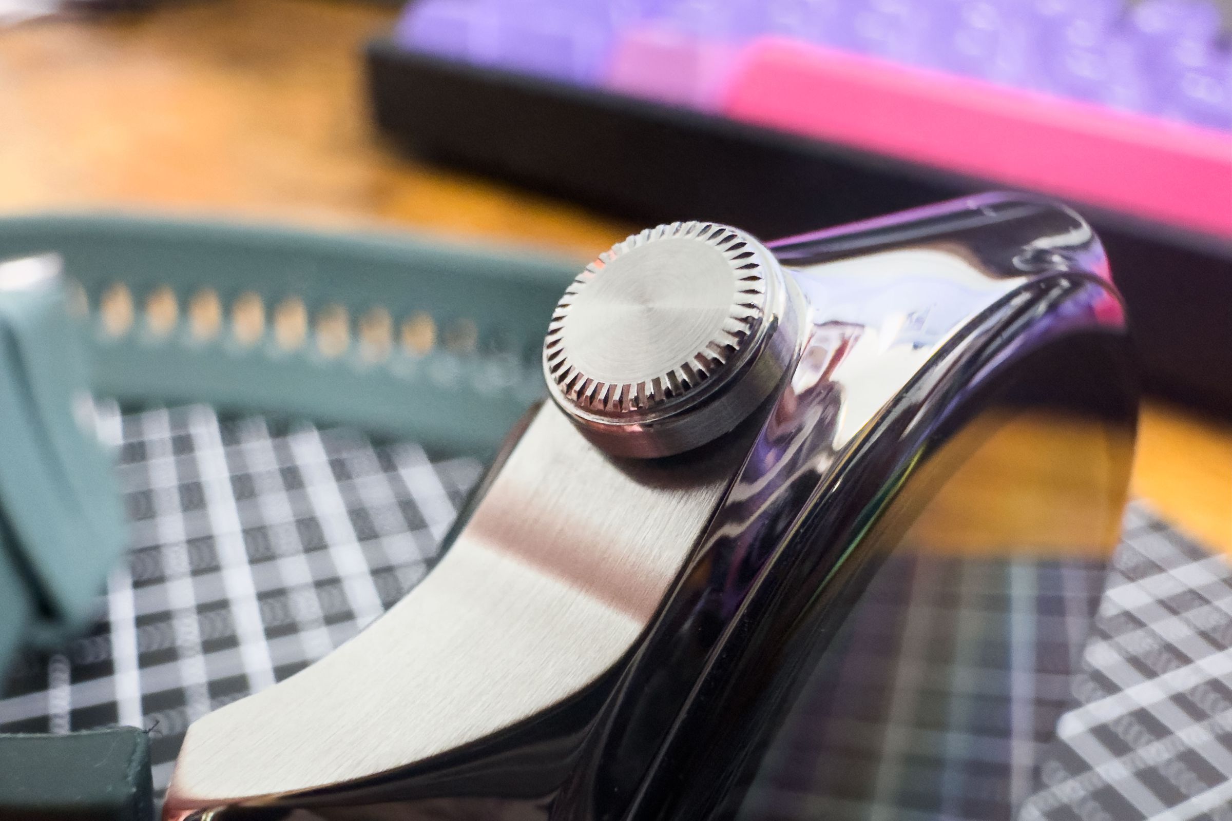
When I reviewed the OnePlus Watch 2 last month, I said it had a digital crown. I did so because it had a button with grooves that you could twist and press. I didn’t think much of it, but a few readers contested its crown-ness.This, they said, was naught but a mere button.
To that, I furrowed my brow.
The problem was that twisting the OnePlus Watch 2’s “digital crown” didn’t do anything. It broke the unspoken nerd covenant that smartwatch crowns must scroll. Pressing the button brings up an app menu, but twisting it? Zip, zilch, nada. On other smartwatches, twisting a crown generally lets you scroll through menus and notifications — whatever’s on your display. Since this button didn’t do that, the people argued, it could not be a digital crown, style be damned.
In today’s digital age, it sometimes feels like hardware has taken a back seat to the software that drives our devices. Button of the Month is a column that explores the physical pieces of our phones, tablets, controllers, and beyond.
When I type “What’s a digital crown?” into Google, the top results tell me it is a large, protruding dial on an Apple Watch that’s based on a mechanical watch’s crown. It’s a means of navigating and activating features. This is a deeply dissatisfying answer.
For starters, digital crowns are not limited to Apple Watches. I’m not denying that the first Apple Watch popularized the digital crown: if you look at pre-2015 smartwatches and fitness trackers, you’ll see buttons and pushers were the more common design choice. (Some, like the LG G Watch R, had a crown-like button that could rotate, but like the OnePlus Watch 2, didn’t scroll.) But these days, digital crowns are fairly common outside of Apple’s walled garden. The Pixel Watch and Pixel Watch 2 have one. So do a bunch of my Withings, Mobvoi, and Fossil watches.

Secondly, digital crowns have never been the primary means of navigating smartwatch menus. The vast majority use touchscreens where swipes and taps reign supreme. (Some smartwatches don’t even have a single button!) The smartwatches that don’t have touchscreens, like some multisport watches from Garmin or Polar, primarily rely on a five-button system for navigation and selecting. Athletes swear by these buttons because they’re immune to sweat and gloves.
Out of curiosity, I rummaged through four drawers of smartwatches I’ve reviewed over the years. A trend emerged. Most watches with digital crowns — from brands both big and small — were those mimicking the feel of an analog mechanical watch.

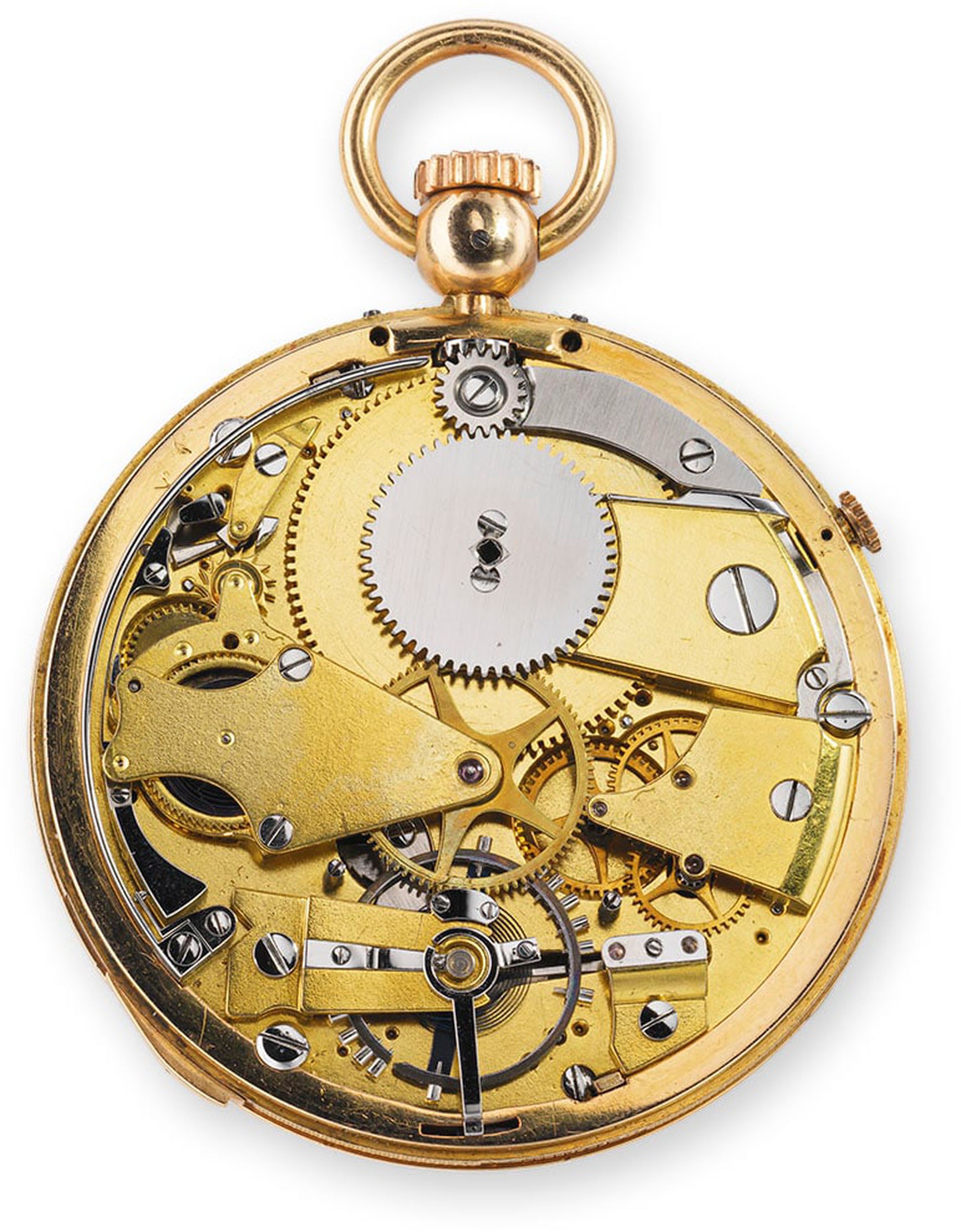
That, in turn, made me wonder why watches had crowns to begin with. Before the 1800s, winding a pocket watch or a clock often required a special key — which could get pretty annoying. The “crown” seemingly emerged in the 1830s, letting owners turn a decorative part of their watch to wind its mainspring, thereby powering the device’s internals, too. They did it using a dial with ribbed grooves that looked like a king or queen’s crown.
But earlier inventors call it a “knob,” or simply a way to wind a watch without a key, and enthusiasts have traced keyless winding mechanisms as far back as 1686.


In short, the traditional watch crown was both the main way of interacting with a watch and crucial to the watch’s functioning. But it was always more knob than button.
That was then. Technically, wristwatch wearers haven’t needed to use crowns to wind springs since Seiko made the Astron 35SQ, the first quartz watch, in 1969. Today, analog knobs are mostly used to set the time. The modern digital crown isn’t even necessary for that, so really, it’s all about interacting with a smartwatch.
Each smartwatch maker is different, but I’m struggling to remember a digital crown that just scrolls. More often than not, it works as a select button, a shortcut, or a way to bring up a voice assistant. Some people don’t even use the crown to scroll menus at all. (Yours truly primarily uses it to adjust volume.) So when did scrolling become the defining criterion of what makes a digital crown?
To that, I could probably point my finger at one Sir Jony Ive, Apple’s former design chief. In an interview with Hodinkee, Ive notes that the crown is a “fantastic solution for scrolling and making choices.” Ive mentions scrolling first, and Apple itself made a big hullabaloo about the digital crown as a pioneering input method in the first Apple Watch’s marketing. But again, he primarily refers to it as an input mechanism, a means of interaction — he calls it an alternative to the “panacea” of “direct manipulation,” aka touchscreens.
In typical Ive bombast, he says implementing the digital crown “took a modicum of courage” and that it allowed Apple to “offer a ‘second button’ on the device.”
But you heard the man: it’s a button.

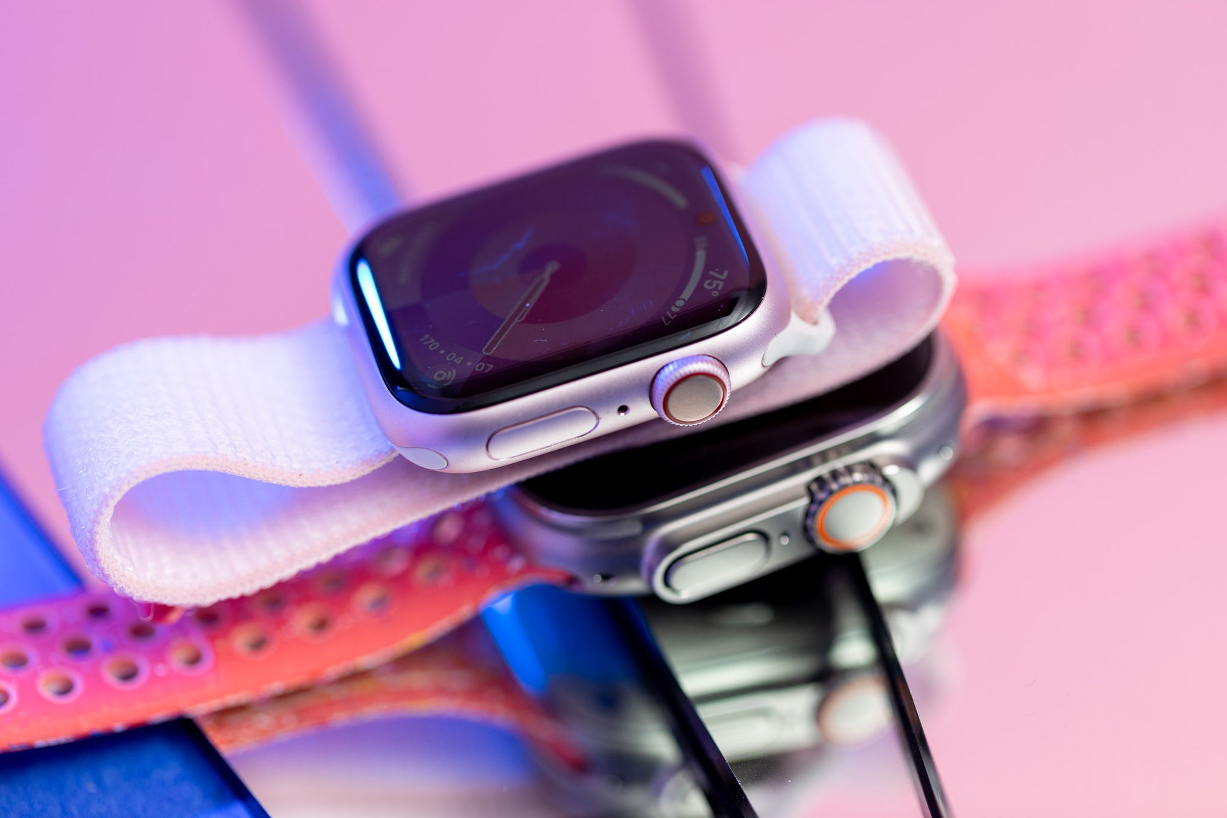
Today, Apple doesn’t use scrolling as part of its definition of a digital crown. It calls it an “important hardware input” for the Apple Watch and the Vision Pro. On the Vision Pro, turning the crown doesn’t scroll through menus at all. The rotation does, however, have a purpose. When you turn the crown, it lets you adjust your immersion in virtual environments — as in fine-tune your connection to reality. It also acts as a means of adjusting volume and an alternative to pinching your fingers when you want to select a button.
So, even Apple — which popularized the digital crown as we know it — doesn’t seem to have a hard and fast rule about the crown. Just that the rotation should be an intuitive part of the UI.
After much soul-searching, it’s clear that the OnePlus Watch 2 definitely has a crown. Whether it’s digital boils down to if that rotation truly does anything at all. It ought to have some kind of intentional purpose. Otherwise, why not just have a regular old pusher-style button?
Out of curiosity, I reached out to OnePlus.

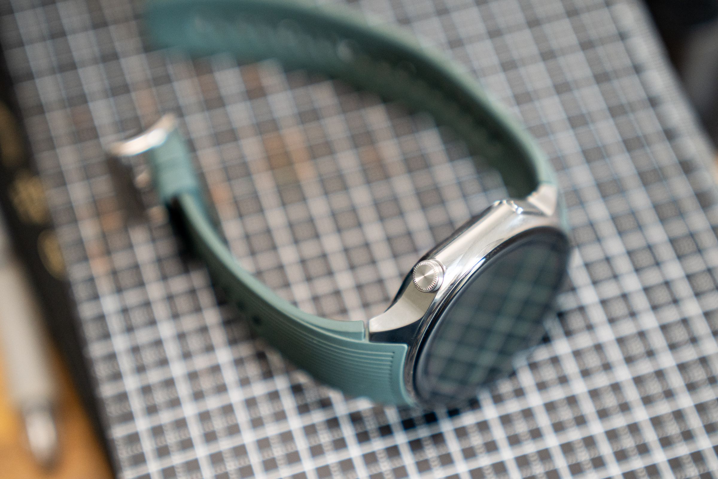
“The crown does not have any function on the device. The crown rotating when moved leads to the button being more durable than if it was rigid, especially during impacts,” says OnePlus spokesperson Spenser Blank. “Also, Wear OS 4’s intuitive interface plus the OnePlus Watch 2’s large screen allows for easy swipes and interactions, making the adjustments provided by a digital crown unnecessary.”
There you have it. I stand corrected: even OnePlus says it’s not a digital crown. The rotating serves a mechanical purpose — just not one anyone can get particularly excited about. (I know a few glove-wearing athletes who’d take umbrage with Blank’s assertion that a touchscreen suffices.) So let’s leave it at this: the OnePlus Watch 2 has a crown. It’s just not a particularly good one and definitely not digital.
