The Aston Villa crest, reimagined – originally posted on Sportslens.com
It’s strange someone decided once that dark murky red (Claret) and bright sky blue would make for a great combination for a football club’s colours. Stranger still that it worked so well, several other teams also adopted it (Looking at you West Ham & Burnley).
There is, of course, no evidence for it, but I read somewhere that West Ham adopted the kit after a Villa player settled a gambling debt by stealing a full set of the kit. Quite a colourful story, no pun intended.
Aston Villa FC was formed in 1874. Their first match was actually against the local Aston Brook St Mary’s Rugby team. They decided to play the first half under Rugby rules and the second half under Football Association rules. I would really pay to see such a match again.

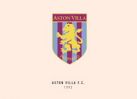
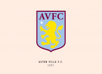
Being the proud owners of some of the most consistent crests, Aston Villa FC has always had the Scottish lion and the club motto “Prepared” on their crest since the beginning. Along with these, there has recently been a white star too. The white star apparently is simply there to remind us of a victory against Bayern Munich in the 1982 European Cup. I wonder if they would place another one if they won against them twice.
The current Aston Villa crest though is pretty beautiful. The “Prepared” might be gone, but the club crest doesn’t look any less dominant because of it.

My first step was to try this idea to use just the head and mane of the lion and try to use it to make the shield shape overall. After a lot of minor adjustments, it finally worked, and I had my overall shape. The heavily stylized lion did remind me a lot of the American football team logos, but that just made it look much more youthful and modern.
I’m so glad the current crest already had AVFC abbreviated, all I had to do was divide the crest into 3 very clear parts – the star, the lion and the letters. It took me a while to try and find the right balance with colours.
I wanted to include yellow, but not lose the claret and blue. Finally, you can see what I ended up with, and I’m mighty pleased with the results.
Growing up watching football in the early 2000’s, Aston Villa FC has always been a formidable team. Now that they have returned to the Premier League, I felt they would want a crest worthy of the same ferociousness that their lion is supposed to signify.
This article is part of the Premier League 2020 Crests series.
Shadab Wajih is an award-winning art director, graphic designer and an illustrator based in Miami, US. Besides his design and advertising work he also prides himself in his FIFA managerial skills. You can see more of his work, contact or complain to him on his Instagram: @snikt13
From Sportslens.com – Football News | Football Blog


