Spotify wants to be much more than a music player. So its app is turning into much more than a bunch of album covers.
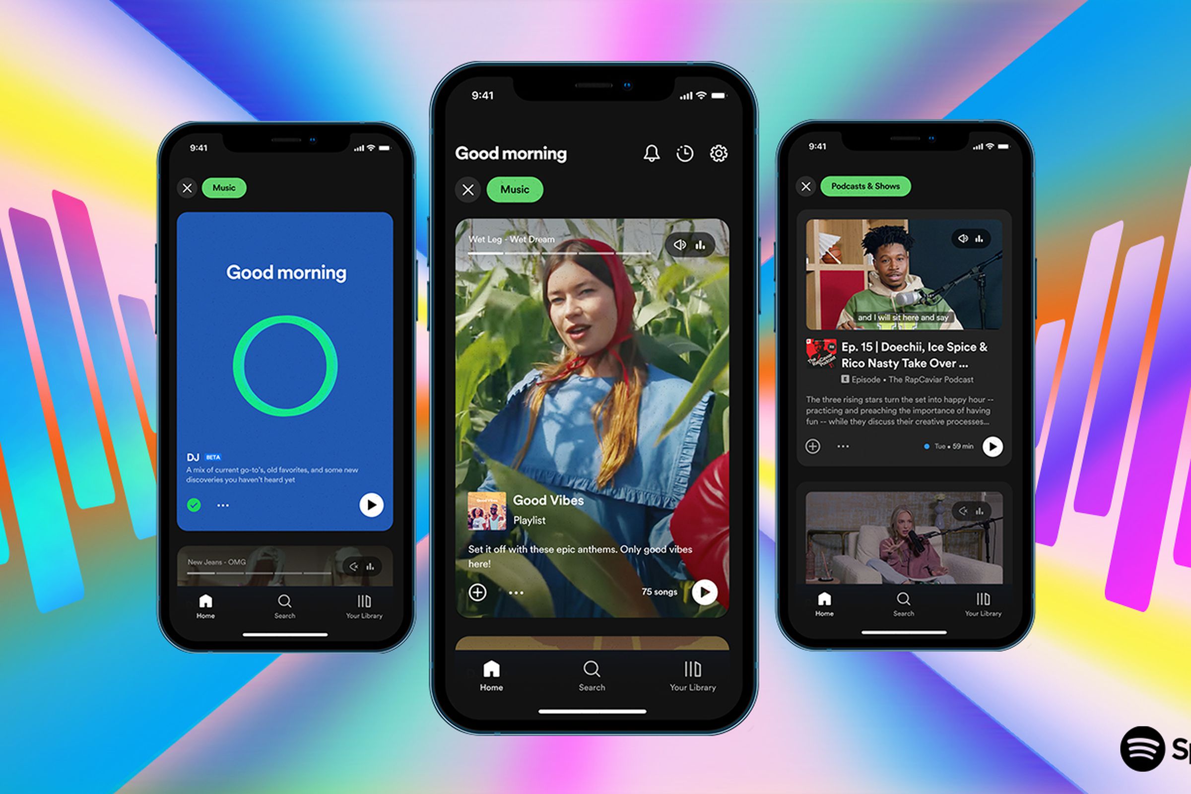
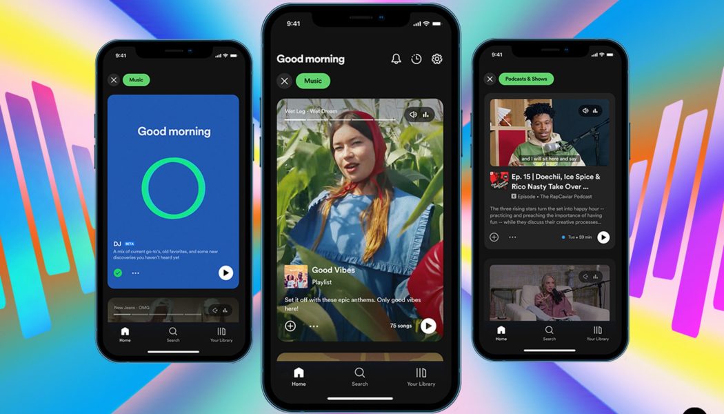
Spotify is redesigning the core homescreen of its app, trying to make it easier for users to find new stuff to listen to — and watch. The new design goes heavy on imagery and vertical scrolling, turning your homescreen from a set of album covers into a feed that much more closely resembles TikTok and Instagram. As you scroll, Spotify is also hoping to make it easier to discover new things across the Spotify ecosystem.
The new look, which Spotify just announced at its Stream On event, is clear evidence of the kind of company (and product) Spotify wants to be. Over the last few years, it has invested heavily into podcasts, audiobooks, live audio, and more, all in an attempt to be more than just a music app. The company also wants to be a home for creators: Spotify CEO Daniel Ek told The Verge in 2021 that he hoped to have more than 50 million “audio creators” on the platform. Spotify has also pushed for years to make video podcasts happen and is now largely watching as YouTube pulls it off.
Put it all together, and that’s a lot of things to shove into a single app called Spotify. Spotify has been on a seemingly relentless quest to nudge people toward content that’s more differentiated and more profitable, which often meant making it harder to listen to music. That’s why the app’s new design seems to be in part meant to create more dedicated space for all those new kinds of content. Spotify has for years tried to find ways to put podcasts and music and everything else side by side but seems to be recognizing that the best answer is to give each thing more space to breathe.

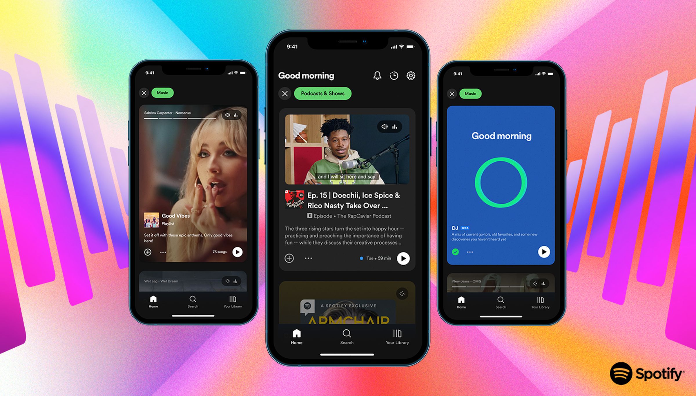
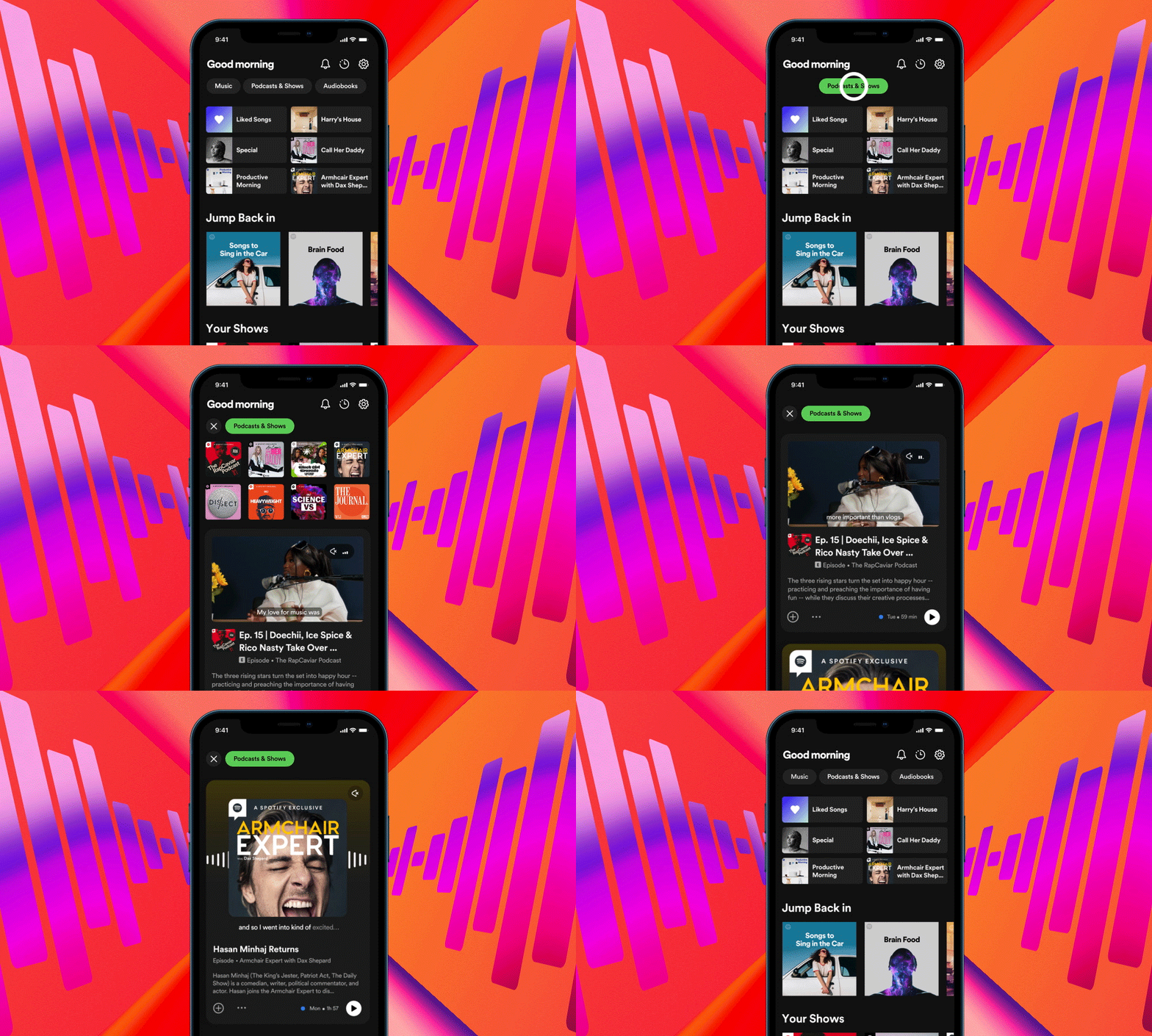
Going forward, when you open Spotify, you’ll still see a bunch of album and playlist covers at the top. But underneath, you might see an autoplaying video podcast, which you can jump into with a tap. Or you might see a big, Instagram-style photo meant to tell you a little more about a playlist you might like.
At the top, if you tap on “Music” or “Podcasts & Shows,” you’ll be taken into a vertically scrolling feed that looks a lot more like Instagram Stories or TikTok than the Spotify you’re used to, dedicated to just that section of Spotify. You can flip through as many as you like, each one autoplaying to give you a sense of what it is, or tap on one to dive in and save or explore it further.
There’s an obvious tension in the design, between Spotify wanting to make the app a calmer and more navigable space while also trying to find new ways to entice people into new things. There’s more autoplaying content than ever in the app now and lots of ways to quickly preview songs and playlists without hitting fully diving in. Full-screen vertical scrolling is everywhere now and is an obviously useful tool for discovery. Billions of users are used to swiping through a dozen things they don’t like before landing on one they do. And in this new look, every song or playlist or podcast gets a momentary extra chance to grab you.

Playlists have been Spotify’s main — and, for all intents and purposes, only — source of discovery, but in the new design, there’s a much greater emphasis on getting you into new things. That makes particular sense in podcasts, where Spotify desperately needs to find ways to recoup its huge investments in the space. Ek may have admitted he made a mistake in betting so big on new kinds of audio, and the company has scaled back its team in the space, but that doesn’t mean he’s slowing down.
The other new thing you may notice in Spotify is more personalized AI. The Smart Shuffle feature, which temporarily adds tracks to your existing playlists, is supposedly an improvement on the “just for you playlist” idea Spotify has been working on for years — and don’t forget DJ, the AI spinning records and hosting your own personal radio show.
Spotify is the biggest player in music streaming but continues to want to own audio in an even bigger way. That’s what the new design really shows: that Spotify is no longer a music app and shouldn’t look like one — and, hopefully, not look like a mish-mash-y mess of content, either.
