Phones in a flagship lineup have come to feel like variations on a theme. There’s the base model, the bigger base model, and then the biggest model with an extra camera and some other minor hardware upgrades. Features, screen size, and cost all increase in increments as you go up the chain, but you’re more or less getting the same phone in three different flavors.
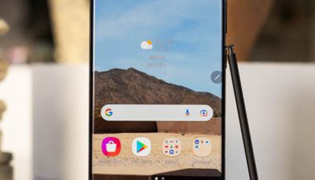
That’s been true of Samsung phones for the past few years, but it’s not the case anymore — the $1,199 Galaxy S22 Ultra sits at the top of this year’s lineup as an entirely different option. It’s the first S series phone to include a built-in stylus, a feature it’s inheriting from the evidently now-retired Galaxy Note series. On top of that, it still offers a very good 10x optical zoom, as well as some appealing updates to its photography features. It happens to be a great phone, too, but despite its place in Samsung’s mainstream S series, it still feels like the enthusiast device that the Note series represented.
Samsung has, at least, made the job of deciding which of this trio of phones is for you very easy. If you miss the Note and you love the stylus life, get the S22 Ultra. There’s nothing else like it in Samsung’s lineup or anywhere else on the market, really. If you’re just slightly curious about the stylus, or the 10x zoom, or you just want a really nice big-screened phone without a lot of fuss, then you’re probably better off with the S22 Plus. It’s not for everyone, but for a few, the S22 Ultra is a truly great device.
:no_upscale()/cdn.vox-cdn.com/uploads/chorus_asset/file/23256281/ajohnson_220216_5032_0008.jpg)
Samsung S22 Ultra design and hardware
Different it may be, there’s still plenty of common ground between the Ultra and its S22 and S22 Plus siblings. All three models include (in the US) Qualcomm’s latest, the Snapdragon 8 Gen 1 processor, as well as IP68 weather sealing, and Gorilla Glass Victus Plus on the front and back. The Ultra and S22 Plus have OLED screens with higher 1,750 nits peak brightness, but all three have a top refresh rate of 120Hz. Only the Ultra uses an LTPO display, which allows the screen to change its refresh rate more than the other models, which in theory helps save battery life. It’s a huge, 6.8-inch 1440 x 3088 panel, so every bit of power saving can make a big difference.
Not surprisingly, the display itself is excellent. At its default “vivid” setting, it’s a little on the warm side, but I only noticed this looking at it side by side with the Pixel 6. Colors are, indeed, vivid but not to the point of oversaturation. There’s also a slightly cool color shift when viewed from extreme angles, but nothing that bothered me in day-to-day use. It was also plenty bright for me outside, but I live in Seattle, so I didn’t exactly push it to the limit here.
The Ultra stands apart with a boxier design lifted straight from the Galaxy Note and, of course, that built-in S Pen silo. While the S22 and S22 Plus follow last year’s design cues with rounded corners and a camera bump that blends into the side rail of the phone, the S22 Ultra embraces chaos and skips the camera bump altogether. Four camera lenses (and a laser autofocus sensor) protrude from the back plate of the device housed in… nothing at all. More than one person on Twitter told me it looks like a spider. And it is weird at first, but I’ve grown to like it. Maybe more phone makers will follow Samsung’s lead. Who knows? I’m here for it.
I was a little worried that the protruding lenses would catch on pockets, but that hasn’t been a problem. The spaces between the lenses, however, are serious dust and lint traps. I have faith that the IP68 sealing will keep dust out of the cameras, so it’s more of an aesthetic thing if you’re meticulous about keeping your phone dust-free. And if you can’t live your life at these kinds of speeds, Samsung sells a case that will very neatly eliminate the valleys between lenses.
The rear camera array is one way you can immediately differentiate the Ultra from the S22 and S22 Plus, but it also stands apart with curved edges on the long sides of its screen, where the others have flat displays. It looks nice and makes the tiny bezels on the sides all but disappear, but I ran my stylus off the edge of the screen one too many times, expecting a flat surface where there wasn’t one. Personally, I could live with a little bit of bezel to avoid the whole situation.
The S22 Ultra supports 45W fast wired charging, but you’ll need to buy the $50 power brick separately. Spending $1,200 on a phone and having to spend another $50 on a charger is about as annoying as paying $12 for Wi-Fi on a $500 flight. If you preordered the Ultra, I hope you put some of your Samsung store credit toward one. There’s also 15W wireless charging. I utilized this extensively during my review, and it usually charged the half-depleted battery back up to 100 percent in under two hours, which is fine for me.
:no_upscale()/cdn.vox-cdn.com/uploads/chorus_asset/file/23256279/ajohnson_220216_5032_0006.jpg)
Samsung S Pen
While the S21 Ultra officially supported the S Pen, it didn’t include a built-in silo for storage, which is sort of… half supporting the S Pen. The S22 Ultra includes full support and stylus storage — the real deal. There’s not a lot that’s new to the S Pen or stylus features this time around, though Samsung does say it has reduced latency by 70 percent. It’s hard to say if that’s accurate since it’s a matter of milliseconds, but either way, writing with the S Pen feels fluid, and recognition is speedy.
Using the S Pen can be as simple as putting the digital pen to screen, scribbling yourself a note, and calling it a day. Or, you can go really deep with the stylus features, which I suspect a lot of Note power users do. It took me a little while to find my way around just everything you can do with the stylus throughout the system, but especially in Samsung’s Notes app. I found at least three different ways to convert handwriting to text in the app, not counting the option to use the keyboard in handwriting mode and go about it that way. It’s a little overwhelming.
There are other ways to use the S Pen throughout the system aside from scribbling notes and watching them magically become human-readable text. It’s very handy for photo editing or grabbing a screenshot and circling important information. You can use it to trace a shape and clip something out of an image, like a picture you took of your dishwasher model number (I can attest this is very handy). There are Air Actions, too, in which you use the S Pen as a kind of remote control in certain apps without touching the screen, which work okay but don’t feel like they solve a real problem.
You can go deep with the stylus features or stay on the surface level, but if you suspect that you’re the kind of person who would use the stylus a few times and then forget about it, then the S22 Ultra probably isn’t for you. I do think it’s for someone who likes to be able to scribble out a quick note without unlocking their phone or make a to-do list with a pen rather than a digital keyboard. I imagine that digital artists would also make good use of the S Pen and its many digital brush stroke options. It’s also more responsive and flexible for sketching than a simple passive stylus. Note fans will feel right at home, but unless you’re sure you can embrace the stylus life, you’re likely better off with a regular old stylus-free phone.
:no_upscale()/cdn.vox-cdn.com/uploads/chorus_asset/file/23256278/ajohnson_220216_5032_0005.jpg)
Samsung S22 Ultra performance
In everyday use, the S22 Ultra performs like the $1,200 flagship that it is. Jumping from app to app is quick, graphics-intensive games run smoothly, and everything looks buttery smooth on the 120Hz display. In my testing, it was a very rare occurrence to see the screen stutter as I scrolled, and in the cases where it did, I don’t think it was the phone’s fault (I’m looking at you, Twitter for Android).
The phone does get noticeably warm with intensive tasks like gaming and using the Expert RAW app. I never saw slowdowns as a result while playing Genshin Impact for about half an hour, but Samsung’s Expert RAW app does take progressively longer to process (very large) RAW file after RAW file if you just keep pressing the shutter. You can’t take another photo until the last one is done processing, so there’s nothing to do except wait.
The more significant bad news is that the Ultra’s 5,000mAh battery doesn’t perform quite as well. On days of lighter use with a lot of time on Wi-Fi, plenty of social media scrolling but not much video or gameplay, I got through with about 50 percent battery left by the evening. It doesn’t take a lot of effort, though, to drain the battery much lower in a single day.
With screen brightness cranked up, the always-on display always (not sometimes) on, and about an hour of video play and gaming, I was down below the 20 percent mark by the end of the day. That’s not exactly a torture test, so the power users who are certainly the Ultra’s target audience will probably have to keep an eye on battery life more than they’d like to. That’s disappointing from a flagship phone with a huge battery.
:no_upscale()/cdn.vox-cdn.com/uploads/chorus_asset/file/23256273/ajohnson_220216_5032_0003.jpg)
Samsung S22 Ultra camera
There are a few minor differences in the S22 Ultra’s camera hardware compared to last year’s — the telephoto lenses are just a little wider, for example — but it’s largely the same setup. Here’s what you get:
- 108-megapixel f/1.8 standard wide with OIS
- 10-megapixel f/2.4 3x telephoto with OIS
- 10-megapixel f/4.9 10x telephoto with OIS
- 12-megapixel f/2.2 ultrawide
- 40-megapixel f/2.2 selfie
Since the hardware is mostly unchanged, what was true of last year’s model is still true this year: it’s a great camera system overall, with a couple of quirks. The 10x optical zoom continues to be really impressive, Samsung is still cranking up the blue skies and the saturation to 11, and 100x “Space Zoom” is still a gimmick.
Video capabilities are largely the same, too. There’s a new autoframing feature, which will track up to 10 people and adjust automatically as people move in and out of frame. There’s also an auto frame rate feature to adjust frame rate on the fly to account for brighter or darker conditions. Video recording resolution still tops out at 8K/24p for the main camera and 4K/60p for the selfie cam.
:no_upscale()/cdn.vox-cdn.com/uploads/chorus_asset/file/23255912/20220211_165119_vert.jpg)
This year’s photo improvements are mostly software-based, which makes them sound boring, but they’re not. Portrait mode photos have been improved with better, more detailed depth mapping (and, importantly, official support for pet portraits). The phone is better able to identify small details on a subject like individual hairs and keep them sharp rather than blurring them into the background.
This change has resulted in some of the most impressive portrait mode photos I’ve seen from a smartphone yet. Portraits from the wide lens still aren’t totally convincing — even if the depth mapping is better, elements in the foreground are sharp where they shouldn’t be. But photos from the 3x zoom in good lighting look excellent — pets and humans alike. It can still get tripped up on some details, but it gets a lot right, even wispy hair and glasses.
I’m a little less enthusiastic about the night photography improvements — they’re fine, just not as impressive. You can now use night mode and shoot a 108-megapixel, full-res image at the same time where previously you could do one or the other. This is only possible in very dark conditions, where a little moon icon will appear on-screen to enable night mode. Without night mode, a high-res image in these conditions looks quite bad, so the bar is sort of low to start with. You get a slightly better 108-megapixel image rather than a very noisy one.
It’s also possible to apply night mode to the selfie camera, and similarly, it has to be really dark for the option to appear. I’m impressed that the camera can find enough light to make *any* usable photo of me sitting very still in near-total darkness, but the results are so unflattering that I think I’d rather just have no photo at all.
:no_upscale()/cdn.vox-cdn.com/uploads/chorus_asset/file/23255972/20220214_175714_vert.jpg)
Samsung has also officially graduated its Expert RAW app out of beta with the S22 Ultra, a multi-frame RAW capture app similar to Apple’s ProRAW. Expert RAW captures multiple frames and merges them into a single DNG file, combining the benefits of computational photography with the post-processing flexibility of a RAW file. To use the feature, you need to download the Expert RAW app from the Galaxy app store — it’s an entirely separate camera app, and it’s not preloaded on the phone. It provides access to manual exposure controls, and you can use it with any of the rear cameras.
The resulting RAW files are huge, but they’re more malleable than a traditional, single-frame RAW file from the standard camera app. Pushing shadows all the way up on a standard RAW photo reveals some unpleasant banding. The multi-frame RAW is noisy but tolerates the edit better because it has that much more information to work with. Is this a difference you’re going to see on an Instagram-sized image? Probably not. But if you’re a photo geek who likes to tinker with post-processing, it’s a really nice tool to have on hand for the occasions that call for it.



:no_upscale()/cdn.vox-cdn.com/uploads/chorus_asset/file/23256280/ajohnson_220216_5032_0007.jpg)
:no_upscale()/cdn.vox-cdn.com/uploads/chorus_asset/file/23256275/ajohnson_220216_5032_0004.jpg)
