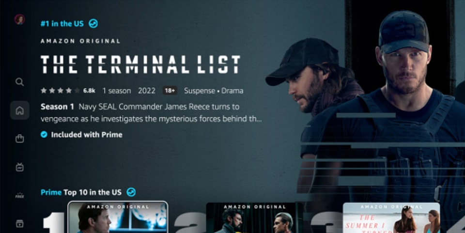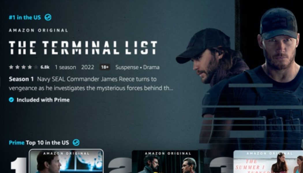
Amazon on Monday unveiled an entirely new interface for its streaming platform Prime Video, featuring a strong focus on Amazon Originals, live content and the service’s top titles on the main page.
Within the redesign, the company has moved the main navigation bar to the left side of the screen, where six menu items — Search, Home, Store, Live TV, Free and My Stuff — are listed in a vertical column. With the goal of making the Prime Video experience “less busy and overwhelming,” each aforementioned menu item is broken down into subcategories for various types of content, including movies, TV series and more. Additionally, the home page features a top 10 list of the most popular content on the platform, similar to that of competing streaming services like Netflix.
Amazon has also added a new set of icons that will allow users to more easily identify whether specific content is included in their Prime Video subscription. Specifically, a blue checkmark will indicate that content is included in a user’s subscription, while a gold shopping bag icon will indicate that content must be purchased or rented.
The new look, which the company said has been in development for the last 18 months, will become available this week on connected home devices, including Fire TVs, as well as on Android devices across the globe. Web and iOS will arrive at a later date.
Take a look at Prime Video’s new interface above.
Elsewhere in entertainment, Peter Dinklage to star in Hunger Games prequel The Ballad of Songbirds and Snakes.


Tagged: ENTERTAINMENT