Home » Technology » PayPal has a new logo that makes it look just like everything else

Share This Post

Technology

PayPal has a new logo that makes it look just like everything else

PayPal has a new logo that makes it look just like everything else

/

Flat, black, and generic.

Share this story

Roughly 25 years after it launched payment processing, PayPal is “ushering in a new era for customers” with some generic black text. The company has a new logo, designed by Pentagram, that looks incredibly plain — especially compared to previous iterations of the logo that featured a rakish slant, two shades of blue, and prominent PayPal P’s.

The evolution of PayPal’s logo.

The evolution of PayPal’s logo.

a:hover]:text-gray-63 [&>a:hover]:shadow-underline-black dark:[&>a:hover]:text-gray-bd dark:[&>a:hover]:shadow-underline-gray [&>a]:shadow-underline-gray-63 dark:[&>a]:text-gray-bd dark:[&>a]:shadow-underline-gray”>Image: PayPal

The company justifies the change by saying that the new black standalone wordmark won’t be confused with the rest of the payments processing world — especially “the blue that has become synonymous with fintech.”

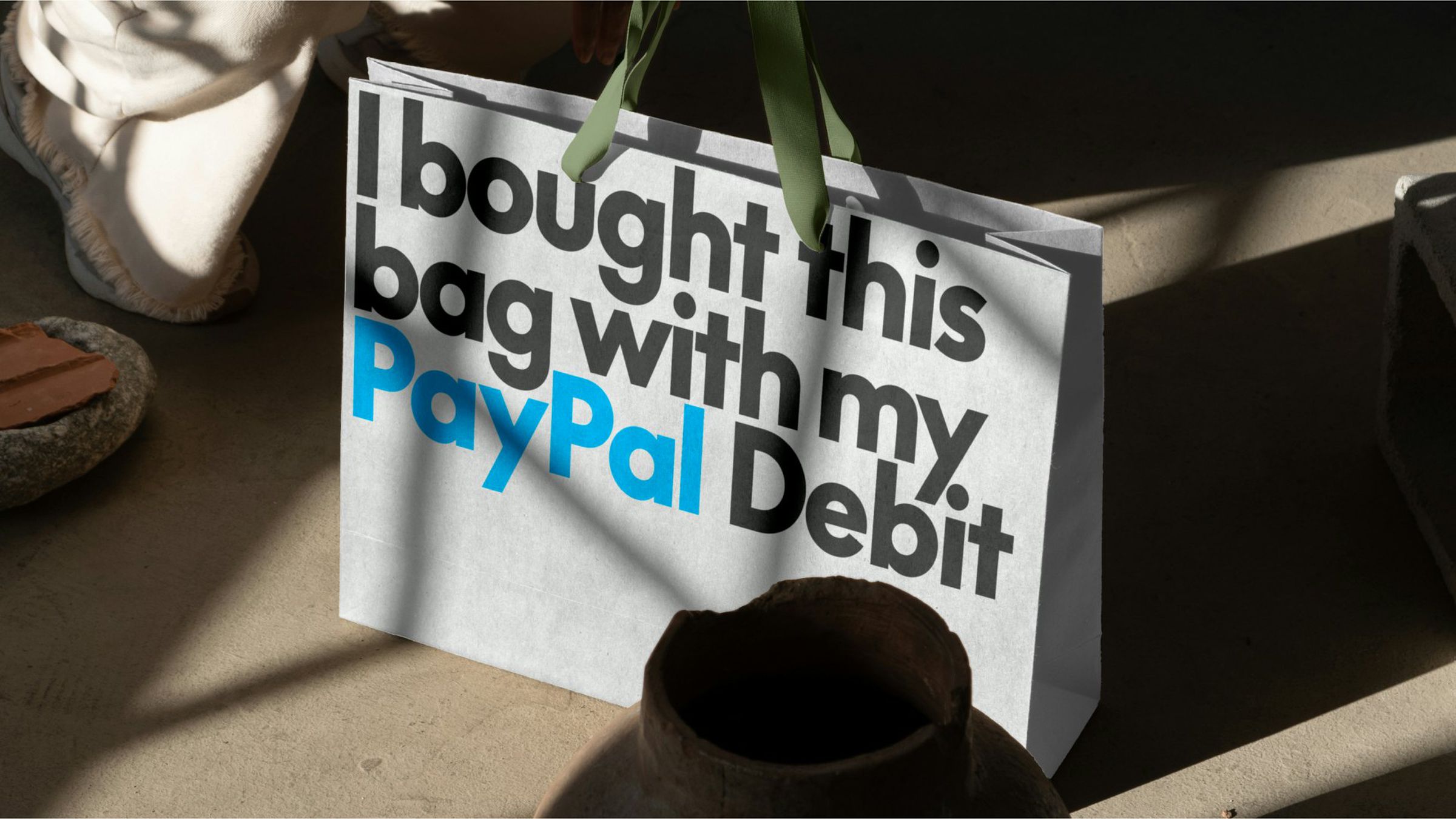
That is a very blue word.

That is a very blue word.

a:hover]:text-gray-63 [&>a:hover]:shadow-underline-black dark:[&>a:hover]:text-gray-bd dark:[&>a:hover]:shadow-underline-gray [&>a]:shadow-underline-gray-63 dark:[&>a]:text-gray-bd dark:[&>a]:shadow-underline-gray”>Image: PayPal
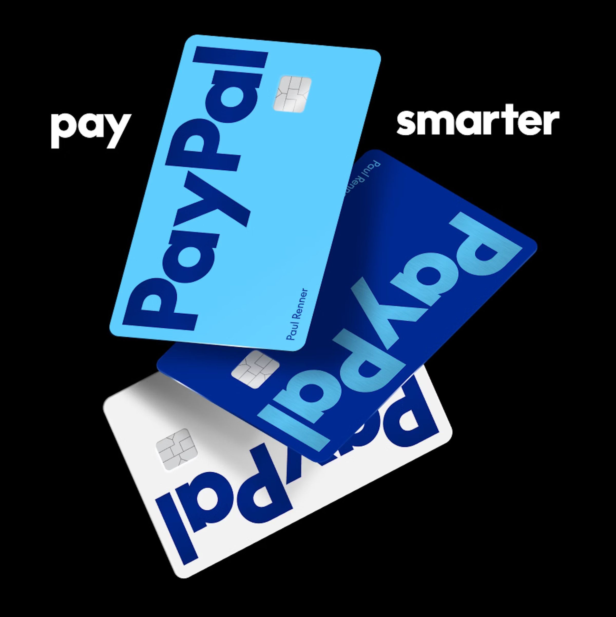
PayPal’s new debit cards are blue, and all have blue letters. One card is technically white with blue letters.

PayPal’s new debit cards are blue, and all have blue letters. One card is technically white with blue letters.

a:hover]:text-gray-63 [&>a:hover]:shadow-underline-black dark:[&>a:hover]:text-gray-bd dark:[&>a:hover]:shadow-underline-gray [&>a]:shadow-underline-gray-63 dark:[&>a]:text-gray-bd dark:[&>a]:shadow-underline-gray”>Image: PayPal

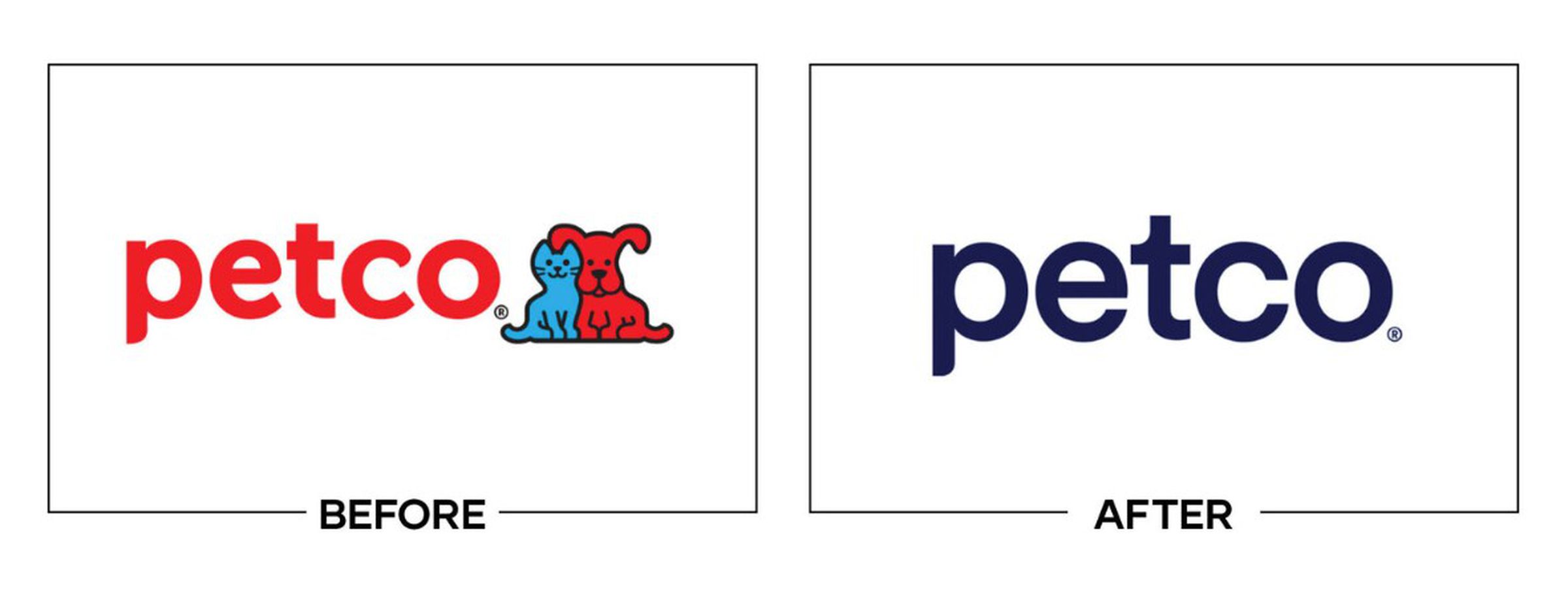
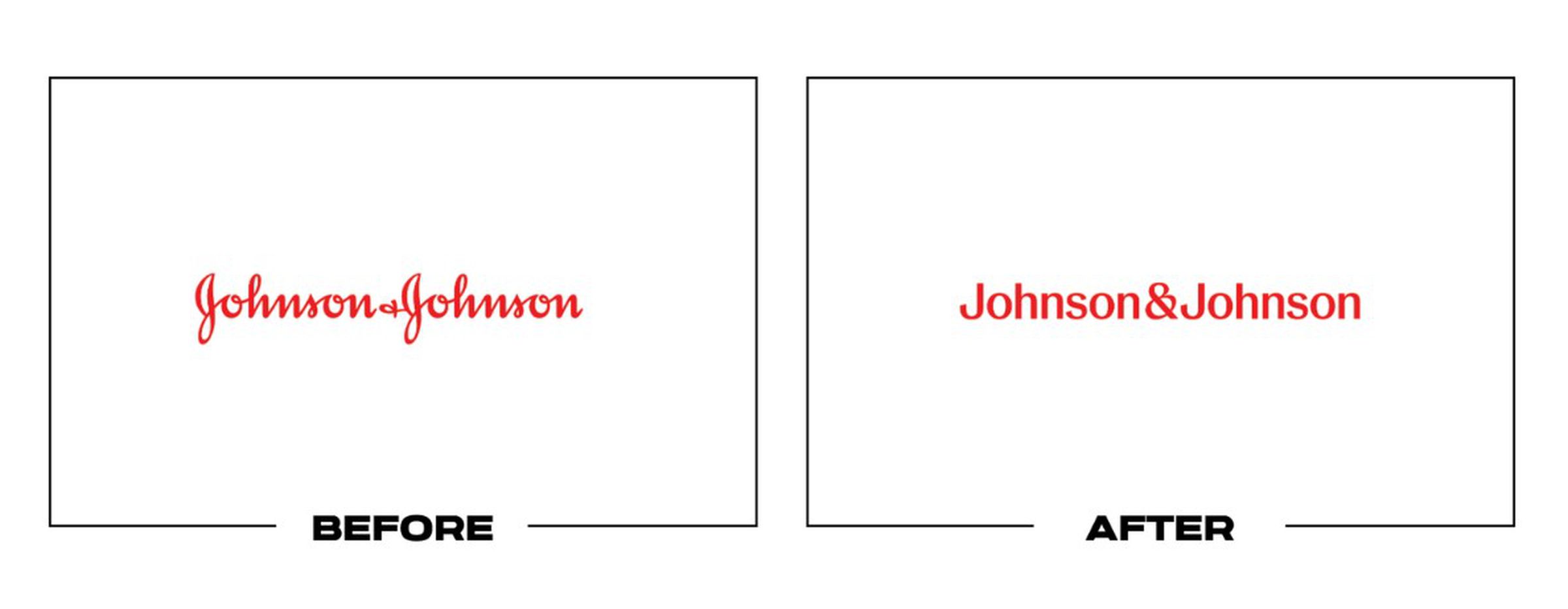
But even if PayPal doesn’t intend to prioritize the black wordmark, it will be in the good company of many other firms that have moved from something fun and recognizable to boring, plain text! Here’s GoDaddy, Petco, and Johnson & Johnson (hat tip to Parker Lee’s “worst logos” lists):

It also joins the fine tradition of flattening logos just for the sake of them being flat and inserting weird corporate synergy for no obvious reason. Here, that synergy is actually accomplished in PayPal’s choice to use some colors alongside the word PayPal: “Bright blue and deep blue overlap to reveal Venmo blue,” writes Pentagram.

It does seem like Pentagram put a good bit of thought into this, coming up with a “new bespoke brand typeface, PayPal Pro,” which it says is based on LL Supreme, which, in turn, is based on Futura.

We also appreciated the use of alliteration: “The colors have been calibrated for continuous contrast, to create a sense of depth and dimension.”

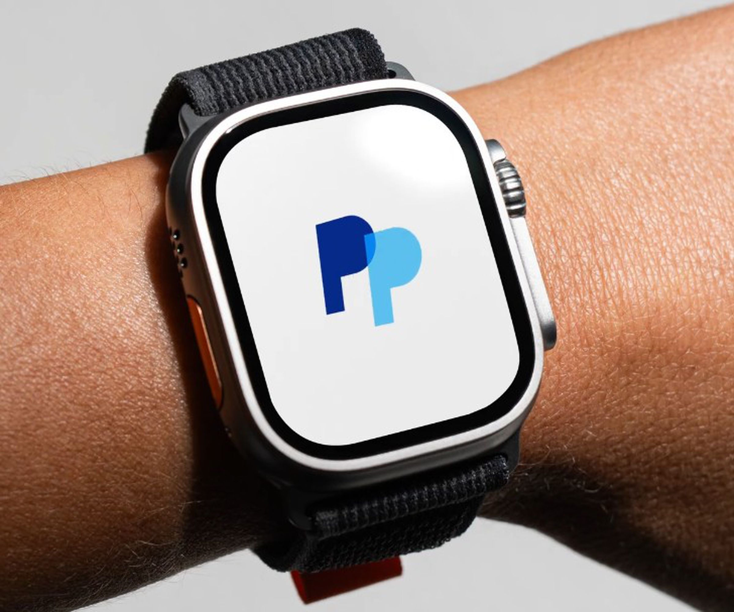
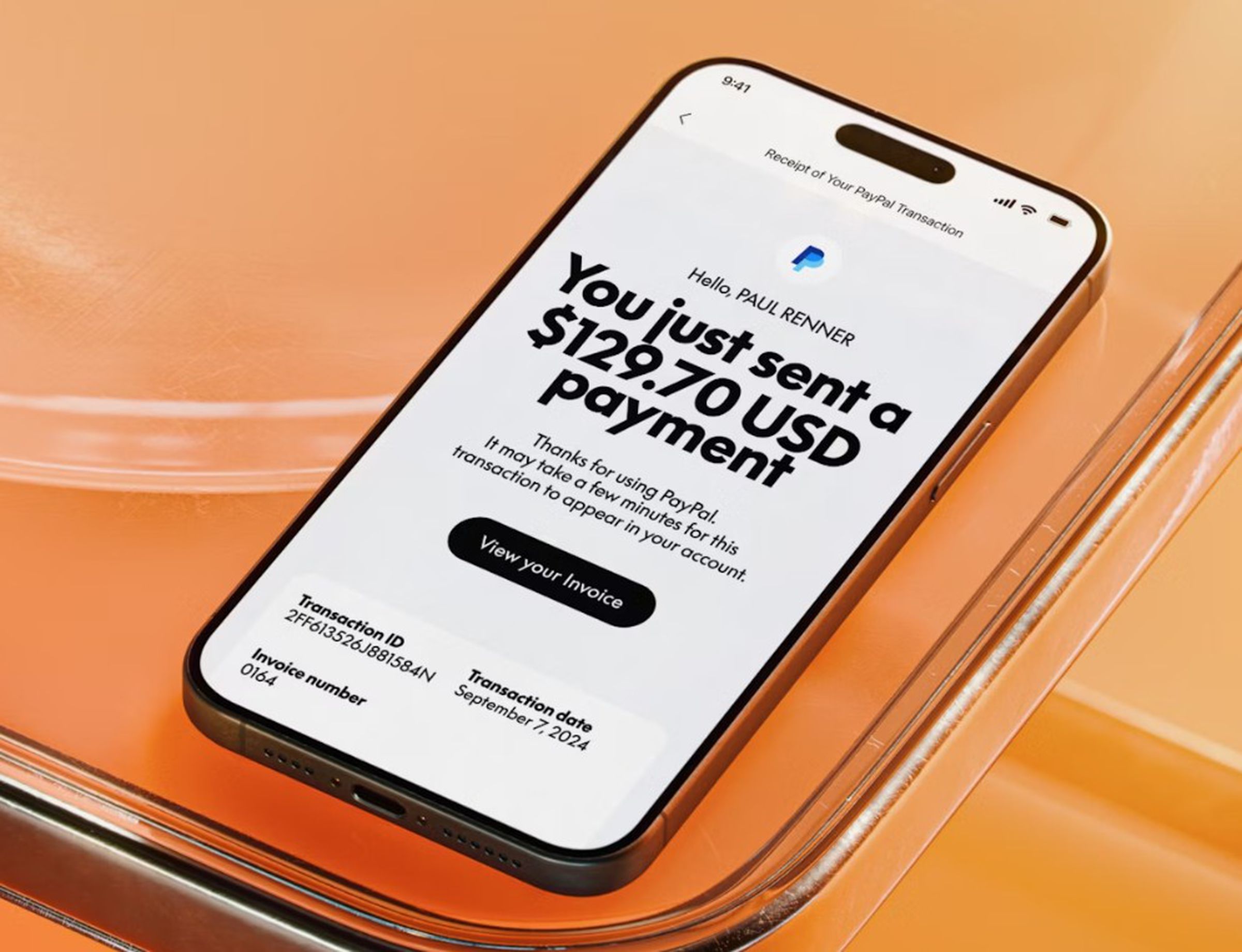
For what it’s worth, the pitched PayPal P’s persist: they should appear when you pay digitally.

The old PayPal P’s show up and circle when you pay with a watch, it seems.

The old PayPal P’s show up and circle when you pay with a watch, it seems.

a:hover]:text-gray-63 [&>a:hover]:shadow-underline-black dark:[&>a:hover]:text-gray-bd dark:[&>a:hover]:shadow-underline-gray [&>a]:shadow-underline-gray-63 dark:[&>a]:text-gray-bd dark:[&>a]:shadow-underline-gray”>Image: PayPal
An example digital payment.

An example digital payment.

a:hover]:text-gray-63 [&>a:hover]:shadow-underline-black dark:[&>a:hover]:text-gray-bd dark:[&>a:hover]:shadow-underline-gray [&>a]:shadow-underline-gray-63 dark:[&>a]:text-gray-bd dark:[&>a]:shadow-underline-gray”>Image: PayPal

Technically, it looks like PayPal already started using the new wordmark earlier this month, though it says it’ll formally launch with the new PayPal debit card — and a new ad campaign starring Will Ferrell, which you can check out below.


Share This Post

Leave a Reply