I was having a good time with No More Heroes 3 until I somehow lost my save file. I don’t think it was the game’s fault, but unfortunately since it’s coming out today for the Nintendo Switch, I wasn’t able to finish it in time for a full review. I did get several hours into it, though, and it was already feeling like a worthy followup to the Wii original, which I was a big fan of back in 2007.
Developed by Grasshopper Manufacture, there wasn’t anything quite like the original No More Heroes, an action game that saw video game nerd protagonist Travis Touchdown climb the ranks of the world’s deadliest assassins through a series of increasingly ridiculous boss fights. The game also featured an open-world structure where you had to perform menial tasks like pumping gas in order to earn enough money to register for the battles.
2010 sequel No More Heroes 2: Desperate Struggle dispensed with the open world, opting instead for a more traditional action game structure. But No More Heroes 3 returns to the original game’s design, a change that makes it feel like a true follow-up — for better and worse.
:no_upscale()/cdn.vox-cdn.com/uploads/chorus_asset/file/22808585/02_Boss2.jpg)
Before you get to hit the streets on your Akira-esque bike, you’ll need to play through No More Heroes 3’s opening moments, which set the scene in typically bombastic fashion. Rather than mere assassins, this time you’re taking on a league of alien superheroes that makes up the posse behind a powerful CEO and a Thanos-like supervillain.
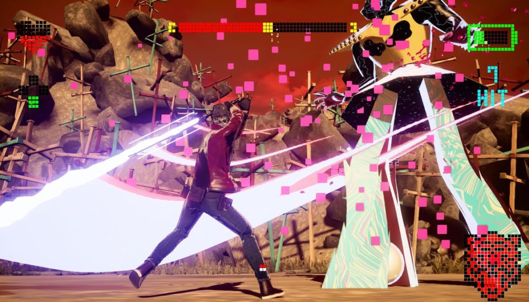
Suffice it to say that No More Heroes 3 is incredibly stylish. The aesthetic is like grindhouse theater meets ‘80s arcade, with deliberately grungey, low-res elements clashing with a pixelated neon UI; the opening moments of this game are like nothing you’ve ever seen. The game often feels like an extended running joke, satirizing everything from Alien to the “next episode” button on Netflix.
Unfortunately, and in keeping with the original game, its technical performance is as varied as its influences. Combat in No More Heroes 3 looks and feels great — it runs at 60fps and has a satisfying crunch to it, with or without the recommended Wii-style motion controls. (I played much of the game just fine with buttons and sticks on a Switch Lite, although it’s more convenient to recharge your lightsaber-style weapon by shaking a Joy-Con.)
:no_upscale()/cdn.vox-cdn.com/uploads/chorus_asset/file/22808586/06_Slash4.jpg)
But once you’re outside of combat, the game gets much less smooth, and performance in the open world falls off a cliff. No More Heroes 3 can’t hold anywhere near a solid 30fps when you’re driving your bike around the city — the constant hitches and judders honestly made me feel a little nauseous at points.
Director Goichi Suda pledged in the video embedded above to “deliver solid and stable performance,” so maybe a future update will improve the situation, because that was certainly not my experience. It was enough to make me wonder why Grasshopper wanted to include the open world in the first place. We’re not exactly talking Grand Theft Auto V here; this is a barren environment with very little to do. You’re mostly just grinding missions for cash to get to the next boss fight.
Still, I’m going to start No More Heroes 3 again from scratch, which should say something about how entertaining I found the chunk I did manage to play. The technical issues don’t obscure the sheer passion and energy that have clearly been poured into this project, and unlike, say, Deadly Premonition 2, the majority of the game does actually play well. As with the original No More Heroes, if the strong combat and unique sense of style click with you, it’s worth powering through the open-world drudgery.
No More Heroes 3 is available today for the Nintendo Switch.
