Buying an upgraded version of a gadget can be complicated. It’s not always immediately clear what’s changed or if those changes are even useful to you; this can happen with iterative phone updates or, more recently, the latest generation of game consoles from Sony and Microsoft. In the case of the latest Switch, though, Nintendo made things easy: all that matters is how much you care about the screen.
The new $350 OLED Switch is functionally identical to the version that launched in 2017. It plays all of the same games, has the same interface, and uses the same controllers. Those games don’t have any kind of performance boost; no better frame rates or higher resolution. And aside from some small tweaks — an improved kickstand, a slightly redesigned dock, more storage — the hardware doesn’t seem all that different. When you pick it up, it just feels like a Switch.
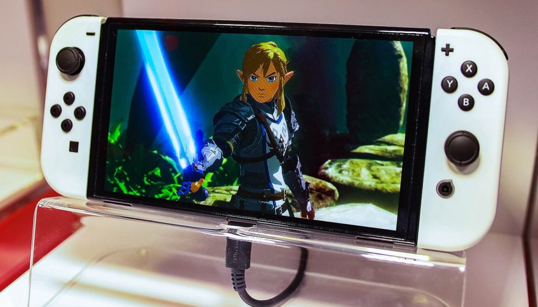
But as soon as you turn on the screen, you can see the difference. The new Switch swaps the original’s LCD display for a bigger, brighter OLED screen. It doesn’t fundamentally change what the Switch is or what it can do. But if you plan on spending a lot of time in handheld mode, it makes a big difference to how you experience games.
Okay, so, the basics. The OLED Switch has a seven-inch OLED screen, which is a bump up from the original’s 6.2-inch display (and a huge jump from the portable-only Switch Lite and its 5.5-inch touchscreen). This doesn’t actually make the hardware all that much bigger, though. The OLED Switch measures 102mm x 242mm x 13.9mm and weighs 420 grams with the controllers attached; the original Switch clocks in at 102mm x 239mm x 13.9mm and weighs 398 grams. In my hands, I could barely tell the difference in terms of weight and size. Rather than feeling bigger, it’s more like Nintendo trimmed back the huge black bezel to make more screen real estate.
That screen is the star of this new device. The size is nice, particularly if you’re playing games with lots of text or a complicated interface, like Fire Emblem: Three Houses. And though it features the same 720p output as the base model, things didn’t appear noticeably less sharp to me. But the more obvious change is how much brighter and more vibrant everything looks. You can see this in colorful games like Super Mario Odyssey and The Legend of Zelda: Link’s Awakening, where the colors really pop. (Rewatching Link’s Awakening’s Ghibli-inspired opening animation really made me wish the Switch had some video streaming apps like Netflix.) This is true whether you’re playing something new or old; I found that the excellent sprites from Street Fighter III: Third Strike were really striking on the new display, even if they are two decades old.
:no_upscale()/cdn.vox-cdn.com/uploads/chorus_asset/file/22873299/cfaulkner_210921_4751_0001.jpg)
:no_upscale()/cdn.vox-cdn.com/uploads/chorus_asset/file/22873311/cfaulkner_210921_4751_0013.jpg)
:no_upscale()/cdn.vox-cdn.com/uploads/chorus_asset/file/22873312/cfaulkner_210921_4751_0014.jpg)
The benefits also go in the opposite direction and make dark virtual worlds appear more stark. The creepy side-scrolling game Inside is a great example of this; the inky blacks really stand out, making its world feel all the more bleak and oppressive (as it’s supposed to). On some screens, Inside’s black-and-white visuals can blur together a bit, but here things remain distinct. Possibly the best showcase for the OLED display is Metroid Dread, which coincidentally launches alongside the new Switch. The moody adventure has you navigating dark caverns, ancient forests, and underwater research facilities, and there’s a wonderful contrast between them. During one sequence when you turn the lights on in an old, abandoned facility, the shift is genuinely jarring. I played through the entirety of the game on the original Switch for our review, and then spent a few hours replaying it on the OLED version and, well, I really wish I had waited for the new console.
It’s important to note that these visual upgrades are purely due to the display. The new Switch isn’t more powerful, so you won’t see any kind of performance changes. (It’s most certainly not the much-rumored “Switch Pro.”) Fortnite looks more vibrant and colorful on an OLED Switch, but it still has the same flat textures and slow pop-in as it does on every other version of the hardware. This also means that if you play games on your television using the dock, the experience is exactly the same as would be with a base model.
A few other things about the screen. While it’s far too early to say whether burn-in will be a problem, Nintendo does warn against displaying “the same image on the OLED screen for extended periods of time” in order to minimize “risk of image retention or screen burn-in.” The company also says that the display features an “anti-scattering adhesive film,” which it says not to remove; though after several days with the device I admit I didn’t even notice there was a film on the screen.
Aside from the screen, the biggest upgrade here comes down to design rather than technology: the Switch finally has a good built-in stand. I never really think about the kickstand on my base Switch, mainly because it sucks. It’s so flimsy that I don’t trust it with keeping an expensive video game console upright. In four years, I’ve barely used it at all. But the OLED Switch now features a Surface-style stand that extends the full length of the device and is much more flexible in terms of viewing angles. You know how in every Switch commercial, there are people playing games in the park or on a rooftop in tabletop mode, having lots of fun? Well, I finally feel comfortable doing that, and it turns out it’s great. It’s become my preferred method of getting in some matches of Pokémon Unite, and it works especially well for pick-up-and-play games like WarioWare: Get it Together or Clubhouse Games.
:no_upscale()/cdn.vox-cdn.com/uploads/chorus_asset/file/22873303/cfaulkner_210921_4751_0003.jpg)
The rest of the changes are much more minor. The buttons and vent on the top of the Switch have been streamlined a little, and the speakers have moved from the back panel to just under the screen on the front. Nintendo says they offer improved sound, but to me they just sounded a bit louder. (There’s still a standard headphone jack for when you really want to immerse yourself, and Nintendo recently added Bluetooth audio support to all Switch hardware via a software update.) The dock has a slightly more refined look with rounded corners on the top, and it comes in white now. There’s also the addition of a LAN port, and the dock’s rear panel is removable, instead of on a hinge, which makes it a little easier to swap cables. The new dock is also compatible with the original Switch, and vice versa. Meanwhile, Nintendo has doubled the built-in storage to 64GB, though you can expand that to up to 2TB with a microSD card.
Key aspects of the handheld haven’t changed at all. The Switch OLED uses the same Joy-Con controllers, so you’ll still have to live in fear of the dreaded drift. And it has the same battery life as the slightly improved version of the base Switch introduced in 2019, which means you’ll get between five to nine hours of gameplay on a charge, depending on what you’re playing and your brightness settings. The bigger, brighter screen doesn’t appear to make a difference in that regard. When playing docked, it also still tops out at 1080p.
All of this puts the OLED Switch in an interesting place within Nintendo’s slowly growing family of hardware. The Switch Lite is the obvious entry point, a cheaper model and one designed explicitly for portable play with its small size and sturdy construction. The base Switch, meanwhile, is decent on the go but best for those who will primarily use it as a home console, which makes the newest model the best of both worlds. For $50 more it works like a typical Switch at home, but its excellent OLED display and finally functional kickstand also make it the more premium portable experience.
So, again, it all comes down to that screen. You already know what else to expect from a Switch. It hasn’t changed all that much in four years. But if you want that experience to look better, brighter, and more vibrant when you’re away from the TV, the choice is simple.
The Nintendo Switch OLED launches on October 8th.


