It’s exceedingly rare that a product actually gets better months after it was released. But Microsoft’s oft-forgotten Surface Duo 2, which launched back in October 2021 with a steep price tag and a laundry list of bugs and issues that made it very frustrating to use, has bucked that trend. In fact, the Duo 2 has improved so much that it’s now one of my favorite mobile devices, even if it’s still weird and unique enough that I can’t exactly recommend it to most people.
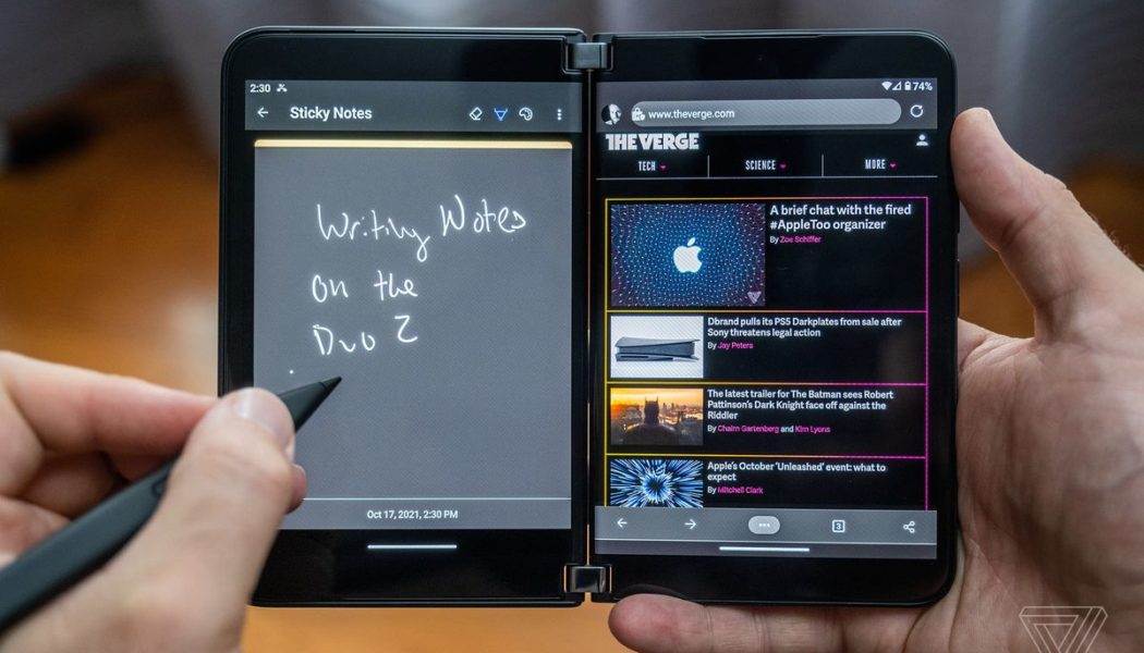
In case you’ve forgotten, the Surface Duo 2 is a folding phone with two big screens joined by a hinge. Unlike Samsung’s Galaxy Z Fold 3, which takes a single tablet-sized display and folds it in half to fit in your pocket, the Duo 2’s two screens make it feel more like two large phones attached together and running the same software. You can easily run two apps side by side as if you were holding two phones at the same time, or you can span a single app across both screens to mimic a small tablet. Both halves of the phone are thin enough that it can fold together like a book and fit into a pocket with relative ease. Pair it with Microsoft’s Surface Slim Pen 2, and you have a portable digital notebook that can work just as well for note-taking, reading an ebook, or drafting an email.
When I reviewed the Surface Duo 2 last year, none of its clever design or book-like features mattered. The device was effectively broken, held back by software bugs that made it infuriating to type on, frustrating to use, and ultimately disappointing. It was a $1,500 novelty that could only appeal to the most die-hard Microsoft brand stooges willing to put up with its many faults so they could have the never-launched Courier device they dreamed about over a decade ago.
:no_upscale()/cdn.vox-cdn.com/uploads/chorus_asset/file/22943445/dseifert_211017_4814_0016.jpg)
But, remarkably, Microsoft has not given up on the Duo 2. In fact, the company has consistently issued software updates on a monthly basis to address the many problems the Duo 2 had at launch. Some of these updates consisted of simple security patches and small bug fixes, while others, like the recent June update, included more significant corrections and added new features. Crucially, Microsoft has addressed the touch latency problems that were prevalent at launch and made it very difficult to type on the Duo 2’s virtual keyboard — or even navigate the interface.
Knowing that Microsoft has been attending to many of my original complaints with the Duo 2, I took advantage of a recent price cut (the phone can now be had for $1,000, which is still expensive but significantly less than its launch price) and a generous trade-in offer and bought one of my own. The goal was to see if I could get a better idea of what Microsoft is trying to accomplish with this device when show-stopping bugs aren’t standing in its way.
And reader, I can finally say I get it. The Duo 2 is the most unique mobile device I’ve used, allowing me to do things I just can’t do with a traditional smartphone. It also does certain things, such as multitasking and reading ebooks, better than the Z Fold 3’s single large screen.
:no_upscale()/cdn.vox-cdn.com/uploads/chorus_asset/file/23634607/dseifert_220616_5301_0004.jpg)
:no_upscale()/cdn.vox-cdn.com/uploads/chorus_asset/file/23634605/dseifert_220616_5301_0002.jpg)
In the past month-plus, I’ve used the Duo 2 for reading lots of books in the Kindle app, which takes advantage of the dual screens to provide a more book-like experience than any other device. I’ve managed my inbox and calendar at the same time; I’ve edited Google Docs while keeping up with a Slack conversation. I’ve used the Slim Pen 2 to take hand-written notes in OneNote. I’ve read countless articles in my Pocket queue with the app stretched across both screens and the Duo 2 turned into a portrait orientation. I’ve watched so much video spanned across both screens that I don’t even notice the slight gap anymore. There’s something undeniably satisfying about completing a task on the Duo 2 and then folding it closed like a book and slipping it into my pocket.
The Duo 2 has not replaced my primary smartphone because I use them for different tasks: messaging, calls, photos, smart home control, music, and mobile payments on my iPhone; reading, multitasking, note-taking, and YouTube on the Duo 2. I’ve yet to actually take a call on the Duo 2 because, unless you use wireless earbuds, it’s horribly awkward to do so. Mostly, I’ve used the Duo 2 exactly how I might use an iPad Mini, except it folds in half and fits in my pocket. It’s not even accurate to call this device a “phone” based on how I use it. (Microsoft attempted to position the original Surface Duo as something other than a phone at its launch but moved away from that marketing with the Duo 2.)
Microsoft has made the Duo 2’s camera app faster and more responsive, but I’ve never used it for taking photos. It’s just too awkward for taking photos, and I have my iPhone for that anyway. In fact, I’d prefer it if the ungainly rear hump and its camera were gone entirely and the Duo 2 maintained the sleeker lines and ability to fold flat against itself that the first Duo had.
Aside from being an awkward camera, there are other things about the Duo 2’s design that make it challenging to use as a primary phone. There’s no quick way to check notifications or do something one-handed — you have to open up the device to use it. (The recent addition of third-party chat app notifications to the “hinge display” in the June update does not change this fact.) It’s a much more intentional device than slab phones that can be easily unlocked and used one-handed when you want to kill some time in line at the grocery store. Samsung’s Z Fold 3 is a much better single device to replace both a phone and a tablet simply because you can still use it when it’s folded closed.
:no_upscale()/cdn.vox-cdn.com/uploads/chorus_asset/file/22943443/dseifert_211017_4814_0014.jpg)
The Duo 2 is also far from a durable device. Though I haven’t had anything break in the month-plus I’ve been using it again, it lacks both water and dust resistance, so you don’t want to get it wet. Its design makes it extremely hard to put a case on and maintain the flexibility of the hinge. (I’ve resorted to Microsoft’s Surface Pen charging cover and bumper along with a Dbrand skin.) Even though it’s folded closed when I’m not using it, it’s not something I’d just toss in a pocket with keys and loose change for fear something will get jammed in the hinge.
The software also has plenty of room for improvement. Aside from the Kindle app and Google Play Books, the only apps that can really work well spanned across both screens are made by Microsoft, even despite the fact that the Duo 2 has been on the market for eight months now. There are still times when an app or link opens on the opposite screen from what I’m expecting or a gesture to full-screen an app fails. Pen input in anything other than Microsoft’s own apps is still lousy. I don’t think I’ve ever actually used the drag-and-drop feature because it’s supported in so few apps that it’s not worth remembering it exists.
It’s possible that things will get better with the forthcoming Android 12L update, which is designed to improve the experiences on folding devices like the Duo 2 and Fold 3. But I suspect that, even after that update, I will still use most apps on a single screen.
All of that is to say that, despite the updates and bug fixes, the Duo 2 is still not going to be a phone for everyone or even most people. It’s best suited as a secondary device for specific tasks, much like how an iPad or tablet is secondary to your smartphone. Even with the recent price cut, it’s still more expensive than an iPad or other small tablet. It’s only ideal for those who will appreciate the ability to take it on the go more places, even if they are already carrying another phone in their other pocket.
:no_upscale()/cdn.vox-cdn.com/uploads/chorus_asset/file/22943428/dseifert_211017_4814_0001.jpg)
Rumors have it that Microsoft won’t be launching a Duo 3 this year, instead holding it for 2023. That would give it more time to iron out issues and avoid the bug-filled launches that plagued both the original Duo and the Duo 2. Microsoft could also address the aspects of the Duo design that make it difficult to use as a primary phone (a touchscreen on the outside would go a long way here). Perhaps it can figure out a way to attach and charge the pen without resorting to a goofy and expensive add-on case. A recent patent filing from the company imagines a Duo-like device that utilizes a single panel that can fold 360 degrees instead of two discrete screens attached by a hinge. I’m not sure what problem that would solve other than eliminating the gap between the screens when you’re watching video, but it definitely would look cool.
Either way, if Microsoft remains committed to the Duo form factor and continues to iterate on it, I’ll be watching. The Duo 2 has gone from one of the most problematic devices I’ve reviewed to one of my favorites, and I’m curious to see where Microsoft takes it next. In the meantime, I’ve got another book to finish reading.
Photography by Dan Seifert / The Verge
