Leicester City’s crest history and a new crest – originally posted on Sportslens.com
5000:1. Those were the odds of Leicester winning the 2015/16 season, after just being promoted to the Premier League. What we all witnessed was not just one of the greatest moments in football history, but sports history in general. This is one of those stories I’ll be telling my grandkids about. One for the history books.
Leicester City was formed in 1884. Initially, they were called Leicester Fosse FC., since they played on a field near Fosse Road. After the Leicester borough was given a city status officially, the club reformed as “Leicester City FC” in 1919.

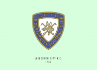
The image of a fox was first incorporated in Leicester City’s crest in 1948 as Leicestershire is known for its foxes and fox hunting. This was the origin of “The Foxes” nickname. The fox has made an appearance on the crest ever since.
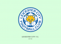
In that regard, the club’s crest has been one of the most consistent ones in the Premier League. The current version of the crest was introduced in 1992 and features a Cinquefoil with a fox’s head overlaid on it.

The current crest was simple enough, so I didn’t feel like taking away any elements. The Cinquefoil made for a good base to the design. I used a fox image which was extremely angular and abstract and changed it in small ways to make the ears jut out between the petals. I felt the recent victory definitely warranted a star for Leicester City FC, even if it can’t be an official one.
The triangles between the petals and the fox’s ears make for a star shape incorporated into the crest. Normally I use just one shade of a colour for other crests of this project, but for this one I used multiple shades of blue and amber, it adds to the beauty of the crest without it looking too outdated.
Leicester City FC’s story is the true story of the underdog. Something that can inspire us in every aspect of our life. Since then Leicester City FC hasn’t won the league, however, it’s still a dominant team that every Premier League team fears facing (and top of the Premier League table at the time of writing).
This new age of this club’s history deserves a new crest, one that shows them LCFC isn’t playing around, they mean business.

This article is part of the Premier League 2020 Crests series.
Shadab Wajih is an award-winning art director, graphic designer and an illustrator based in Miami, US. Besides his design and advertising work he also prides himself in his FIFA managerial skills. You can see more of his work, contact or complain to him on his Instagram: @snikt13
From Sportslens.com – Football News | Football Blog


