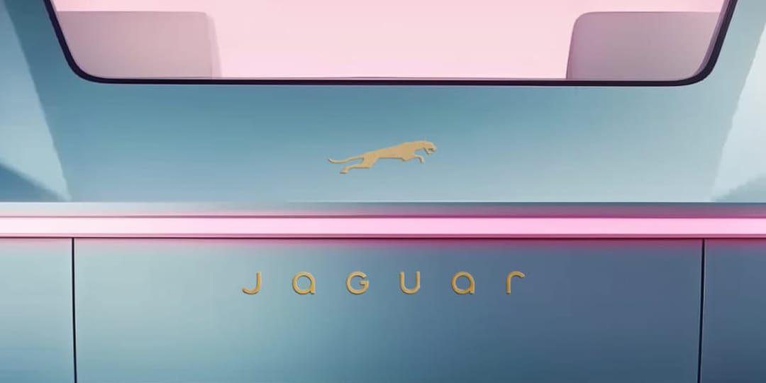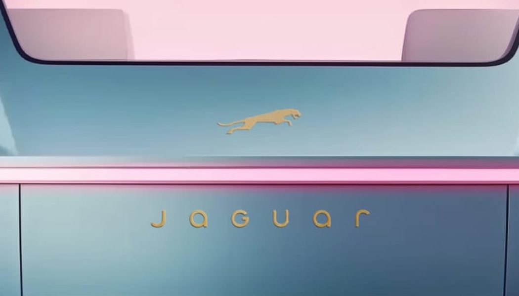
This week Jaguar unveiled its forthcoming rebrand to accompany its push toward all-electric vehicle manufacturing. The auto brand has described its new philosophy as “Exuberant Modernism” characterized by “bold designs, unexpected and original thinking.”
The new thin and rounded typeface couldn’t be more different than the sleek condensed sensibilities of the original logo, forgoing the think lettering for an ultramodern wordmark that combines uppercase and lowercase letters. The logo is not all that is changing; Jaguar unveiled the brand identity with colorful imagery featuring a diverse cast of models against bright pink backdrops–reflecting their new approach, celebrating individuality and non-conformity.
However, Jaguar’s new brand identity has been met with divisive reactions. Some laud the brand for its brave reimagination of Jaguar’s place in the auto industry and broader culture. The new identity seems to redirect focus on Gen Z, emphasizing diversity, creativity and bold expression. Others have criticized the rebrand with different segments citing a spectrum of reasons.
General backlash, amplified by Elon Musk’s recent post on X, has pointed out that there is barely any relation back to cars in the imagery and messaging. Elsewhere, designers have pointed out the mixture of uppercase and lowercase letters as confusing and distasteful. The rebrand has even prompted conservative pushback, with complaints about Jaguar’s alleged coopting of “woke” culture.
Time will tell whether Jaguar’s brand overhaul will lead its charge into the future or ultimately fall flat with its customers. Take a look at the brand imagery in the gallery above and stay tuned for updates on Jaguar’s new chapter.


