“Every single project starts black-and-white in Helvetica.”
You’re design is very minimal and pared-back. Can you describe your own practice and how you approach your projects?
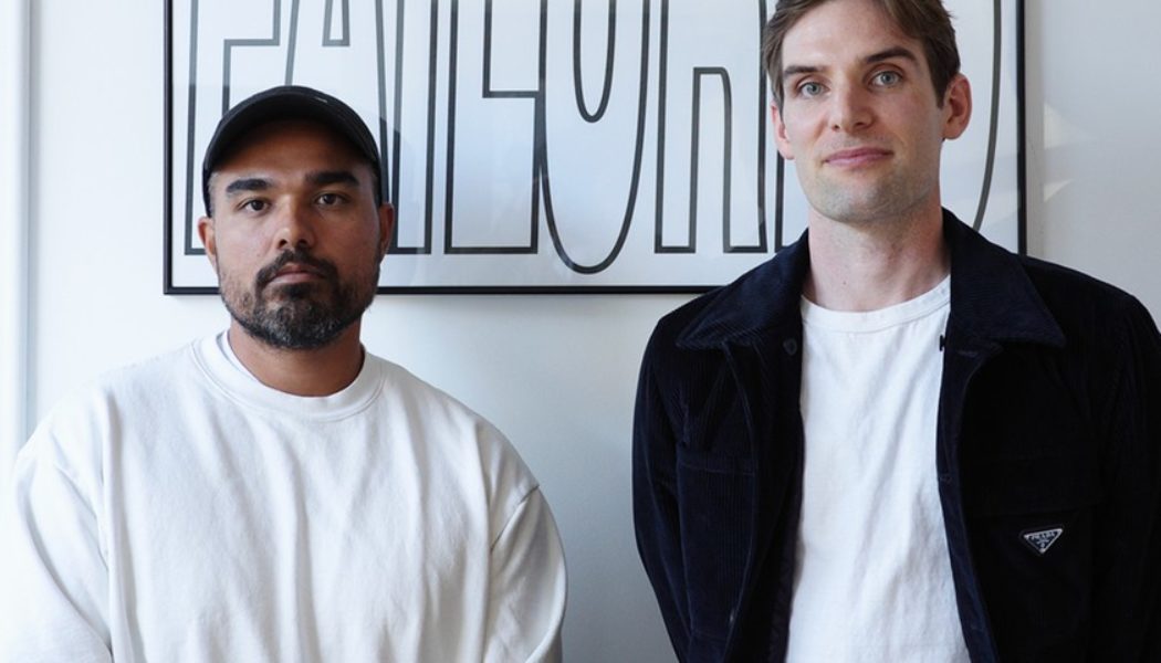
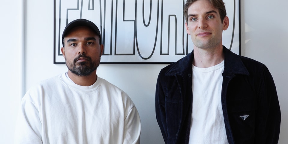
RC: Typography is the foundation of the studio. Marshall studied a little bit in Sweden. I studied in Switzerland and in college, that was what we did — rudimentary typographic studies and exercises. That’s where every project starts is typography.
MR: Basically, in a foundational typography system, you start with one variable and build it up. You’re making one choice. So let’s say you’re picking a typeface, that’s one choice, then you’re picking a color, that’s another choice. You very quickly amplify your choices exponentially in a way where you’re juggling a lot of variables. So something that we do here, every single project starts black-and-white in Helvetica. By eliminating all those other choices, we right away start looking at the letters, the spacing, the content — we don’t have to think about, ‘well, if we change the typeface and it becomes more personalized, is that a true representation of the content? Or is that a representation of the style or personality that we’re trying to impose upon it rather than draw it out?’
By adding color, is that doing something or is that a crutch? We always start there, because we can get a better understanding, formally, of what we’re actually dealing with. It’s like laying all your clothes out before you pack, you need to know what you have to fit into the suitcase. We really try to break every decision down and the way that we do that is by making hundreds of designs before we simplify it down to 10 designs, just because we want to know all the corners of the world that we’re trying to develop and understand all the possible decisions and implications of those decisions.
Apart from the Mac Miller cover, what are some other projects over the years that have been the most fulfilling?
MR: Before the Olympics, we worked with Michael Norman, the 400 meter sprinter. He’s incredible and some of these Nike projects, when you get to see the athlete perform — watching the best 400 meter runner in the world even lightly run on the track and understanding that both him and us are human beings is crazy.
I think anytime you work with an athlete or an artist that is that other one-percent different than you is really energizing. You have a chance to help them tell their story, which is super cool and you feel a responsibility to do that well.
RC: The Grammys to me was a fun project, because it felt for the first time, we had very different eyeballs on our work. CBS, mainstream TV, normal people that watch the Grammys, as opposed to the cultural work for Nike, etc. So that was interesting and a fun challenge to design something that the masses will have their eyeballs on basic cable. Marshall and I were in here everyday just redrawing that gramaphone a million times playing with type, shape and trying to build this world.
Has that been the most challenging project thus far?
MR: I think what’s cool about doing something that big is obviously everyone else that has done it before you — it’s very public. You can see an example of what last year looked like and what it looked like two years ago. You don’t always have that for a given project. For the Grammys, it’s like, here are 40 previous iterations and trying to develop that with all these different types of artists and audiences — while trying to bring our perspective to it.
The team here is three people, so we’re doing a project that is usually done by 100 people. And that’s just how we like to do it because we hate ourselves haha. Like Ramón said, that project had a lot of challenges, but it was very cool because that’s something that even my grandma would get to see.
[flexi-common-toolbar] [flexi-form class=”flexi_form_style” title=”Submit to Flexi” name=”my_form” ajax=”true”][flexi-form-tag type=”post_title” class=”fl-input” title=”Title” value=”” required=”true”][flexi-form-tag type=”category” title=”Select category”][flexi-form-tag type=”tag” title=”Insert tag”][flexi-form-tag type=”article” class=”fl-textarea” title=”Description” ][flexi-form-tag type=”file” title=”Select file” required=”true”][flexi-form-tag type=”submit” name=”submit” value=”Submit Now”] [/flexi-form]
