Just like nearly everything else on the internet, streaming services are ruled by recommendation algorithms that are designed to predetermine what people want before they ask for it.
WarnerMedia is trying to accomplish the opposite with HBO Max. The company’s new streaming service, which will allow for three concurrent streams, is positing itself as a human-first platform — the opposite of Netflix’s strategy. As streaming becomes more of a centerpiece in people’s homes and more platforms find their way to people’s television sets, focusing on improving the actual curation system subscribers use is just as important as available content, Sarah Lyons, senior vice president of product experience, told The Verge.
Lyons walked The Verge through a demo of HBO Max prior to the service’s launch and highlighted areas that WarnerMedia views as a core advantage HBO Max has in the space. Pockets of the platform are dedicated to collections of titles or TV show episodes “recommended by humans.” Curators, ranging from WarnerMedia editors to celebrities, put together a list of movies and TV shows they’re watching (or a package of choice episodes of Friends or Rick and Morty) to help subscribers find something new to watch.
“There’s so much great content out there that customers are kind of getting a little overwhelmed,” Lyons said. “It’s really hard for them to make a choice about what to watch. We felt like there was a real opportunity to do something a little different with regard to discovery.”
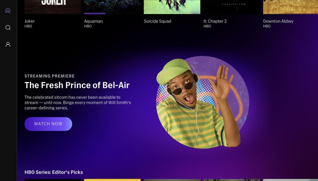
An emphasis on human curation doesn’t mean HBO Max is completely forgoing machine learning tools to help build recommendation algorithms. Both strategies are used to make browsing through tens of thousands of titles easier. Subtle design decisions are also being implemented to help with browsing, Lyons explained: traditional vertical posters (think of how Netflix displays series) are used to indicate a movie or TV show, rectangular boxes are designated for individual TV episodes, squares represent titles people are currently watching (these will also appear in subscribers’ “My List” section of the app), and circles represent people who are recommending something to watch.
HBO Max’s big play is a quasi-social aspect that’s more in line with Spotify than Netflix. A big part of creating a shared experience is making it feel tailor-made to each person. Spotify lets people share what they’re listening to with friends and create their own shareable playlists. HBO Max won’t have a friends recommendation feature at launch, Lyons confirmed, but she suggested it was part of a bigger ongoing discussion.
:no_upscale()/cdn.vox-cdn.com/uploads/chorus_asset/file/20003660/04_Highlight__Fresh_Prince___iPad.jpg)
“We’re definitely looking at all those types of things for later in our roadmap,” Lyons told The Verge. “We’re going to be testing a lot of different ways to give other humans recommendations. As testing goes, and as we evolve the experience, we’re certainly looking at things like friends giving other friends recommendations. But we need to read the data and see how consumers engage.”
Designing a streaming service as something people interact with instead of just scroll through, taking an isolating product and turning it into something that feels lifelike, is ambitious and full of buzz words. Lyons’ team “assessed experiences that are out in the marketplace,” trying to learn what’s “best in class” and what features “you may not want to repeat.”
Outside of human curation, HBO Max looks like an amalgam of features from the other streaming platforms. Look at how HBO Max handles its hubs. Similar to Disney Plus, major tentpole hubs have special boxes that appear when people scroll through their homepage. Studio Ghibli, DC, Sesame Workshop, Adult Swim, Cartoon Network, and Turner Classic Movies are just a few.
:no_upscale()/cdn.vox-cdn.com/uploads/chorus_asset/file/20003662/06_HBO_Max_Hubs___tvOS.png)
Clicking on a hub opens an entirely new page with specific programming. (Like Disney Plus, HBO Max will feature a large catalog of older titles, TV shows, and cartoons, some of which will depict imagery or include language that might be considered vulgar and inappropriate today. HBO Max will include messaging addressing the imagery and language, but Lyons didn’t comment on whether edits would be made like Disney has done with some of its titles in Disney Plus.)
Another example is how HBO Max handles kids’ profiles, which is reminiscent of Netflix in that they are separated from the main HBO Max app, so no child stumbles into The Wire when they’re searching for the late-night Elmo show. Those profiles are locked with pins (similar to Netflix), and parents can filter content by rating. Once those filters are in place, movies and TV shows that are deemed inappropriate are filtered out of search queries, too.
Other features brought up by The Verge during the demo are being considered but aren’t available at launch, including being able to set a timer for how long a child can use HBO Max.
“Things like a timer for how long a child could watch is one of the ideas we had,” Lyons said. “We obviously have to do some testing and learning and figure out prioritization of which things we’ll roll out. But things like that, things like dashboards for parents to be able to see what their children are watching, or how long they’ve spent watching aids for the parent to have more information about the title so that they can make those decisions.”
:no_upscale()/cdn.vox-cdn.com/uploads/chorus_asset/file/20003663/13_HBO_Max_Hub__Studio_Ghibli___tvOS.png)
WarnerMedia’s goal is to tailor HBO Max for individual subscribers as accurately as possible. It’s the same goal Netflix has, but that’s why WarnerMedia is pushing its recommended-by-humans curation feature, one that Lyons acknowledges will get a much heavier lift over the next few months as HBO Max enters the world.
HBO Max wasn’t made to emulate everyone else, but there are bits and pieces of Disney Plus and Netflix everywhere. HBO Max’s fundamental design goal is to function as an easy-to-use streaming platform that offers good discoverability and wastes as little time as possible for people between opening the app and hitting play. HBO Max doesn’t radically redefine streaming, but the service wants to feel unique in small ways: different-shaped icons, room for show-specific podcasts to exist, and celebrity profiles, which are all attempts to make the product feel less sterile.
We’ll have to wait and see if small differences are enough to distinguish HBO Max. But there’s a part of me that feels like leaning on curation and celebrity recommendations aren’t just subtle marketing ploys. WarnerMedia wants to show it knows what Friends fans want with highlighted episode bundles and demonstrate it understands film aficionados’ interests with bundled classic recommendations. WarnerMedia wants subscribers to feel like celebrities, such as Zac Efron, are speaking directly to them, as if HBO Max has more in common with YouTube than Netflix.
HBO Max’s human curation is a response to the impersonal nature of algorithmic recommendations. But is seeing what Zac Efron’s favorite teen movies really any more personal?
