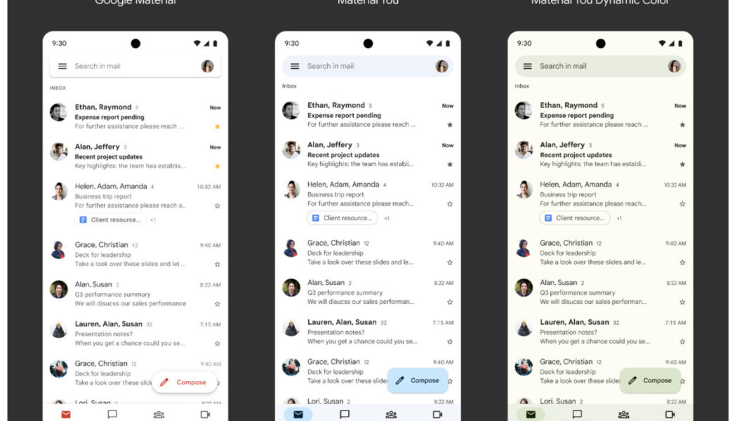
Google is starting to roll out its new Material You design system to Gmail, Calendar, Docs, and more on Android. The new look will include changes to navigation bars, improved action buttons, and Google’s Sans text for better readability. It’s part of the bigger Android 12 redesign that includes big, bubbly buttons, shifting colors, smoother animations, and some overhauls to built-in apps.
The design changes mean Pixel devices with Android 12 or newer will be able to match the colors inside apps like Gmail, Google Meet, and Google Drive with their wallpapers for what Google calls a “more dynamic, personalized look.” Existing color schemes and color-coded file types and folders will remain unchanged within the apps, though.
:no_upscale()/cdn.vox-cdn.com/uploads/chorus_asset/file/22839365/Screen_Shot_2021_09_09_at_3.26.48_PM.png)
:no_upscale()/cdn.vox-cdn.com/uploads/chorus_asset/file/22839366/Screen_Shot_2021_09_09_at_3.32.07_PM.png)
The end result is subtle but colorful changes to apps like Gmail, Calendar, and Docs. Google has really leaned further into rounded corners here, and the changes are mostly aesthetic, meaning button placements and core navigation won’t be changing.
The design changes are already available in Gmail, Google Drive, Google Docs, Sheets, and Slides. They will also appear in Google Calendar on September 20th, and Google Meet on September 19th. All of the design changes are available to both personal Google accounts and Google Workspace customers.
