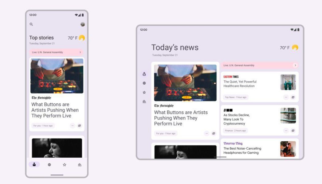
Android 12 has launched along with Google’s new Pixel 6 lineup and brings with it a new look that Android VP of product management Sameer Samat called “the biggest design change in Android’s history.” That’s in reference to Material You, which applies a new set of principles for creating interfaces, in addition to changes that will help Android adjust to bigger screens. We’ve already gotten a hint of how the look affects usability across the updated OS and Google’s own apps, but now the focus is expanding to reach more of the apps made by others.
Today at Google’s Android Developer Summit, the company announced that Material You is available in Jetpack Compose, so app designers can more easily adopt the look in their own products.
:no_upscale()/cdn.vox-cdn.com/uploads/chorus_asset/file/22960054/material_you_android_12.jpg)
New elements include dynamic guidelines that will help apps respond and adjust algorithmically to a user’s wallpaper choice, as well as tips on how to maintain a third-party app’s individual brand expression while adapting. Another element developers will need to learn about are the design tokens that “represent design system styles as data” so they can change as the system changes.
[embedded content]
Developers can see how their apps will look in different circumstances using the Material Theme Builder, which is available as a Figma plugin and on the web starting today. Beyond just how apps look, Google says that new features for its Jetpack libraries will help developers manage Android 12’s background restrictions, measure performance, and handle backward compatibility.
For future updates, Google says it’s planning on accessibility updates that tie into the dynamic color and adaptive layouts. Other guidance and system adjustments will help apps work with new form factors like foldables, even though Google doesn’t make a foldable phone… yet.


