Google’s excellent and neglected note-taking app is getting some much-needed formatting options and overall love. Here’s hoping it’s not the last time.
Share this story

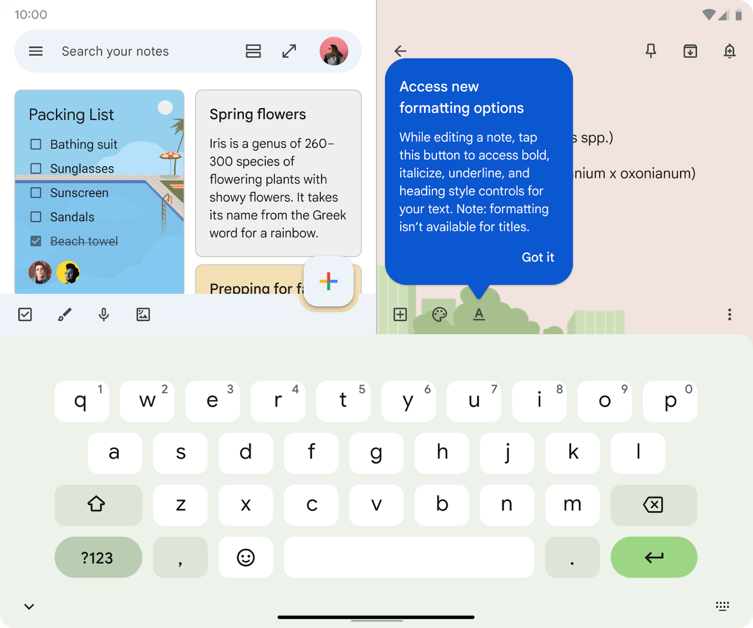
Good news for Android-toting Google Keep users: you’re finally getting the text formatting options the app has so desperately needed for years. Google announced this week that the ability to bold, italicize, and otherwise transform text in your notes is rolling out now, and you should start to see it in the app soon. (I don’t have it yet, but Mishaal Rahman and a few others actually spotted the feature ahead of its official launch, so it seems to be coming fast.)
The new Keep features are more in the “should have been here all along” category than they are shiny new things, but they’re still a welcome addition to the app. And actually, Google has been paying an unusual amount of attention to Keep recently: users got a new homescreen widget earlier this year, and you can now open multiple Keep windows at a time on your device. Google’s also slowly rolling out version history so you can see all the changes you’ve made to your notes over time.
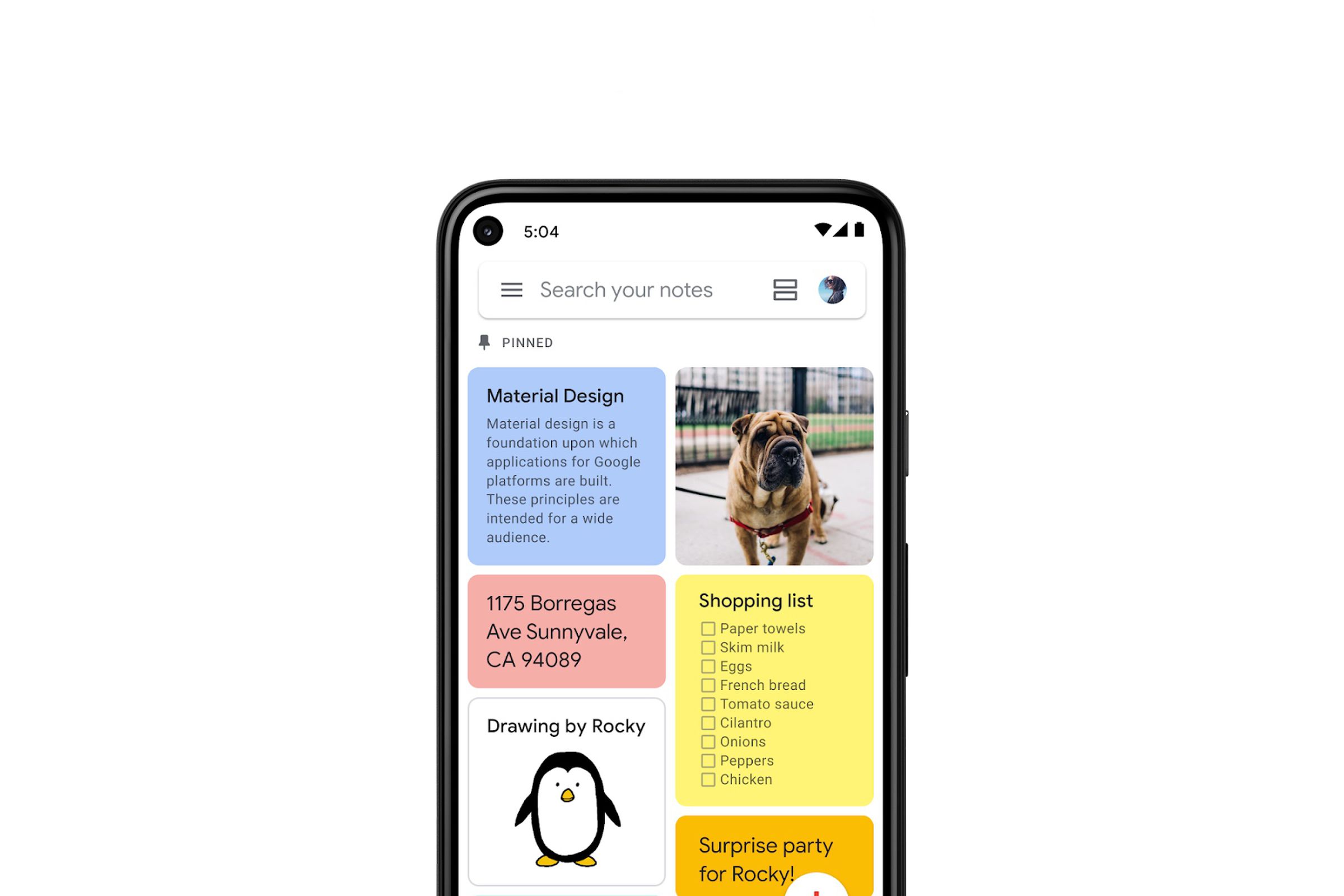
Keep is, if you didn’t already know, an excellent note-taking app. It’s fast, available on Android, iOS, and the web, and it manages to be both extremely simple and quite clever. Paste a link into a note, and the card reformats as a rich preview so you know exactly what it is. A single-line note just looks like a Post-it, but a longer note looks more like a document. You can draw in a note; you can record audio in a note; you can set reminders in a note! And because this is a Google product we’re talking about, it’s all searchable and accessible in the sidebar of a bunch of other Google products.


The big problem with Keep is that its future seems tenuous. It doesn’t get much attention or many feature upgrades — the app is a full 10 years old, and this is maybe its biggest update ever! You’re never going to see some long speech at the I/O developer conference about how great Keep is and all the cool stuff you can do with it. That makes users reasonably worried that Google might at any moment kill the app, as it has so many others, as part of some cost-cutting or refocusing initiative. Keep does many things better than Docs, but Docs is far more likely to still be around a few years from now.
That’s why it’s nice to see Google continue to remember Keep exists, just as it has seemed to also remember this year that Tasks exists. (Now, Google, make Keep reminders show up in Tasks. It’s right there!) The formatting options will presumably be available on the web and iOS at some point, and they make Keep even more powerful on top of that simple interface. Keep remains one of the best note-taking apps on Android, and in general, and hopefully it stays that way.


