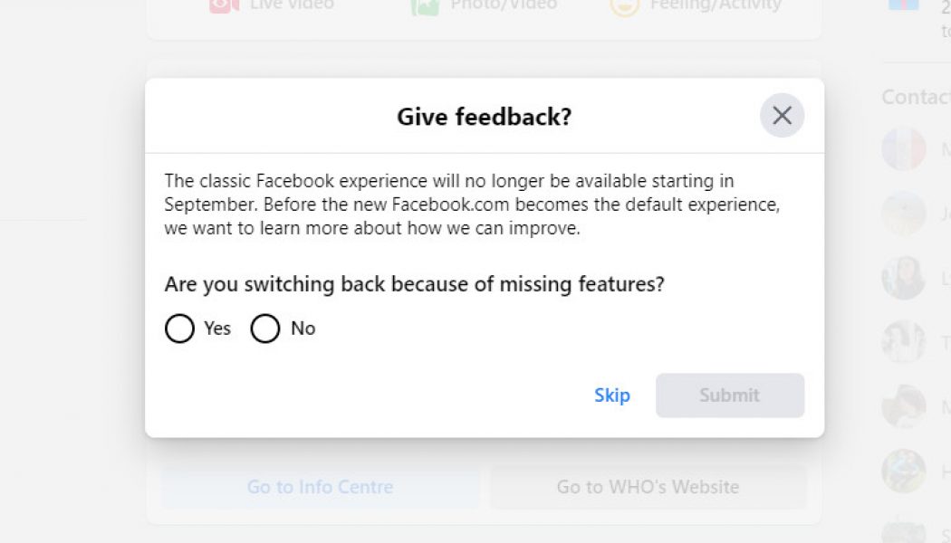
Facebook’s “classic” experience, the interface with the iconic blue navigation bar at the top, is disappearing for good in September. Engadget reports that a Facebook support page has been updated saying everyone will soon have the new design. Although you can temporarily switch back to the old interface on Facebook’s site, the button warns that “the classic Facebook will no longer be available starting in September.”
The new design was announced at Facebook’s developer conference last year, and initially rolled out on the service’s iOS and Android apps. In March it got a widespread release on desktop as an opt-in feature, leaving people free to continue using the old design if they want to. Come September, however, the old design will disappear for good.
:no_upscale()/cdn.vox-cdn.com/uploads/chorus_asset/file/21805476/msedge_KferoIu7G8.png)
The new interface is a big change from what Facebook has used for most of its existence. It’s a lot cleaner, includes a lot more white space, and there’s also a dark mode for people who are into that sort of thing. Functionally, it also places a bigger focus on the service’s Groups features, as well as prominently displaying links to Facebook’s Watch, Marketplace, and Gaming sections in its top navigation bar.
It’s a much-needed update compared to the cluttered look of yore, but it’s hard to see it bringing back any Facebook users who’ve abandoned the service in recent years.


