Extreme heat is on the way. Here’s how to use the US’s new warning system for heatwaves.

Extreme heat is in store for communities across the US this week, and the CDC and National Weather Service (NWS) have new tools to help people prepare for the health risks.
Heat is the top weather-related killer in the US, a threat that’s growing worse with climate change. But even though heatwaves kill some 1,220 people in the US, according to the CDC, the health risks can often fly under the radar. Heatwaves don’t necessarily illicit the same sense of urgency as tropical storms, for instance, which are named and categorized according to their intensity.
This year, it’s easier to see how any impending heat spell might impact your area thanks to HeatRisk tools launched by the CDC and NWS this year. You can head over to the HeatRisk dashboard and plug in your zip code to see forecasts and health recommendations for your area. For a bigger picture of how heat is impacting the US, check out a still experimental HeatRisk forecast online tool with a new color-coded system for assessing health risks.
“With hurricanes and tornadoes, those might get much more attention because you can visibly see the damage that occurs. But with heat, it’s a lot harder to actually see the impact unless it happens to impact you,” says Jessica Lee, NWS public weather services program coordinator. “The main thing we hope to accomplish with HeatRisk is that it will be used by individuals to help them personalize what forecasted heat will mean to them and better understand what actions they may need to take.”
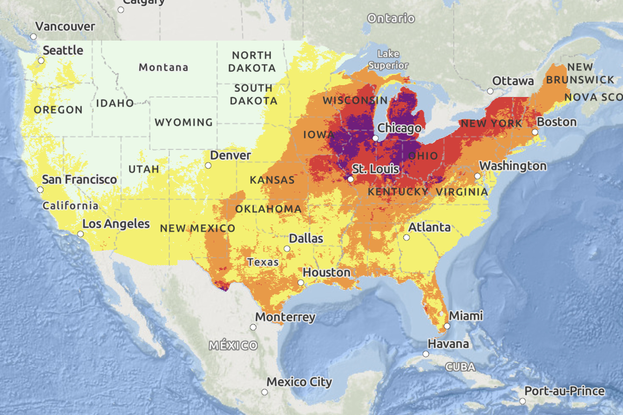
More than 72.9 million people — over a fifth of the population — are under active heat advisories as a record-breaking heatwave is forecast to unfold across much of the Central US and Northeast this week. Open up the National Weather Service’s HeatRisk tool, and you’ll see a map of the contiguous US ablaze in yellow, orange, red, and magenta colors. Each color is a warning about the potential impacts heat is expected to have in a particular location each day of the week.
For now, much of the Northwest is green, denoting “little to no risk from expected heat.” Yellow indicates a “minor” level of risk, although this can still affect people who are more susceptible to heat-related illness — especially anyone who has to spend time outdoors. “Moderate” risk, defined as affecting “most individuals sensitive to heat, especially those without effective cooling and/or adequate hydration,” is labeled orange.
Children and older people tend to be more vulnerable. Kids’ bodies are less efficient at cooling themselves down, and older adults might be taking medications that affect their body’s ability to thermoregulate or may have health conditions that heat can exacerbate. It’s a good idea to check in on loved ones who live alone or have chronic health conditions during an orange alert.
Red and magenta correspond with “major” and “extreme” health risks, respectively. At those levels, anyone might be at risk if they don’t have a way to cool down and stay hydrated. Parts of Texas and states across the Midwest, Ohio Valley, Mid-Atlantic, and New England are forecast to face bouts of “extreme” risk this week. That’s considered rare since it generally takes a prolonged heatwave with soaring daytime and nighttime temperatures to reach magenta-level risk.
It’s important to understand how heat interacts with an individual’s health history and their surroundings. City sprawl tends to trap heat, making urban neighborhoods feel much warmer than more rural areas. Cities in the Southwest meanwhile, might be better prepared for temperatures soaring above 90 degrees Fahrenheit than typically cooler regions in the Pacific Northwest where air conditioning isn’t as commonplace. The heat can even exacerbate air pollution in your area by supercharging the chemical reaction that creates smog. Entering your zip code into the CDC’s HeatRisk dashboard addresses a lot of these nuances, sharing air quality information on top of color-coded HeatRisk scores for the week and actions to take to protect your health.
The two websites launched on Earth Day, April 22nd, this year. The tools build off a similar system used in California since 2013 that expanded to other western states in 2017. Early iterations focused on climatological data, like how soaring temperatures compared to the norm for that area. Soon after, the NWS started working with the CDC to incorporate health information into its assessments and account for more humidity in the eastern half of the US.
HeatRisk is still an “experimental product” while the agencies continue to take public feedback on it through September 30th via an online form. Then, they’ll decide whether to implement changes based on that feedback and / or continue taking feedback. In 2022, the US launched yet another website called heat.gov to help city planners stay up to date on heat alerts and incorporate that data into their decision-making.


