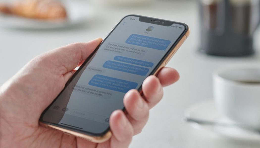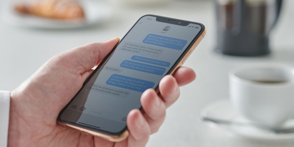
According to a report, there is an actual reason why you think that Apple‘s blue iMessages are better than the green text bubbles you get from Android device users. Popularly believed to be based on iPhone elitism, Apple is accused of using color contrast to make its iMessages more favorable than regular text from its competitor.
iMessage’s blue/white provides greater color contrast than the regular text green/white color scheme. The greater distinction between light and dark results in more readable text. The greater legibility results in a better experience when messaging iPhone users versus Android users.
It is interesting to note that the green/white color mix scores “very poor” on the Web Content Accessibility Guidelines (WCAG) at 2.18, impacting the user experience for all, but especially for those with visual disabilities.
Known for its exceptional products and services designed by its extensive resources and talent, it is theorized that Apple has intentionally made messages from Android devices “bad.”
In case you missed it, Cartoon Network as you know it is coming to an end.
