As part of Dazed’s PC Music takeover, we profile Timothy Luke, the Brooklyn-based designer who has helped shape the label’s aesthetic for the majority of a decade
Welcome to Dazed’s PC Music takeover, a week-long guest edit celebrating 10 years of pop music’s most exhilarating label. Head here to check out exclusive mixes, an oral history, and in-depth profiles with some of its key players.
“One thing we all dislike is things being halfway between things,” Danny L Harle says in a 2019 interview about the defining elements of PC Music. “So if you’re going to make something loud, it has to be the loudest thing you’ve ever heard.”
Timothy Luke, the Brooklyn-based designer who has helped shape the label’s aesthetic for the majority of a decade, echoes these words when telling Dazed about his overall vision for PC: “A lot of it is just taking ideas, and just pushing them as far as possible.”
PC Music defined a whole new kind of pop music, but you couldn’t talk about the label without mentioning its visual component. Bouncy, shiny, commercial, plastic, unnatural, metallic – these are all elements of an instantly recognisable look that Luke helped cultivate. Whether it’s his gleaming pink Nespresso-like pods for A. G. Cook’s “Beautiful” 2023 edit, or his jewel case CD designs for PC Music’s 1&2 compilations, the digital artist’s fingerprints are all over the label’s trajectory.
Luke was working as an art director at magazines and newspapers when a guy named Alexander (A.G) Cook hit him up in the hope of collaborating on a project, having found his work on Tumblr. That project was a bespoke magazine for Charli XC.X, which never came out in the end, but Luke came on board for other design work for her, including the scarlet red, motherboard-esque Number 1 Angel mixtape artwork. “For me, it was like a major unlock,” he explains. “It very quickly spiralled into a thing where we realised that we had a lot of mutual interests. Meeting Alex was a revelation for me – it felt like a completely different, more liberating medium. It was open and free from the constraints that I was experiencing in the editorial world.”
He wasn’t involved with PC until around three years in, but one of Luke’s first projects was 2017’s 1UL EP for Danny L Harle. It was a similar thing with A. G. Cook, where the pair instantly realised they had a bunch of things in common. “There was a lot going on in the project, maybe even too many things!” Luke remembers. “Dan was interested in achieving this neon, acid rain yellow, and an atmosphere where it was always raining. A sort of sombre feeling, but also being a bit silly about the references it was making.” Luke made custom typography inspired by German designers Rudolf Koch and Berthold Wolpe, with a Renaissance, wood-cut feel. The EP artwork has four panels, with glowing yellow lines representing a physical form of the sung words on each track. “It really encapsulated something that Dan and I shared an interest in – this really literal thing of visualising the rise and fall of the melody, and it also has this puzzle-like quality.”
Luke’s work has often translated the physicality of the music – one example being the video for A. G. Cook’s “Xxoplex”. In Luke’s grey-toned, clubland-adjacent animation, the frame rate syncs up perfectly with the track’s BPM and Cook’s hyperactive production, with strobe lights that seem to flash into your soul. “Watching this would kill a child from the 1700s”, one of the YouTube comments on the video reads. Another of Luke’s equally mesmerising designs is the optical illusion-style artwork for PC’s full squad Month of Mayhem 2018 compilation. He took the word ‘mayhem’ and asked himself, “What’s the craziest thing I can do?” As a fun twist on the theme, Luke applied the hypnotic black and white print onto the comp’s vinyl edition, where “if the disc moves even just a tiny little bit in the sleeve, it creates this really chaotic visual on the surface”.
Luke talks about taking a very literal approach to his designs for PC – the logo and initial designs for Easyfun, for example, were him playing with the words ‘easy’ and ‘fun’, whether that was children’s toys or carnival imagery. “I liked the idea of the logo being able to morph into anything you wanted it to be,” he says. Easyfun’s 2023 double EP release, ACOUSTIC and ELECTRIC, see an up-close illustration of the soundhole of an acoustic guitar, as a direct contrast to the black matte studio monitor speaker design.
“A lot of it is just taking ideas, and just pushing them as far as possible” – Timothy Luke
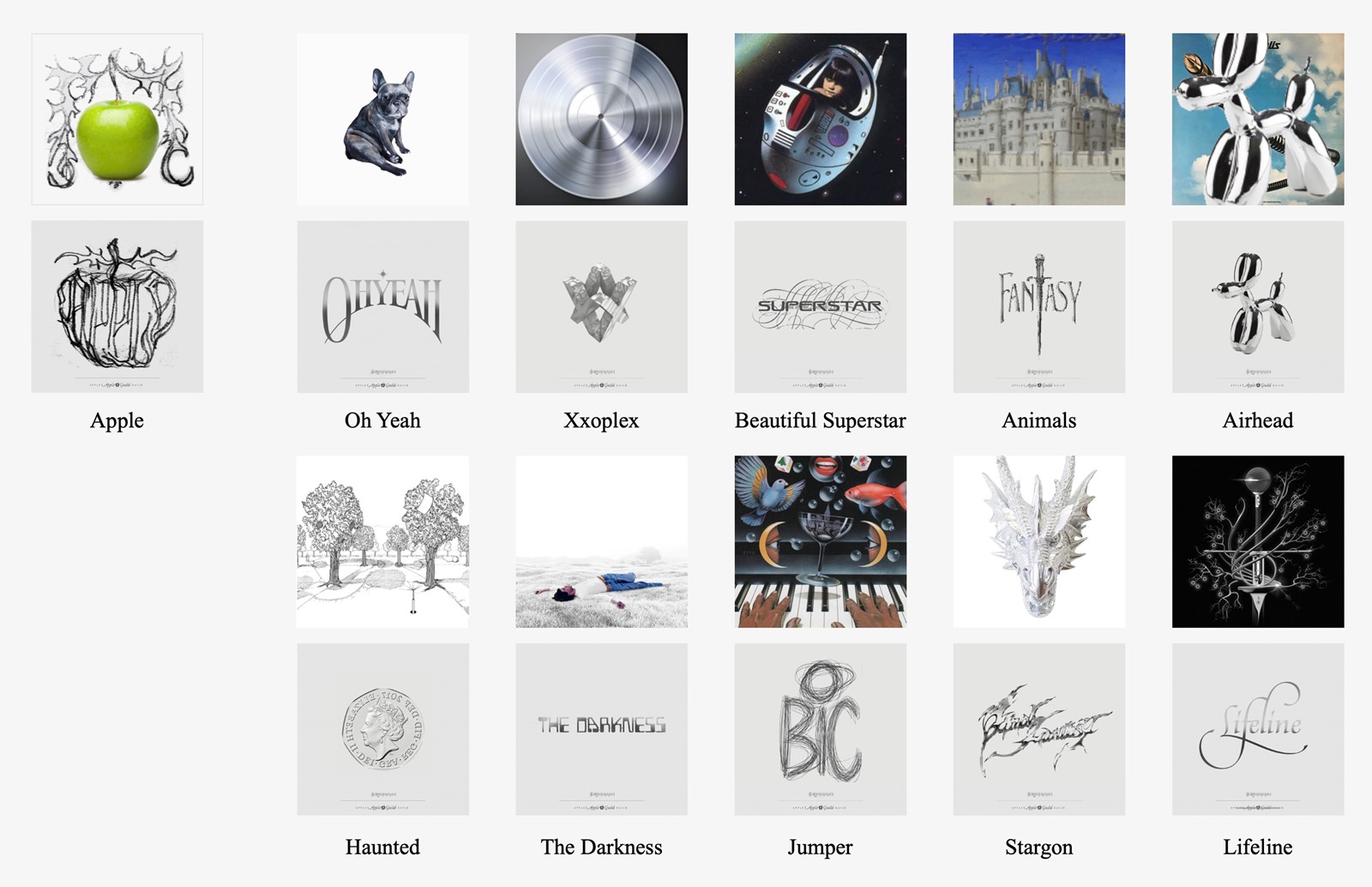
Luke describes himself as a “major book collector”, and adds he has a “massive, really chaotic folder of references on my computer that I’m looking at pretty regularly”. He’ll go down Wikipedia holes, too, for inspiration. Easter egg-like elements crop up frequently in Luke’s work, which is something he has in common with label boss Cook. “Alex is obsessive about wordplay,” Luke says. The genius of the naming of Cook’s 2020 album Apple was instantly clear to him, “because of the way it brought together The Beatles, Apple Records thing, and the Apple computer, with that being tied up in the idea of PC Music”. Researching 90s computer imagery and riffing on the idea that Ag is the symbol for silver on the periodic table, Luke deliberately used the “milled aluminium texture” of Apple products for the artwork, which also references the Internet Explorer logo and metal bands’ iconography – not to mention an obvious bit of biblical imagery. “Alex is just crazy about this stuff in the way that he can knit together all of these ideas,” says Luke.
For what will possibly be PC Music’s final project (the label announced that 2023 would be the last year it releases music), A. G. Cook and Easyfun joined forces for the collaborative project Thy Slaughter, with an album titled Soft Rock. Taking that literal approach again, Luke’s artwork shows a giant orange rock chained up, smashing and splintering in front of a stone backdrop resembling a mausoleum, which he explains was something of an ‘RIP’ moment for the label. Fantasy, role-playing, RPG and Dungeons & Dragons, and the Tudors were all reference points, he adds, saying: “Alex had the idea of presenting things as there being this dark, colourless, bronzey-grey realm, contrasting with the neon, pop-rock world.”
Despite Cook’s suggestion of a somewhat glum, post-PC world, and the conclusive feeling of the Soft Rock artwork, Luke says, “I definitely don’t feel like my work with Alex or any of these people really is coming to an end. I just can’t imagine us not working on things in the future.” Aside from his contributions to PC, the designer has worked on label-adjacent projects including Caroline Polachek’s Pang and Charli XCX’s Pop 2, as well as doing branding work for clients including F1 and Nike.
That being said, Luke admits that “it’s definitely sad” that the label is shuttering, adding that “a big part of the work for me is the fact that there is such an engaged audience on the other side”. He points to the 10 anniversary mix, which was “more emotional than I would have expected. They really played up all the emotional points of the last ten years. It really is crazy to think back.” Another of Luke’s final projects to emerge is the artwork for PC Music Forever, a Spotify playlist charting 100 of their releases, presenting a simple, gleaming disc. It comes washed in the #0000ff blue colour that’s the original colour of a URL link, and in typical fashion, it plays into the simplicity of advertising language while giving a playful wink. If one thing’s for certain, it’s that PC and Luke’s work will continue to reverberate through the under- and overground when it comes to culture.


