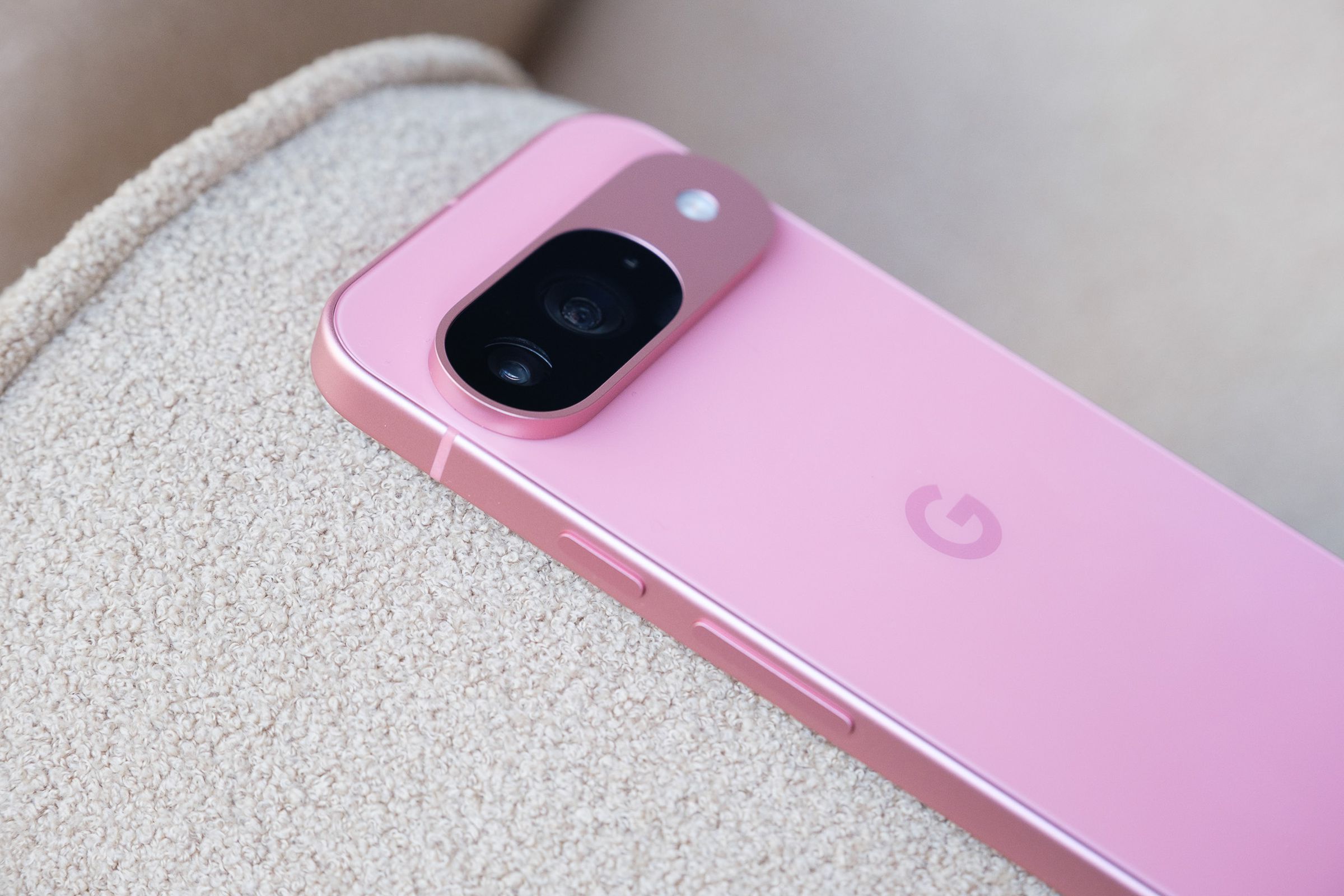
Claude Zellweger on the Pixel camera bar and the challenges of small phones.
Share this story
See our ethics statement.

There’s one thing about the just-announced Google Pixel 9 that’s hard to convey in photos — its camera bar is prominent. Bigger than ever before. It’s roughly as thick as two US quarters stacked together — nearly a third as thick as the entire rest of the phone. It’s so big even the vanilla Pixel 9 is now roughly as thick as a “Pro” iPhone, with a far more prominent camera module.
I’ve never felt a bump quite like it, but I don’t hate it!I argued in 2022 that Google’s camera bar was a good thing: the first major smartphone design element that’s truly Google’s own. In an era when most everyone’s phone is a simple rounded rectangle, it’s a playful way to stand out, giving the phone a cute robot face.
I ask Claude Zellweger what he thinks about the beefier bump — and he says it’s “absolutely intentional.” As a director of design for Pixel phones, he’s the man behind the team behind the camera bar, and he calls it a “modern and unapologetic approach.”


I don’t bring up the idea that the camera bar gives the Pixel a cute robo-face, and neither does Zellweger — when I ask for his reasoning, he says the bar’s simply “the most efficient way to package these camera modules” and that it’s designed to highlight that minimalist beauty. “There’s a purity to our photography, right? We want it to be reflective of that.” (Elsewhere, Google says the camera bar design is inspired by the shape of the search bar.)
But while he says Google wants to “set a new era for phone design” with the Pixel 9, he doesn’t think a big bar will necessarily dominate Google’s future phones forever. To bump or not to bump? He says it depends on how much future phone buyers need big camera hardware inside.
“The desire to have really good photography is not going to go away,” Zellweger says. Today, that means big sensors and big lenses, which mean big bumps if you want the rest of the phone to stay thin.
But he suggests that designers might someday usethinner hardware because the computational photography and AI post-production techniques that Google and its rivals use could fill in gaps if thicker cameras were to be removed. (One example: Google just released its Zoom Enhance feature, which might someday lessen the demand for a long zoom lens.)
He says designers will likely revisit the ratio of camera hardware to phone hardware, as the entire concept of a “camera” continues to evolve.
Speaking of smaller hardware: I ask Zellweger how he feels about small phones, the ones that have largely died after Apple and Google stopped selling them. (Some would argue they don’t sell well; I maintain these companies have never given gadget enthusiasts a true choice.) Surprisingly, Zellweger says he’s personally a small phone fan — and pulls out his own Pixel 9 Pro, which is the same size as the Pixel 9, to demonstrate that Google’s no longer pushing you to buy the biggest phone to get the best features.
But when I point out that his 6.3-inch phone is nowhere near as small as my beloved old 5.4-inch iPhone Mini, he says modern expectations make that harder. “Building small phones is just fundamentally a bigger challenge,” he says, ticking off battery life, cameras, thermals, and user experience as things that tend to help push manufacturers toward taller and wider handsets. He says many people expect to watch video or play games on phones these days and, therefore, prefer bigger screens.
But it might not always be that way, Zellweger says. “I could see a future in which some people have different priorities about what they use their devices for, and there, some compromises can be made.”


