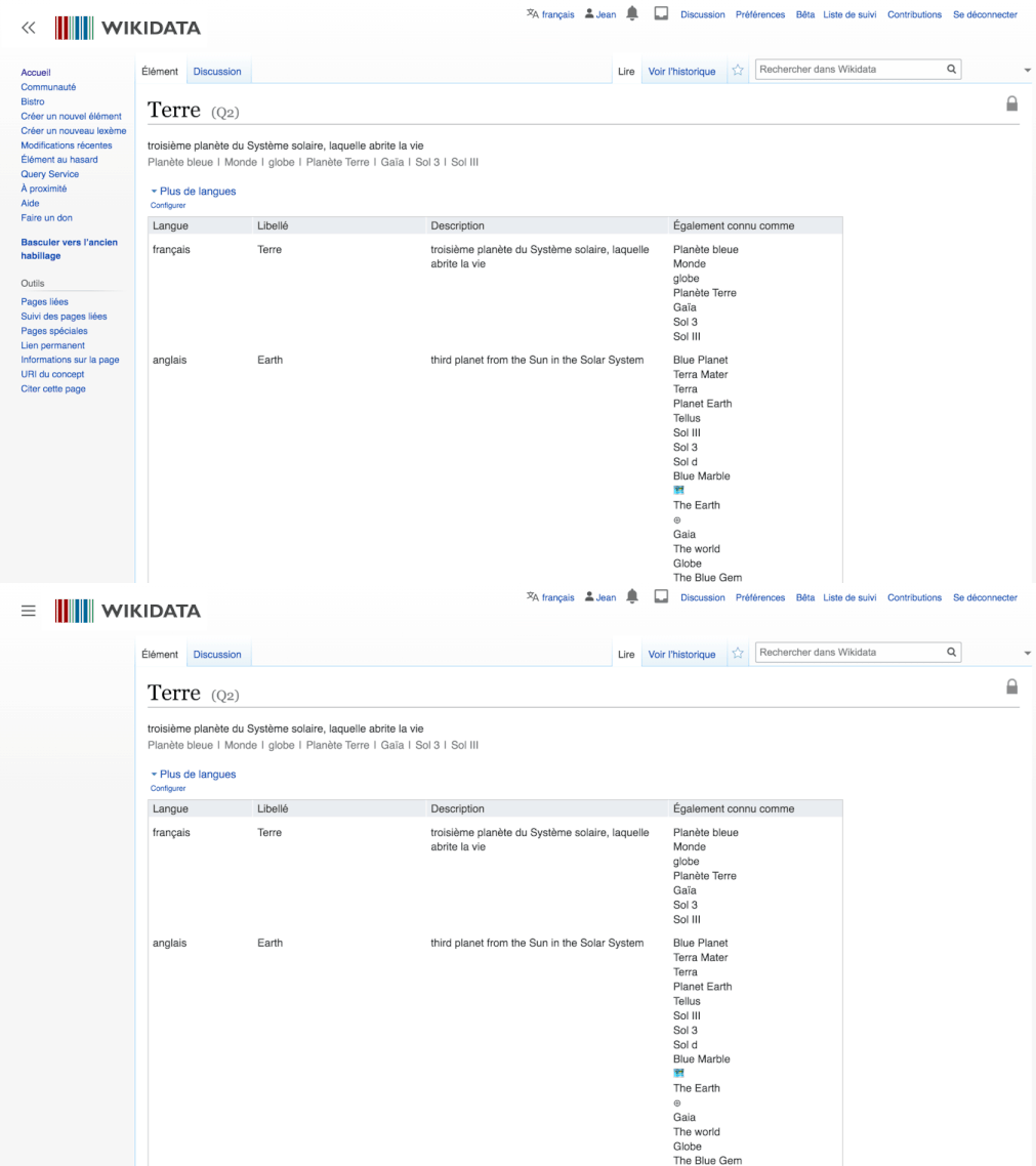
Wikipedia has been an integral part of web culture for nearly twenty years, letting users browse its millions of text-heavy, crowd-sourced encyclopedia entries from their computer, tablet, or phone. Now, the overall look of Wikipedia on desktop is getting a makeover for the first time in a decade to make the site more approachable for new users.
You can browse all the proposed new features in this MediaWiki post, and there are some animated GIFs to show you what they might look like. Personally, I really like how the new table of contents feature looks. I tend to curiously read Wiki pages of public figures and this could make it a lot easier to skip past certain sections of a page without having to scroll down on my computer.

A collapsible sidebar will be the first change to roll out; this will allow users to collapse the menu on the left side of each page, to minimize distractions, and limit irrelevant content and links on the left of your screen to make it easier to focus. The site will also add an easy one-click button to switch the language for a page you’re reading.
Wikipedia will also add improvements to the in-site search tool to make it easier to find other pages and will reconfigure the logo to make it smaller on each Wikipedia page.

Wikimedia Foundation, the site’s parent company, announced in a blog post that the changes will happen “incrementally over a long period of time,” allowing users to test the new features before they officially roll out, but that it plans to redesign the entire look of the desktop version of Wikipedia by the end of 2021. It didn’t say whether the mobile version would receive the same redesign.


