The Facebook logo is still blue, but it’s a little more blue.
Share this story

Meta is updating Facebook’s “identity system,” and that includes a dramatically refreshed logo.
Just kidding! It’s basically exactly the same as the last one, except the blue is a darker blue, and the lowercase “f” has a few subtle tweaks. You can see the new logo next to the most recent one in the image at the top of this post.
Here’s Meta’s explanation for the changes from a Wednesday blog post:
Our intention was to create a refreshed design of the Facebook logo that was bolder, electric and everlasting. Each of the distinctive, new refinements drive greater harmony across the entire design as a key element of the app’s identity. We’ve done this by incorporating a more confident expression of Facebook’s core blue color that is built to be more visually accessible in our app and provides stronger contrast for the “f” to stand apart.
I really love the phrase “a more confident expression of Facebook’s core blue color.” That’s a lot of words to say that the logo is a darker blue!
Jokes aside, it makes sense that Meta is only slightly tweaking the Facebook logo instead of totally redesigning it. Meta says the platform sees a jaw-dropping 2 billion daily active users every single day, meaning any visual change will be seen by a lot of people. I can see why Meta is opting to only make relatively tiny tweaks to what’s already one of the most recognizable logos in tech.
If you want to take a trip down memory lane, Meta’s blog post included a short video chronicling the history of the logo that I turned into a GIF.


The Facebook wordmark has gotten an update, too, according to the blog post. “Using our custom typeface, Facebook Sans, we redesigned the wordmark and logo to create a consistent treatment and improve overall legibility across Facebook,” Meta says. “Similar to the changes to the logo symbol, these refinements allowed us to build upon the heritage of our identity, while creating a stronger relationship between how the wordmark pairs with the rest of the typeface.”


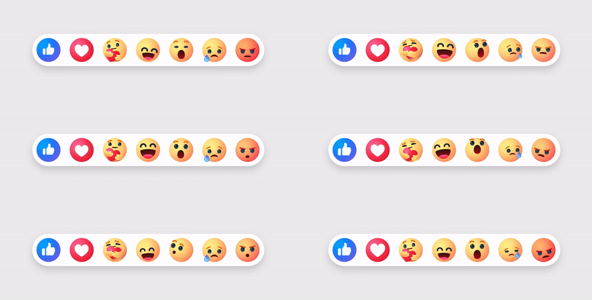
There’s a new color palette as well — shockingly, it has a lot of blue — and Meta refined the way Reactions look, too. “Through our expanded color palette, we were able to evoke more dimensionality and emotion in Reactions. We adjusted colors to meet color accessibility guidance so that our iconography is legible at any size, flexible enough for different needs and easy for people to interact with.”

Meta has more changes planned for the way Facebook looks. The company described the updates featured in Wednesday’s blog as “the first phase of a refreshed identity system” for the app, so keep your eye out for further design tweaks to come.
