YouTuber Marques Brownlee has published an early video on the upcoming phone, and has given a rundown of what its flashy interface is capable of.
Share this story
See our ethics statement.
Nothing is upgrading its signature Glyph interface for its upcoming Phone 2 smartphone, which is due to be officially announced on July 11th. YouTuber Marques Brownlee has put out an early hands-on video with the new smartphone that offers a thorough look at the flashing light interface built into the back of the phone, and the changes Nothing has made to it compared to last year’s Phone 1.
Although the Glyph interface uses roughly the same pattern, it now includes more zones of LED lighting, which should allow it to offer more granular control of the phone’s lighting effects. There are almost triple the number of zones this time around, with the Phone 2 including 33 zones versus 12 on the Phone 1.
More zones means the phone can show how loud its volume is, or the progress of a timer, within the curved strip of light on the upper right side of the phone’s back. There are also plans to allow third-party apps to use this light strip like a progress bar, with Uber and Indian restaurant app Zomato signed up to support it. The strips themselves are also divided into more sections, although they use roughly the same layout as last time.


Another new feature is the ability to set an “essential app” and have its notifications illuminate the top right light strip on the back of the phone. So if you want the Phone 2 to illuminate for WhatsApp notifications, but not Gmail or Instagram, that should now be possible.
The Phone 2 maintains the same essential design language as the Phone 1, with a couple of tweaks. The non-white variant is now more gray than black in color, and Brownlee notes that its back is slightly more rounded this time around. If you’re interested in the white version, Nothing has shown it off in a new promotional image published to its website, and which we’ve included below.

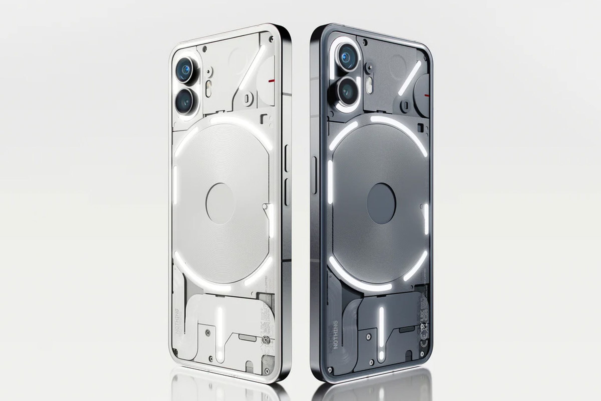
Brownlee’s video adds to a host of details Nothing has already announced about its Phone 2 in recent weeks including that it’ll come with a transparent USB-C cable, offer support for 3 years of Android updates and 4 years of security updates, and be powered by a Snapdragon 8 Plus Gen 1. Crucially, it’ll also be available in the US, unlike its predecessor. You can read a complete list of Nothing’s announcements about the phone over on our Phone 2 stream.

