While it isn’t perfect, the app embraces metadata to a degree that a lot of other apps could learn from.
In 2023, it’s hard to love classical music. Not because of the music itself — it’s just difficult to find it. Searching for George Gershwin is as likely to bring up his own performances as it is to bring up music he composed that’s performed by other artists. The problem is that, in the metadata, classical music doesn’t just rely on the typical stuff like artist, genre, song title, or album title. There are soloists to consider, and composers, and conductors, and pieces performed by an orchestra and a choir. Apple Music Classical, based on the Primephonic app that Apple acquired in 2021, addresses the problem with the metadata and has me wondering why more apps aren’t this rich in the stuff.
I didn’t realize how little classical music was in rotation on my phone until I downloaded Apple Music Classic. I used to love classical music, collecting LPs and bouncing between different performances, marveling at the subtle changes to the music each conductor and musician created. Before streaming became the dominant form of music playback, I had whole playlists of composers I liked with the metadata for each musical file meticulously filled out. MP3 files actually have a lot of places for metadata, and it was useful to know which pianist was taking the solo in which recording of Sergei Rachmaninoff’s Piano Concerto No. 2.
But the nuance was lost as streaming became the dominant form of music playback. Streaming needs to be good enough to reach the widest range of people possible, and it takes resources to get as meticulous as I would with my own curated list of pieces.

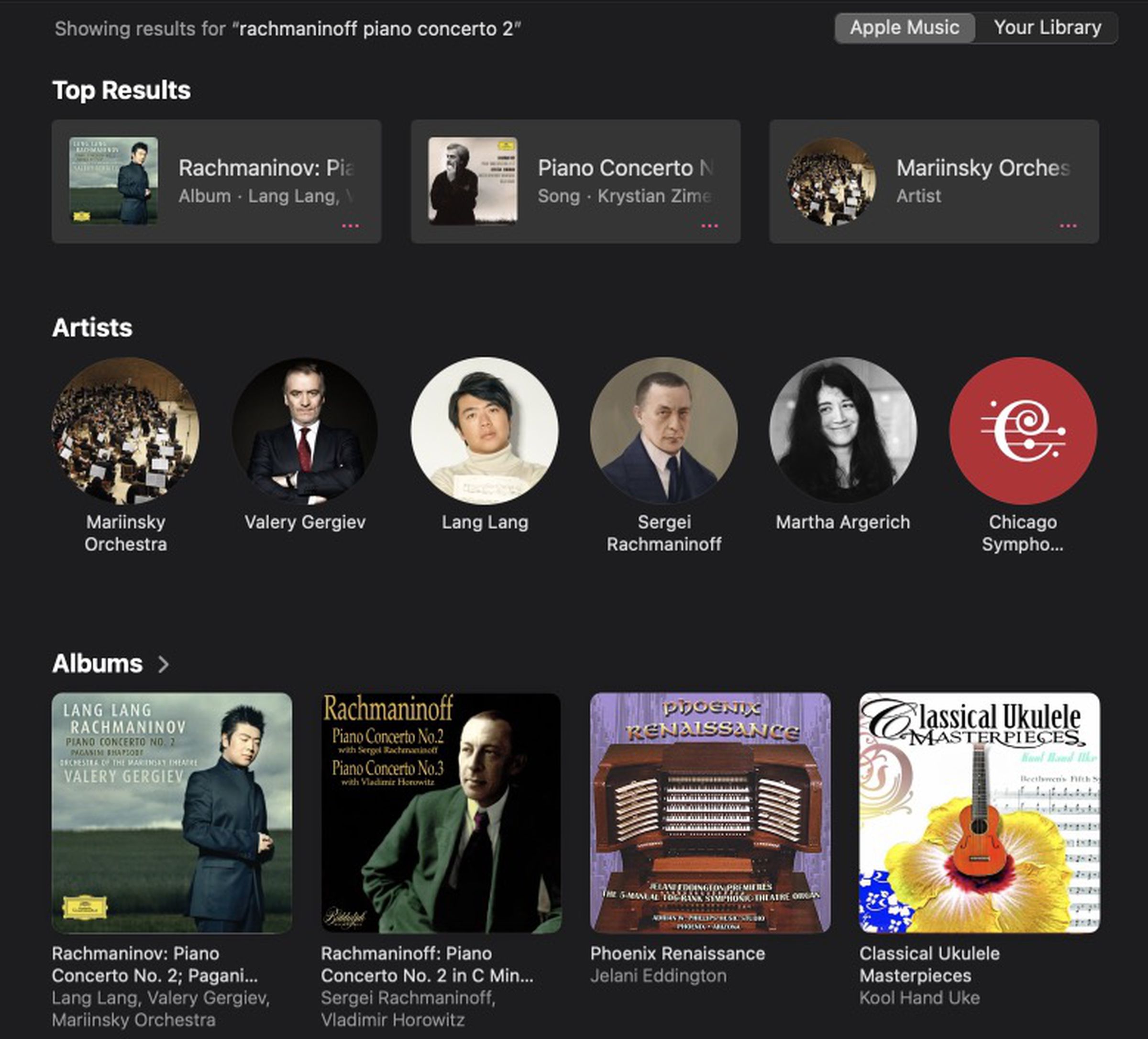
Even now, searching that same concerto in the vanilla Apple Music app gives me only two suggested performances before suggesting organ and ukulele covers. That’s not what I want, and I love that, in Apple Music Classical, I can (and have) spent a couple of hours listening to dozens of performances of Piano Concerto No. 2. Some play it with a somberness of a funeral dirge, others with a breathtaking speed that calls to mind something composed by Franz Liszt, and I can flip between each version with speed and ease. There’s even a little description of the concerto explaining its historical context and the difficulty of the piece.
There feels like a genuine affection for the music in Apple Music Classical. Quite a few pieces I’d consider fairly significant get the same treatment of Rachmaninoff’s work, with dozens of renditions and a neat little explanation. But there are also just a lot of ways to find the music. I can search by composer if I’m feeling like it’s a Ralph Vaughan Williams sort of morning or by artist if I’ve got an urge for more Sviatoslav Richter in my life. I can also search by instrument, orchestra, ensemble, conductor or soloist, or even choir.
I was particularly impressed by the array of choir music, which felt more robust, or at least easier to find, than on other music apps. I spent years looking for a specific arrangement of “Let All Mortal Flesh Keep Silence” that I heard in college and finally found it on Music Classical (it’s from Bairstow: Great Cathedral Anthems Vol. 1, and it’s almost embarrassingly emotional — I adore it). I was also able to listen to just the recording of a specific choir I’ve had a fondness for for years.

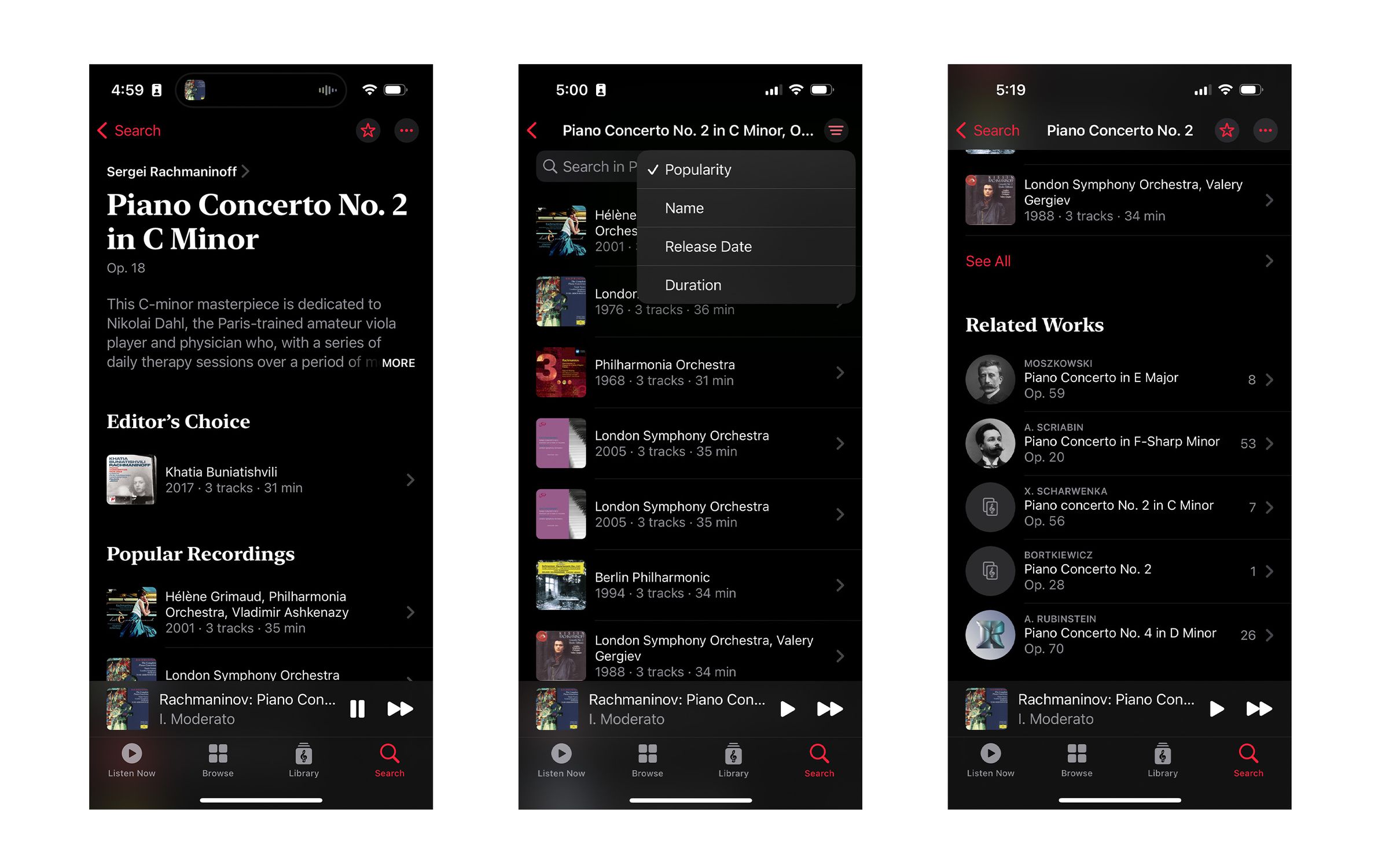
Music Classical isn’t always perfect. I was surprised that “Gliding Dance of the Maidens” from the Polovtsian Dances in Prince Igor wasn’t included in Alexander Borodin’s popular works given it’s the basis for the well-known song “Stranger in Paradise” from the 1953 musical Kismet. But that could just be a me thing.
This is all to say, I’m in love with Apple Music Classical, and I just keep wondering why the regular app isn’t more like it. While classical music certainly has a need for a vast array of metadata, I like to think most other music does, too. People like to listen to the works of a single producer, and when they search for Stephen Sondheim, they should be able to just see all the musicals he composed as neatly as I can see all the works of Antonín Dvořák in Music Classical.
I understand why the main app doesn’t provide the same kind of nuance in searching and browsing. It’s covering a lot of different genres of music with a lot of different expectations from listeners, and it has to do a good-enough job for all of them, whereas Music Classical does an excellent job for only really one. But already, I have co-workers wondering where the Jazz version of this app is, and I don’t think they’ll be the only ones. Right now, music streaming apps are trying to differentiate themselves from each other to earn our dollars. Apple is foisting spatial audio upon us, and Spotify is trying to get us to care about podcasts, and YouTube Music is quick to give us a video and remind us of its origins in the main app. But Music Classical remembers that a lot of us are giant nerds, and we just want to go down rabbit holes with our faves.
