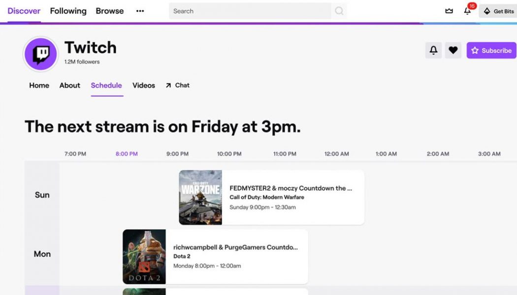
Twitch is getting a new look — sort of. Starting today you’ll see the site’s channel pages slip into something more comfortable, to borrow a phrase; streamers will now have way more control over what their channel looks like when it’s offline, with a more customizable home page, channel trailers, and more. The changes were first announced at last year’s Twitchcon in San Diego, and they’re finally rolling out today.
Probably the coolest part of the new look is the new integrated stream schedule, because it makes it super easy to see when a channel’s next planned stream is — but also because it brings watching Twitch more in line with the experience of watching TV. Now you’ll know when your favorite streamer plans to stream games you like or when they’re having guests on. (And yes: streamers can enable vacation mode, because creator burnout is real.) Streamers will be able to upload customizable banners, a curated selection of videos, and bigger avatars.
The point of the redesign, at least as far as I see it, is to make Twitch both more streamer-brand friendly and more interactive when streamers themselves are offline. The old channel pages are more static, and don’t really tell you what a streamer and their community is about — which is crucial when you’re a mercenary in the internet’s unending war for attention. It helps fix the problem with discovering new things to watch on Twitch, because now you’ll be able to try, in a manner of speaking, before you buy.
