The biggest tournament in sports is back once again. The Qatar World Cup 2022 will host 32 sides from around the globe in search of ultimate glory from November into December – but it’s not just sporting immortality each nation is battling it out for. While many shirts will fade into anonymity, a selection of the jerseys we’ll see this winter will live on in footballing – and fashion – folklore forever. Lil Baby crooned “Everybody Wants to Rule the World” on this year’s World Cup anthem. But when it comes to shirt supremacy at this year’s tournament, there’s plenty more drip than drown.
Before we get the ball rolling, there’s been an interesting series of trends we’ve seen with 2022’s kit designs, now that they’ve all finally been unveiled. So after carefully reviewing each and every option available from an array of manufacturers, a few key things stood out. 2022’s away kits are undoubtedly better this time around, with the big hitters – namely adidas and Nike – pushing the boat out for their designs this year, with bespoke details, easter eggs and striking alternate aesthetics. Innovation and ingenuity have definitely been on the agenda this year.
There’s also been a noticeable theme of kits being much more purposeful, whether that’s down to them being the most sustainable and technologically-advanced run of shirts ever created on a material level, or embodying unity and support for human rights and diversity. Manufacturers are now going harder than ever to deeply consider what it means for their federations with designs that will resonate with generations of fans across the globe – and it’s truly great to see.
So without further ado, here’s another list to relish on our favorite kits of the World Cup 2022 — many, and we mean most of which, will embarrassingly crash out in the first two rounds. But that’s not what is important here. For us, it’s all about style, tradition, and the lack thereof — all of which amounts to a kit that will be remembered for many decades to come. Let’s kick-off.
Belgium Away (adidas)
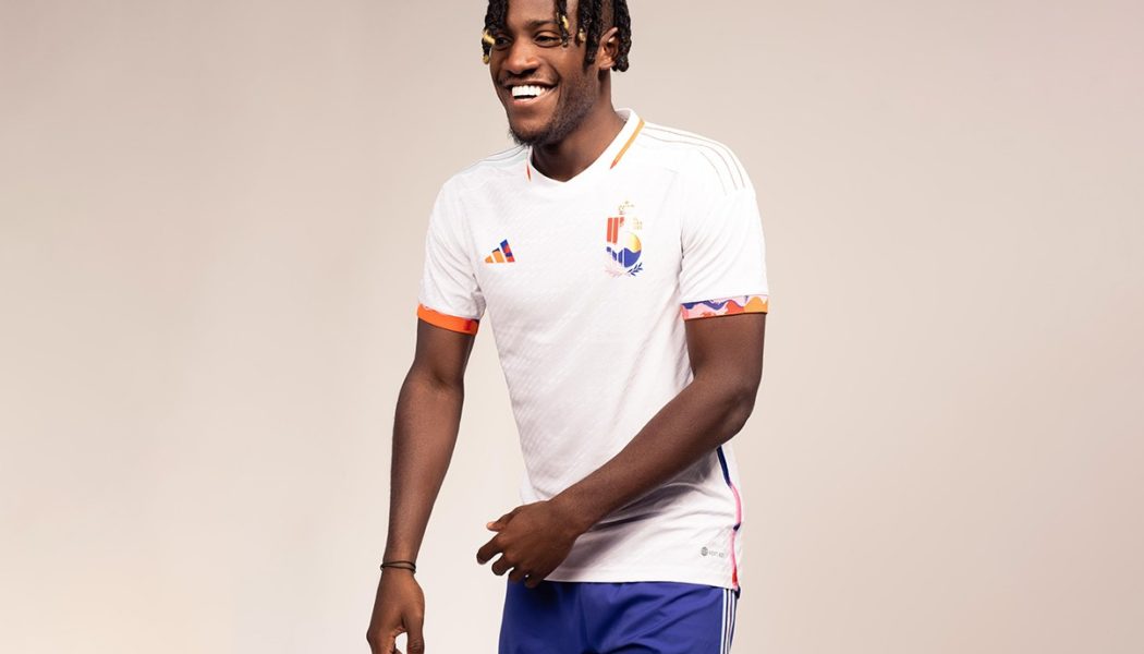
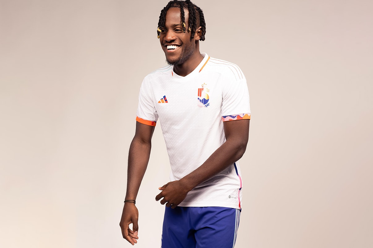
The Red Devils might be looking to light it up with their home jersey, but the remnants of Belgium’s “Golden Generation” will be seeking to spread LOVE with their Away strip. While keeping it traditional with the conventional Away colors – with the jersey arriving with a clean, white backdrop – Belgium’s Away kit breaks convention by becoming the first shirt in World Cup history created in partnership with a festival: Tomorrowland. You don’t even have to be a fan of all things “oontz oontz” to appreciate this design either. Featuring a “LOVE” sign-off as well as a bold graphic print inspired by Tomorrowland’s famous fireworks, the shirt symbolism represents the values of diversity, equality, and inclusivity that the federation and festival both stand for. It’s not as much of an obvious protest as Denmark’s kit, but it’s still nicely executed.
Brazil Away (Nike)
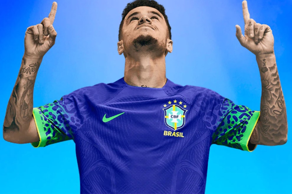
If you had to describe Brazil’s away kits in one word, “vibrant” would be an apt choice. Brazillian football’s “Ginga” style is dynamic and beautiful, but in World Cups past the national team has stuck to a relatively straightforward kit formula — understandably, as the country’s yellow, blue and green shades are some of the most recognizable in all of football. However, this year’s away kit is about as “Ginga” as it gets. The brilliant blue body is trimmed with luminescent green jaguar print on the sleeves, which, besides giving off a striking look nods to Brazil’s natural beauty and the savage strength of their squad. Gol de Placa!
Croatia Away (Nike)
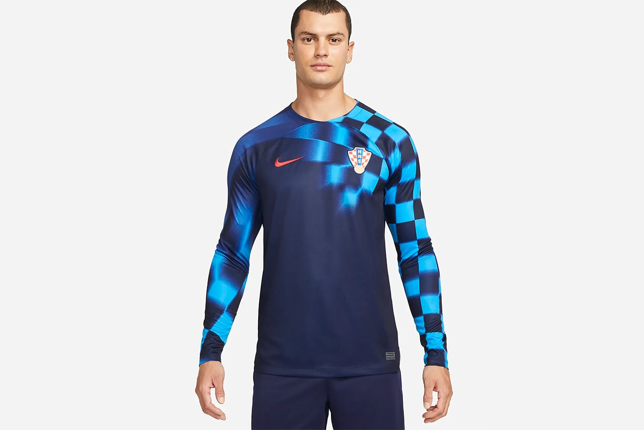
Croatia has a checkerboard-styled cheat code when it comes to their shirts every single World Cup, with the nation blessed with one of the most iconic designs of all time. But you see what Nike has done with their away kit for 2022? Vrlo dobro. Distorting the country’s classic pattern with motion-blurring, the light blue checks run across the left shoulder — and along the arms on the long-sleeve version. This one looks exactly like something that would get conjured up with Off-White™ were to ever reunite with Nike for another football-themed capsule. Call this one “TOP BINS.”
Denmark (Hummel)
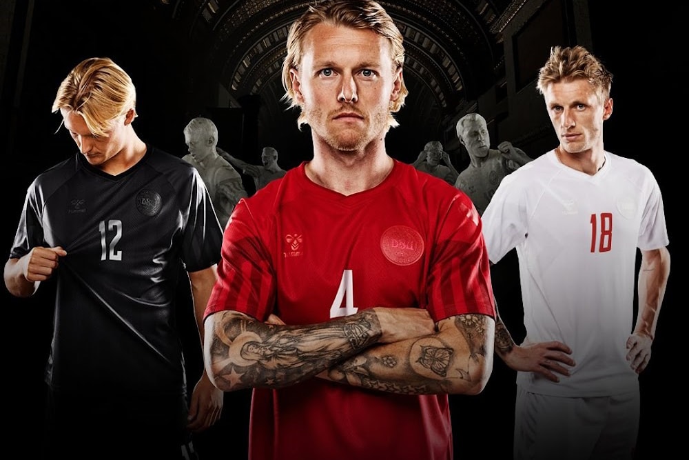
Like all major competitions, the World Cup has surpassed its status as a mere sporting event and become a platform where artists, players and brands can spotlight their creativity, along with raising awareness of a range of social issues tied to sport. While there are many great designs in this year’s tournament, the award for most impactful has to go to Denmark, who has opted to cover their branding through an all-red, black and white set of kits.
Danish brand Hummel, who produced the jersies made the following statement upon release:
“We don’t wish to be visible during a tournament that has cost thousands of people their lives. We support the Danish national team all the way, but that isn’t the same as supporting Qatar as a host nation.” These comments come after years of criticism that both FIFA and the Qatari federation have received due to the labor conditions while the stadiums were being built.
Aesthetically speaking, simple shirts have long been a favorite by football loyalists and all three of these Denmark certainly fall right into place.
England Away (Nike)
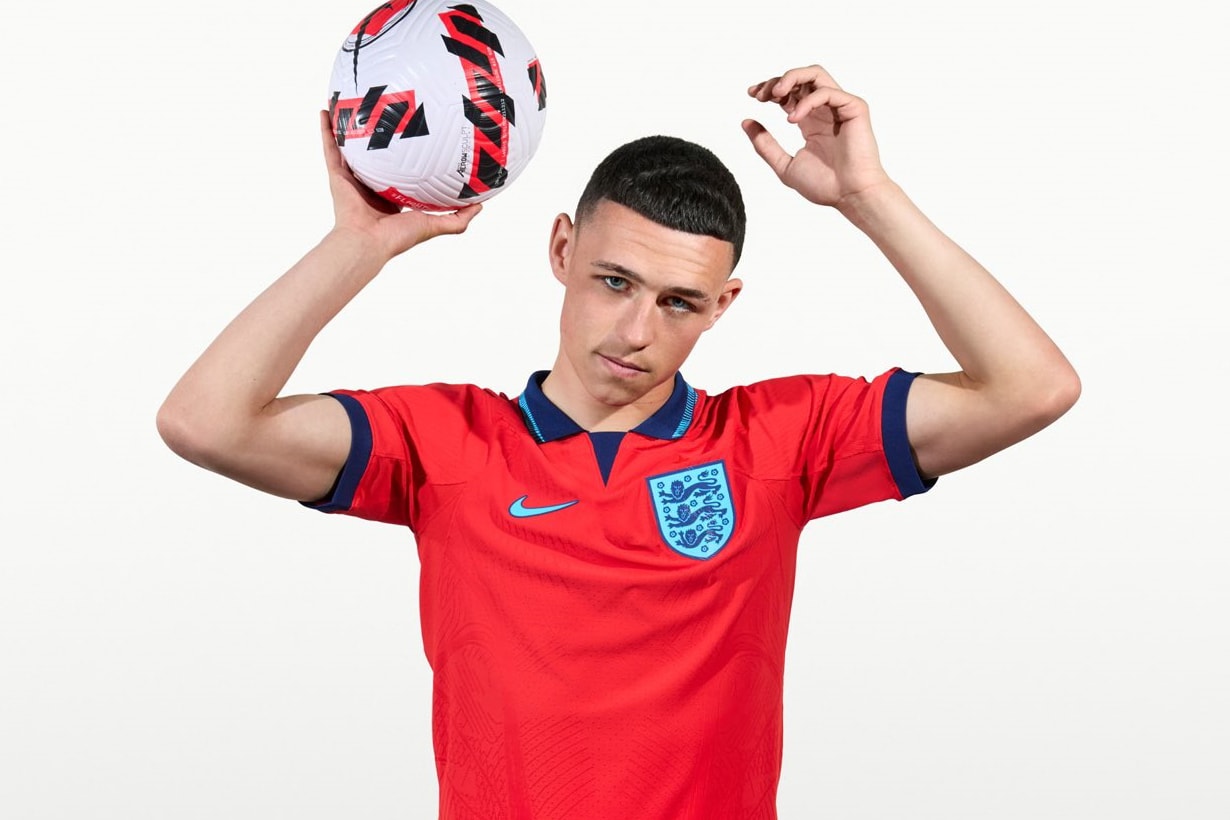
England has had some iconic kits over the years. Most recently, the Three Lions have had major tournament success – in kits such as the 2018-released all-white strip for the World Cup semi-final and the crewneck design that took them to the Euro finals – and thus, the kits garnered vast popularity due to the memories associated with them. However, England’s latest jersey is a mix of the old and the new, making it one of the most unique Nike Football designs of recent times.
The kit takes inspiration from the youthful energy of the current first team with its “Blue Void” color scheme, while also appearing reminiscent of England’s 1998-released jersey that was sported by the likes of David Beckham, Alan Shearer, and Paul Scholes. The new kit also features a new collar as well as an abstract Three Lions graphic when the collar is popped. Opinions on this kit from England fans have been divided this year, but we think it’s a smash-and-grab.
France Away (Nike)
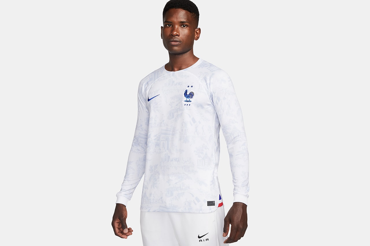
Ahh, Les Bleus. Has there ever been a bad shirt? (The answer is yes, but rarely). While the French, clearly, are very good at football, their history in fashion is arguably second to none.
Away kits have been all the buzz this FIFA World Cup and the defending champs definitely joined the conversation with their own subtle beauty. From a distance, the shirt just looks white. Upon closer inspection, however, a traditional Toile de Jouy pattern begins to emerge — where scenes from the French Revolution and national landmarks like the Arc de Triomphe appear. There’s even a cow. We won’t question why, because it looks great.
Japan Home (adidas)
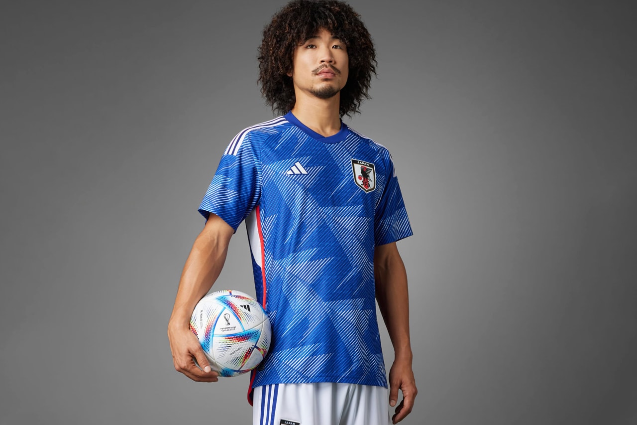
Japan has a great history of donning the most popular kits at major tournaments. Cast your minds back to the 2020 Olympics where the home nation presented its “Great Wave” jersey, for example. But, this latest World Cup jersey could arguably be the nation’s best kit yet. Once again connecting with adidas Football on the design, this latest Japan jersey draws inspiration from traditional origami paper-folding art that was part of the closing World Cup ceremony 20 years ago in Yokohama. The graphic on the jersey also takes inspiration from the flock cranes that are featured on Japan’s federation badge. And while Japan isn’t favored to go far in the tournament this year, the nation is definitely in with a shout for the top spot in the jersey rankings.
Mexico Away (adidas)
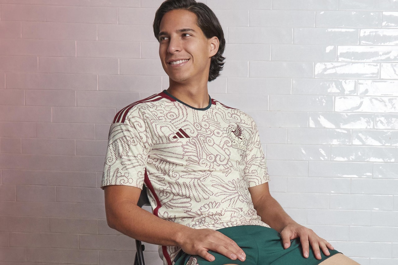
Time and again, Mexico will grace us with a kit that references its proud Aztec heritage. For many fans, the 1998 home kit holds a special place in Mexican World Cup history. It’s likely the 2022 away shirt will do the same.
Featuring a newly redesigned logo atop a beige base, adidas has knocked this design out of the park with a burgundy all-over print inspired by Mixtec art and Aztec deities, such as Quetzalcoatl, whose serpent body is emblazoned prominently at the center. The shirt also features a verdant green trim at the collar that rounds it out nicely.
Portugal Home (Nike)
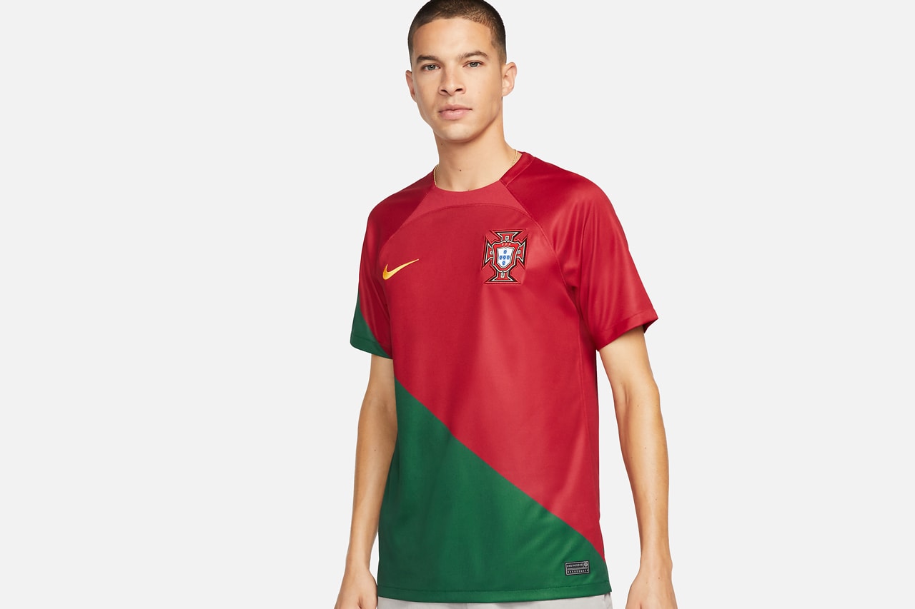
If there was an award for “most divisive kit” on this list, Portugal’s home kit would be a shoo-in. It features a diagonal red-and-green design that was made to mimic how Portuguese national team players occasionally wrap the country’s flag around their body after victories — an inspiration that was communicated even more beautifully on a banned long-sleeve jersey — but its non-traditional template hasn’t found unanimous acclaim. Change is often a good thing, though, and with this new kit plus a roster full of young talent Portugal fans have every reason to be excited.
South Korea Away (Nike)
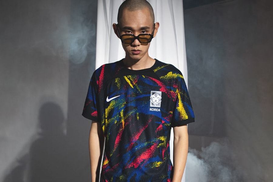
When it comes to the festive fun in the 2022 World Cup, no other kit compares to South Korea’s away iteration. Its multi-colored streaks and stripes are reminiscent of abstract art and fireworks in equal measures, making for a joyful look with plenty of ’90s flair. However, there’s a deeper meaning behind the striking graphics: the blue and red streaks are a salute to Taegeuk, the symbol at the center of the Korean flag that represents the balance between earth (red) and heaven (blue).




Tagged: Sports