The story of iOS 16 is all the things that your phone does when you’re not using it. Apple has been saying for years that we need a reset in our relationship with technology and that picking up our phones hundreds of times a day is not the right outcome. Apple, of course, is probably the company most to blame for that problem. And so, part of the idea with its new smartphone software is that there might be ways for your smartphone to be useful without you having to use it so much.
Like every year, this new version of iOS (which is available for the iPhone 8 and newer starting on September 12th) is filled with improvements and changes to practically every app and screen on the iPhone. In recent years, that’s been just about all the new versions have been. iOS is an excellent, mature piece of software, and Apple’s clearly not looking for an excuse to reinvent the wheel anymore. But this year, Apple found a part of its software that hasn’t gotten much attention recently and gave it a makeover.
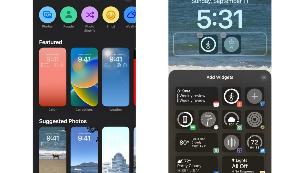
The lock screen is the true star of iOS 16. Apple has reconceived its purpose altogether, shifting it from just a clock and a bunch of notifications to something much more like a second homescreen. Lock screen widgets were an instant upgrade to my phone life: I can now see my calendar without unlocking my phone or even swiping right to get to that page of widgets everyone always forgets about, and I have a tiny widget that launches a new note in my notes app.
My favorite iOS 16 widget comes from the habit tracking app Streaks. I have “take 5,000 steps” as a daily goal (we’re still in a pandemic, I work from home, and 5,000 steps feels like an accomplishment some days now) and a widget on my lock screen with a meter that slowly fills up as I approach that number. It’s a subtle reminder every single time I look at my phone that I probably need to go outside and touch grass.
The iPhone has never been good at these kinds of light-touch interactions. Before iOS 16, most things required you to pick up your phone, unlock it, swipe to the right homescreen, and open an app. Apple has tried to shrink that process through Siri voice commands, and part of the Apple Watch’s whole appeal is easier access to simple tasks. But “put a bunch of them on your lock screen” might be Apple’s best solution yet. And when you pair it with the always-on displays on the iPhone 14 Pro, the iPhone becomes a fountain of useful information without requiring a single tap.
:no_upscale()/cdn.vox-cdn.com/uploads/chorus_asset/file/24013760/ios16_lockscreen_picker.jpg)
Still, Apple hasn’t quite finished the job here. For one thing, these widgets are still irritatingly noninteractive; they can update with new information, but the only way to use them is to tap on them to open their app. Why can’t I long-press the Calendar widget to see my whole day? Why can’t I tap on the “drink water” Streaks widget to actually log my water consumption?
The new Dynamic Island on the iPhone 14 Pro is a slight improvement in this sense, at least while you’re actively using the phone: you see a tiny sliver of information in the pill at the top of the screen, and you can tap it to open the app or long-press to expand to the full widget. I’d still rather be able to play and pause from the pill itself, though. Live Activities are also a sort of interactive widget, with the live updating sports scores and such, but only a few first-party apps seem to be using it so far. (Kudos to Clock, the perennial early adopter of iOS features.) In general, widgets are still basically app shortcuts, and I’d rather them be tiny apps.
With iOS 16, lock screens are also a way to change Focus modes, which is extremely clever. I’ve never been one to change my background; I’ve had the same picture on there for four years. But now, I have one home and lock screen background for the work week and another for the weekends paired with a Focus mode that turns off email and Slack notifications.
:no_upscale()/cdn.vox-cdn.com/uploads/chorus_asset/file/24013764/ios16_Lockscreens.jpg)
Getting all this set up is a fair amount of work — you have to pick backgrounds, choose font colors for the clock, add lock screen widgets for each one, and then go through the Focus rigamarole over and over again — but it’s worth the half-hour because now I can just swipe through all of my phone’s various modes. Focus modes in particular still seem to require an advanced degree to set up correctly, but lock screens make them a nice context switching mechanism, and I’ve come to appreciate it. My weekend lock screen is a photo of my dog, and every time I see it, something in my brain goes “get off your phone and go outside.”
All the small things
It’s a long-running and extremely true joke that two-thirds of Apple’s new iOS features every year are just Android features from six years ago. Much of the other third is Apple taking features from third-party apps and baking them into the operating system itself. Outside of Apple occasionally pretending it invented decade-old software tricks, this is the right strategy: most users don’t want to download tons of apps or learn new things, and the more functional the iPhone is out of the box, the better it’ll be for most people.
There’s one place where Apple does things no other manufacturer or OS can match, and that’s the camera. With iOS 16, you get Live Text in video, which means you can snap some footage, then pause the playback (it doesn’t work while you’re recording), and press and hold on some text to copy it. It’s not perfect — it’ll occasionally think “organic” is spelled “WACIGINIC” — but it’s good enough to be useful. Ditto the feature that can automatically grab the subject, so long as it’s human or animal, out of a photo so you can paste it or save it somewhere else. It works much better when your subject and the background are really well separated, but I’ve been consistently impressed with how well it was able to mask and separate my dog’s head from the couch or my face from the wall behind me.
:no_upscale()/cdn.vox-cdn.com/uploads/chorus_asset/file/24013769/ios16_picture.jpg)
Beyond that, iOS 16 is chock-full of semi-obvious features that it feels like Apple could and should have added a long time ago. Undo Send and scheduled messages in Mail is an obvious one — practically every other email service and app has offered those features for years, but they work well enough in Mail now. Same goes for Maps, which can now do multiple stops in a single trip. It works fine, though it’s not terribly advanced, and it makes you wonder what took Apple so long. But here we are. With iOS 16 comes a handful of new accessibility features, including a really impressive system-wide closed captioning feature and some clever real-time image recognition.
Of all these quality-of-life improvements, there are two that have made my phone-using life markedly better. The first is haptic feedback while typing. After weeks of using it and getting that gentle buzz every time I hit a key, I don’t know how I ever just smashed my fingers onto motionless glass. I’m not sure it’s made me a better typer, but it’s a much more pleasant typing setup. The second is marking conversations unread in Messages. For too many years, my general texting behavior has been to either respond immediately or forget all about the message and never get back to it. Now, I can mark a message as unread and find it later. It’s still ridiculous that iOS 16 doesn’t let you filter to just show unread messages, but I’ll take what I can get.
In Messages, you can also now unsend and edit a message. If you and your recipient both use iOS 16, it works seamlessly: the text changes in place, with a small blue “Edited” symbol underneath that you can tap to see all versions of the message. (You can edit up to five times and up to 15 minutes after you first sent it.) If you’re not all on the latest Apple software on your stuff, you’re doomed to that hideous “David edited this message” text that Android users will learn to know all too well. The unsend feature, meanwhile, only works iMessage to iMessage; there’s no retrieving that text you sent an Android friend. And don’t hold your breath for RCS to solve that problem.
:no_upscale()/cdn.vox-cdn.com/uploads/chorus_asset/file/24013771/ios16_Messageedits.jpg)
One feature I had high hopes for was the dictation improvements in iOS 16. In theory, you can dictate both more and better than ever: it now has emoji recognition, so “heart emoji” actually renders the heart emoji, and it also tries to automatically insert punctuation. You can also now dictate and type at the same time, which is a bit confusing if you accidentally brush the mic button without realizing it and suddenly your text field is filled with background chatter the mic picked up. These features were so hit-and-miss that I just stopped using them altogether. And honestly, if you can remember the names of all the emoji, you should be studied by scientists.
As phones have gotten bigger, Apple’s started shifting its UI emphasis down toward the bottom of the screen. The URL bar in Safari, the Spotlight search bar, and all sorts of other tappable UI fields have been moved down to save your stretchy thumbs. It’s definitely the right idea, but it takes some time to get used to the look; typing something and seeing the results up above felt odd for weeks before I stopped noticing it.
(One other thing you might notice at the bottom of your iPhone? A small translucent pill that says “Search.” This replaced the old button that showed how many homescreens you have and seems to exist entirely to remind users that Spotlight exists. And, PSA: Spotlight is awesome. You should use Spotlight. A quick search is still the fastest way to find an app or a contact, and it’s even a halfway decent way to search through your emails and texts.)
Features like this make up the bulk of iOS 16, and there are a lot of them. (Apple’s full change log is hilariously long.) In all, the changes do make the phone noticeably more functional and easier to use. The only ongoing problem I’ve had is with video apps, some of which fail in really screwy ways when you try to rotate from portrait mode to full-screen landscape. But developers should fix that quickly enough. Even in the early betas, iOS 16 was more stable than most new software, which says something not only about Apple’s capabilities but also about how much it’s really writing from scratch here.
:no_upscale()/cdn.vox-cdn.com/uploads/chorus_asset/file/24003228/DSC03706_edited.jpg)
As ever, though, third-party developers will be the ones who decide whether iOS 16 is a roaring success or just another iterative update. If they embrace the Dynamic Island, develop interesting lock screen widgets, create Focus filters that give users even more control over what they see and when, and flip their UI to the bottom-up style Apple wants, they could help make the iPhone feel more coherent, more useful when you’re not touching it, and a little simpler when you are. If they don’t, and you mostly use third-party apps, you might not notice much about this year’s new OS.
I’m also hopeful developers and sites quickly adopt passkeys, the new password-free authentication system that iOS 16 supports. Right now, you can hardly use passkeys anywhere, but practically the whole industry is behind the idea, and I expect them to catch on quickly. As they do, your iPhone (or other device because passkeys aren’t an Apple-only thing) becomes the key to your security. And in the few places I could test passkeys, snapping photos of QR codes to authenticate to my device, it worked well in iOS 16.
As far as Apple is concerned, I think the company is on the right track. It is clearly invested in turning the iPhone into more than just a collection of apps; it wants the phone to be lively and interactive and to get you what you need without requiring you to enter into somebody else’s universe. (The business and antitrust implications of that thinking are complicated and fascinating and not for this review.) I like the idea that my iPhone has all my stuff and the wherewithal to show it to me in the right places without me having to go looking for it. But to really make this work, Apple’s going to need to push even harder on notifications, widgets, Live Activities, and even the Dynamic Island.
All the big-picture stuff aside, iOS 16 makes most parts of the iPhone at least a little bit better. That’s where Apple is now: polishing, tweaking, fine-tuning. If Apple has whiz-bang new ideas about how tech is supposed to work, I bet they’re not coming for the iPhone. The iPhone’s just going to keep getting a little better every year for a lot of years to come.
What are you gonna do, switch?


