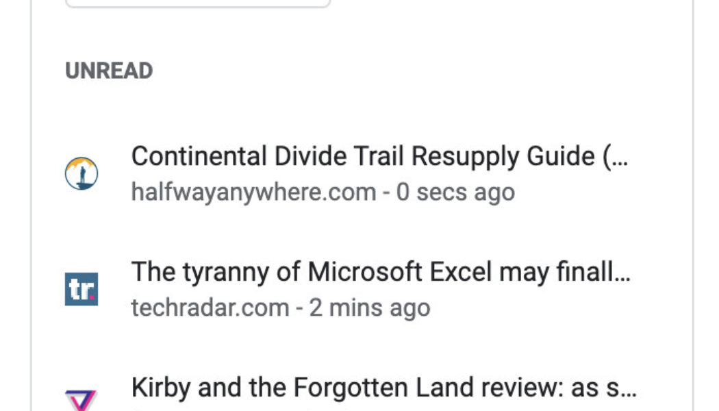
Google has introduced a new sidebar feature to Chrome, which lets you quickly access your bookmarks and reading list while using the desktop version of the browser (via 9to5Google). Previously, the reading list’s main home was as a button on the bookmark bar, which not everyone has enabled.
Clicking the side panel button, which looks like a rectangle with a shaded portion on the right side, will show or hide the panel. Once you’ve got it open, you can access the same reading list functions that were available in the old UI, including the ability to add the page you’re currently on to your list, mark items as read, or remove them. You can also switch over to the bookmarks tab to browse your saved pages.
:no_upscale()/cdn.vox-cdn.com/uploads/chorus_asset/file/23340108/Screen_Shot_2022_03_23_at_09.42.02.png)
It’s a nice change for those who want easy access to their reading list and bookmarks without necessarily wanting an ever-present bookmark bar. Clicking on the button brings up the sidebar, set to whichever tab you left it on last, and then you can easily hide it back away when you get to the website you want. The reading list should be available if you’re using the latest Chrome 99 update.
P.S. — if you’re like one Verge staff member and dislike the side panel, you can turn it off by going to chrome://flags/ and searching “side panel.” Then, set the #side-panel feature to disabled. After you re-launch chrome, the reading list will again be its own button on the bookmarks bar.
:no_upscale()/cdn.vox-cdn.com/uploads/chorus_asset/file/23340233/Screen_Shot_2022_03_23_at_11.25.31.png)


