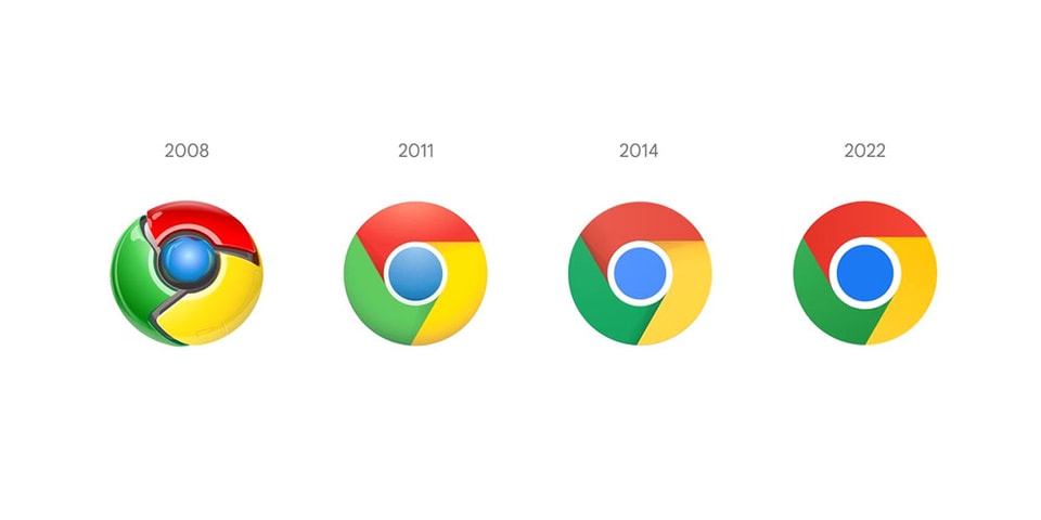
The world’s most-used web browser, Google Chrome, is receiving a redesign for the first time in eight years. Google interaction designer Elvin Hu recently took to Twitter to explain the changes that will be appearing soon.
Continuing the trend from the 2011-2014 change, the new icon features an even more minimalistic design, eliminating shadows for a flatter aesthetic. The saturation of the colors has been dialed up, and the middle blue circle is noticeably bigger than its predecessor.
Hu shares that the changes come in order to “align with Google’s more modern brand expression,” and offers a fun fact that is barely distinguishable to the naked eye: “we also found that placing certain shades of green and red next to each other created an unpleasant color vibration, so we introduced a very subtle gradient to the main icon to mitigate that, making the icon more accessible.”
Some of you might have noticed a new icon in Chrome’s Canary update today. Yes! we’re refreshing Chrome’s brand icons for the first time in 8 years. The new icons will start to appear across your devices soon. pic.twitter.com/aaaRRzFLI1
— Elvin ? (@elvin_not_11) February 4, 2022
Hu encourages Chrome users to provide feedback for the team, promising to refine the direction based on the community reception and will share more behind-the-scenes details in the future.
Elsewhere in tech, early Facebook investor Peter Thiel steps down from Meta’s Board of Directors.


