Microsoft’s Windows 11 preview has been available for a couple of weeks now, but I’m still discovering new animations and details in this new OS that put a smile on my face. While the new Start menu and centered taskbar are the obvious changes in Windows 11 that you’ll notice straight away, it’s the small animations throughout the OS that really make it feel a lot more fresh and alive than ever before.
Microsoft has started detailing some of the design approaches it has used for Windows 11 and its attention to detail for daily micro-interactions. That includes things like a checkbox that has an animated tick to subtly let you know when you interact with it, or a settings cog that spins when you hover over it. Plenty of buttons in Windows 11 pop with faint signs of life or bounce as you move around the OS.
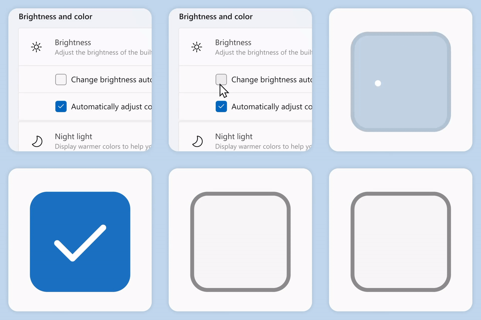
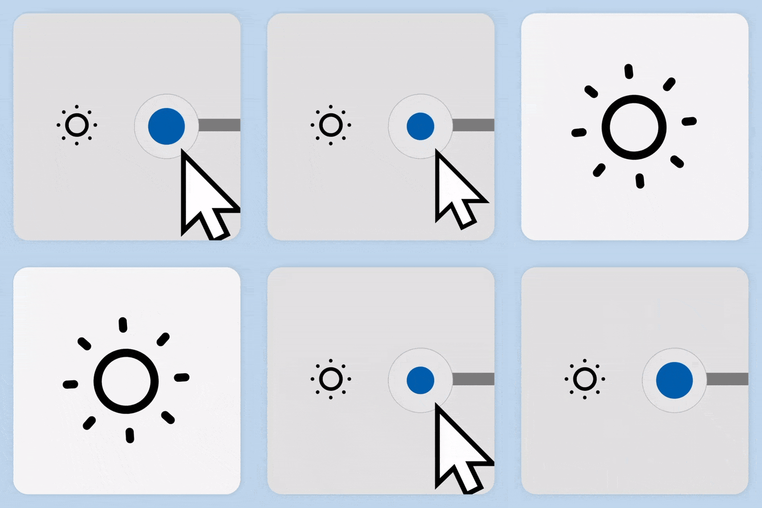
It’s this attention to detail that makes Windows 11 feel fresh and new but still familiar to use on a daily basis. The animations are often playful but in equal parts useful to provide an important visual cue for what you’re interacting with. Thankfully, they’re not in your face, slow, or annoying, mostly because Microsoft designed them to be calming. “Calmness is much needed in today’s world… Windows 11 facilitates this through foundational experiences that feel familiar, soften formerly intimidating UI, and increase emotional connection,” says Microsoft’s design team.
While the subtle animations might be calming, the choice to center the taskbar and change the Start menu is the more striking change in Windows 11. “After listening to people express a need for more efficiency and less noise when using Start, we designed a cleaner and simpler experience that puts people at the center by prioritizing the apps they love and the documents they need,” says Microsoft’s design team. “It also adapts to modern device form factors and enables easier access for all screen sizes, from a Surface Go to an ultrawide monitor.”
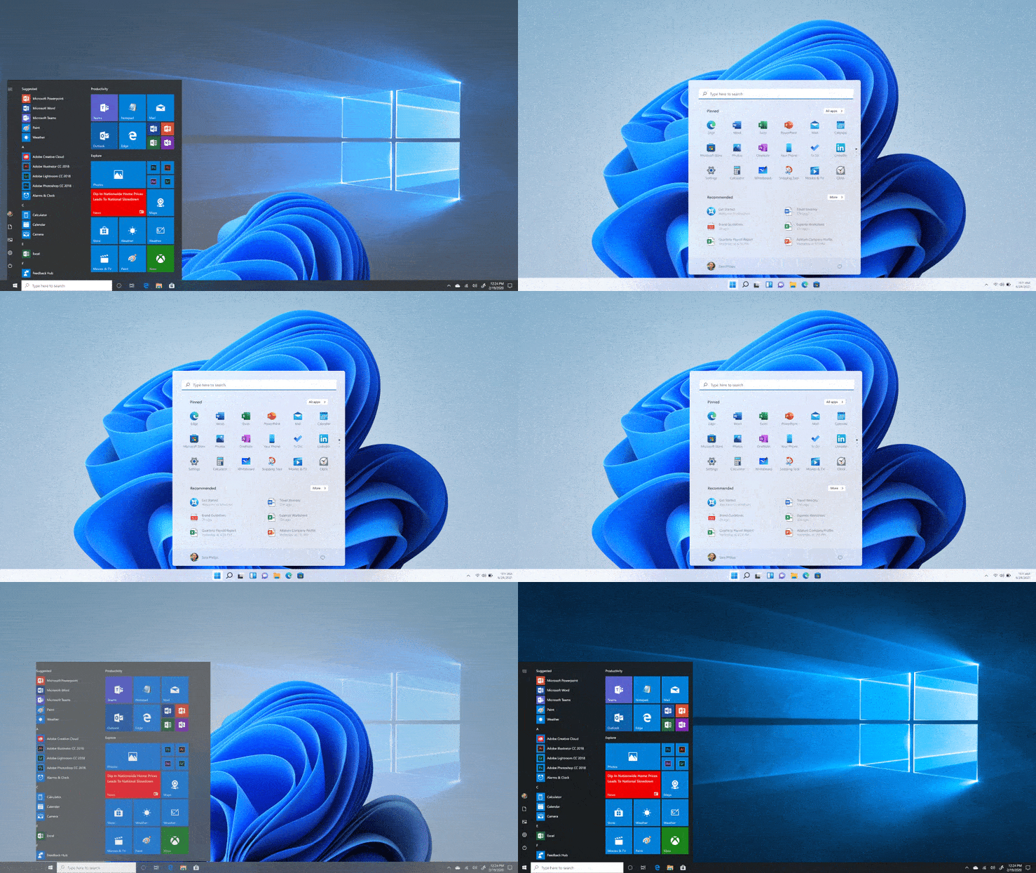
Windows 11 also improves the out-of-box experience (OOBE) of when you set up a machine for the first time. The settings you configure are a lot more useful than in Windows 10, including naming your PC and setting up a PC for how you intend to use it. Sometimes, it’s the little things that count.
Microsoft has also added rounded corners to most parts of Windows 11, new iconography, and an updated Segoe UI Variable font. Like most of Windows 11, these are subtle changes that you only really start to notice after using the OS for a few days. Microsoft even worked with design studio Six N Five to create most of the wallpapers you’ll see in Windows 11. They’re mostly centered to match the Start menu. “We want your journey into Windows 11 to be literally centered from the start,” says Microsoft.
The Windows 11 design certainly isn’t perfect, though. It’s a work in progress, but there’s still a lot of inconsistency in this preview that needs to be ironed out. At times, it still feels like Microsoft is mashing together Windows from a decade ago with this modern and simple UI. There’s a lot that goes into overhauling something as big and sprawling as Windows, so hopefully the final product smooths up some of the early and rough edges.


